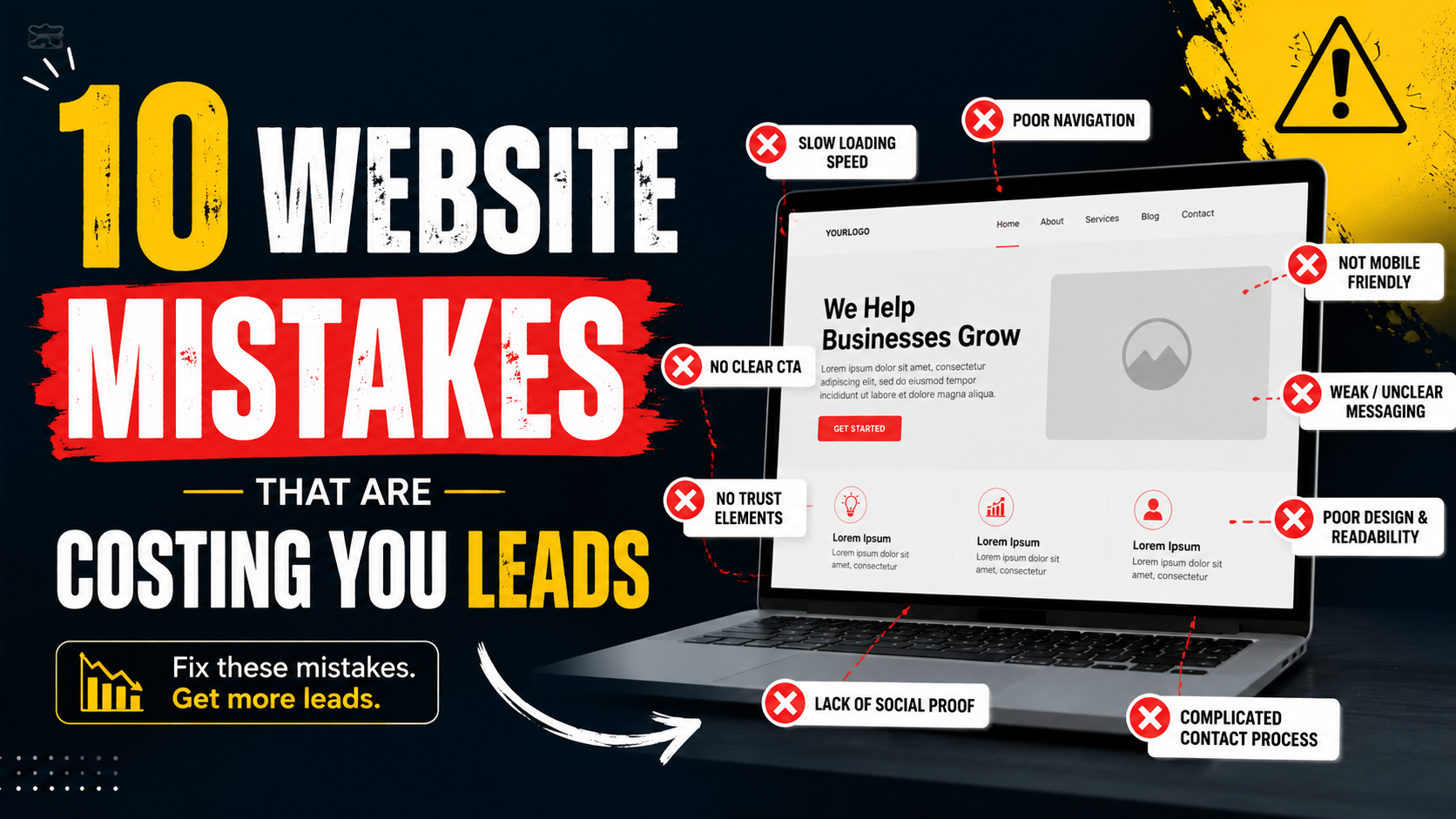
I have seen businesses spend more money on traffic when the real problem was sitting on the website the whole time.
More Google Ads.
More SEO content.
More social campaigns.
More landing pages.
Traffic goes up.
Leads barely move.
That is usually the point where someone says:
“We need more visitors.”
Sometimes that is true.
But sometimes the website is leaking the visitors you already have.
A person lands on the page and cannot tell what the business does.
The contact button is hidden.
The form asks for too much.
The site takes forever to load on mobile.
There are no reviews.
The phone number is difficult to find.
Or the visitor submits a form and nobody replies until two days later.
None of these problems feel dramatic on their own.
Together, they can destroy conversion performance.
The frustrating part is that many of them are fixable without rebuilding the entire website.
Here are ten website mistakes I see most often when a business gets traffic but not enough enquiries.
1. Your Homepage Does Not Explain What You Do Quickly Enough
This is probably the first thing I check.
Open your homepage and ignore the logo.
Can a new visitor understand:
What do you do?
Who is it for?
Where do you operate?
What should they do next?
within a few seconds?
If not, the page may be too vague.
I still see headlines such as:
“Building Better Experiences.”
“Solutions for a Better Tomorrow.”
“Where Quality Meets Innovation.”
“Helping You Reach New Heights.”
They sound polished.
They say almost nothing.
A visitor should not have to read three sections to figure out that you are a roofing company.
A Better Approach
Be specific.
Instead of:
Solutions Built Around You
try:
Commercial Landscaping for Property Managers in Dallas
Instead of:
Helping Businesses Grow
try:
SEO and Google Ads for Local Service Businesses
Clarity is usually more valuable than cleverness.
Why This Costs Leads
People do not work hard to understand websites.
If the offer is unclear, they go back to Google and click the next result.
You may never see that lost opportunity in your analytics.
It simply appears as another visitor who did not convert.
2. Your Call to Action Is Too Vague
The next mistake usually appears right under the headline.
A button says:
“Learn More.”
Learn more about what?
For a service business, visitors often need a much clearer next step.
Examples:
Request a Quote.
Book a Consultation.
Schedule an Inspection.
Call Now.
Check Availability.
Get a Free Estimate.
The wording should match what the customer is ready to do.
“Contact Us” Is Not Always Bad
There is nothing wrong with a general Contact Us button in navigation.
The problem is using it as the only CTA everywhere.
Imagine a roofing service page.
The visitor has read about roof replacement.
A button saying:
Request a Roof Estimate
is much more relevant than:
Contact Us
The page already knows why they are there.
Use that context.
Repeat the CTA Naturally
On longer pages, give visitors several opportunities to act.
For example:
Hero CTA.
CTA after service explanation.
CTA after testimonials.
Final CTA.
Do not add a button after every paragraph.
Just make the next step available at natural decision points.
3. Your Contact Form Is Asking for Too Much
This is one of the easiest places to lose a ready-to-buy visitor.
The customer reaches your quote form.
Then sees:
First name.
Last name.
Phone.
Email.
Company.
Job title.
Website.
Budget.
Timeline.
Address.
How did you hear about us?
Project description.
Preferred contact method.
That may be useful information for the business.
It may not be necessary before the first conversation.
Ask What You Actually Need
For a simple local service, you may only need:
Name.
Phone or email.
Service needed.
Short message.
For a high-ticket B2B service, you may reasonably ask for:
Company.
Budget range.
Timeline.
The ideal form length depends on what you sell.
The goal is not:
“Make every form as short as possible.”
The goal is:
“Collect the minimum information needed to move the lead forward.”
Test the Form on a Phone
A six-field form can feel reasonable on desktop and painful on mobile.
Complete it yourself.
If you get annoyed, your customers probably will too.
4. Your Website Is Painful on Mobile
A website can technically be responsive and still be frustrating.
I have seen mobile pages where:
The headline occupies the entire screen.
Buttons are too small.
The phone number is not clickable.
Popups cover the content.
Forms break.
Menus are difficult to close.
Images load slowly.
The CTA is buried after several screens.
For local businesses, this is particularly costly because many high-intent searches happen on phones.
Someone looking for:
A plumber.
A dentist.
A restaurant.
A towing company.
A roofer.
may want to act immediately.
What to Check
Open the site on a real phone and try to:
Read the headline.
Open the menu.
Call the business.
Submit the form.
View the projects.
Book an appointment.
Get directions.
Do not only inspect the design.
Use it.
Make Phone Numbers Clickable
This small detail matters.
If a mobile visitor has to memorize the phone number and manually type it into the dialer, you created unnecessary friction.
Use tap-to-call links.
5. Your Website Is Too Slow
A slow site does not always look broken.
It just feels annoying.
You click.
Wait.
The image appears.
The page shifts.
The menu hesitates.
The chat widget loads.
Then the cookie banner.
A few seconds of friction can be enough to lose a visitor.
Common Causes
Oversized images.
Autoplay videos.
Too many plugins.
Heavy page builders.
Cheap hosting.
Too much JavaScript.
Chat widgets.
Review widgets.
Tracking scripts.
Social embeds.
Large fonts.
Poor caching.
The solution is not always:
“Buy faster hosting.”
Sometimes the site itself is overloaded.
Use PageSpeed Insights
Google PageSpeed Insights is a useful place to start.
Do not obsess over getting a perfect score.
Look for actual bottlenecks.
For example:
Hero image is 5 MB.
Server response is slow.
JavaScript blocks interaction.
Layout shifts badly.
Those are meaningful problems.
Fix the Biggest Problem First
Do not spend three hours saving 20 KB from a font while ignoring a 7 MB background video.
Performance work should be prioritized by impact.
6. You Are Not Showing Enough Proof
A business can say:
“We provide excellent service.”
The problem is every competitor says the same thing.
Visitors want evidence.
That can include:
Google reviews.
Testimonials.
Project photos.
Case studies.
Client logos.
Certifications.
Awards.
Real team photos.
Years in business.
Specific results.
Real Proof Beats Marketing Claims
Compare:
“We are trusted experts.”
with:
“4.9/5 from 180+ customer reviews.”
Or:
“Experts in commercial landscaping.”
with:
A gallery of actual commercial properties plus a testimonial from a property manager.
The second feels more believable.
Put Proof Near the Decision
Do not hide every review on a Testimonials page.
Place relevant proof near:
Forms.
CTAs.
Pricing.
Service descriptions.
The visitor should see reassurance when they are deciding whether to act.
7. You Are Using Too Many Stock Photos and Not Enough Real Photos
This one has become more important as generic stock and AI-generated imagery has become easier to produce.
A local business website can look polished and still feel anonymous.
Imagine a contractor website filled with:
Perfect luxury houses.
Generic workers wearing untouched hard hats.
People shaking hands.
Smiling call center staff.
None of them belong to the company.
Then compare that with:
Real crew.
Branded vehicles.
Actual projects.
Real office.
Real equipment.
Before-and-after work.
Which one feels more trustworthy?
Usually the second.
Real Does Not Mean Unprofessional
Hire a photographer if necessary.
A half-day shoot can produce:
Team photos.
Project images.
Vehicles.
Office.
Work-in-progress shots.
Those assets can then be used across:
Website.
Google Business Profile.
Social media.
Ads.
Proposals.
Real photography has a lot of value.
8. Your Website Gives Visitors Too Many Choices
More options do not always create a better experience.
I have seen service pages with:
Ten navigation links.
Four buttons.
Newsletter signup.
Chat.
WhatsApp.
Download guide.
Follow Instagram.
Book call.
Read blog.
Get quote.
Call now.
Now the visitor has to decide what the website wants them to do.
That is unnecessary mental work.
One Primary Action
Pick the main conversion.
For example:
Request a Free Estimate
Then use secondary actions only where they support the journey.
Maybe:
Primary:
Request Estimate.
Secondary:
View Projects.
That is clear.
Paid Landing Pages Need Even More Focus
If someone clicks an ad for:
“Emergency Roof Repair”
do not send them to a page full of:
New roofs.
Commercial work.
Siding.
Gutters.
Careers.
Blog posts.
Keep the experience focused on the thing they searched for.
9. You Are Not Tracking Real Leads Properly
This is one of the most expensive mistakes because it creates bad decisions.
A business may think:
“Google Ads is not working.”
because only three form submissions appear in analytics.
But another 18 people called.
Nobody tracked the calls.
Or the opposite happens.
The dashboard says:
50 conversions.
Then you discover the tracking fires every time someone clicks the Submit button, even when the form fails.
Bad data creates bad marketing decisions.
Track Successful Actions
For a service business, that might include:
Successful form submissions.
Qualified phone calls.
Booked appointments.
Consultations.
Quote requests.
WhatsApp enquiries.
Not just:
Page views.
Button clicks.
Contact page visits.
Separate Clicks From Leads
A phone-number click is not automatically a phone call.
A form start is not a submission.
A pricing-page view is not a customer.
Keep those actions separate.
Connect Marketing to Sales
The most useful funnel looks something like:
Visitor.
Lead.
Qualified lead.
Appointment.
Proposal.
Customer.
Revenue.
A CRM such as HubSpot, Pipedrive, Zoho, Close, Salesforce, or an industry-specific platform can help.
Even a spreadsheet is better than nothing if you are small.
10. Your Follow-Up Is Too Slow
This technically happens after the website, but it still belongs in the conversion journey.
I have seen businesses spend hours optimizing:
Landing pages.
Forms.
CTAs.
Ads.
Then a lead arrives.
Nobody replies until tomorrow.
That can wipe out all the previous work.
Imagine someone requests quotes from four companies.
Company A replies quickly.
Company B responds later the same day.
Company C replies tomorrow.
Company D replies three days later.
Which company gets the first real conversation?
Usually one of the faster ones.
Use Automatic Confirmation
After a form submission, send:
“Thanks, we received your request. Someone from our team will respond within one business day.”
That reassures the visitor.
But remember:
An automatic email is not the same as actual follow-up.
Someone still needs to respond.
Route Leads Properly
A good setup might be:
Form submitted.
Lead enters CRM.
Salesperson gets notification.
Lead owner assigned.
Follow-up task created.
Urgent enquiries get immediate alerts.
Tools such as Zapier, Make, HubSpot workflows, Slack notifications, or CRM automation can help depending on your setup.
The exact software matters less than having a clear process.
The Hidden Mistake: Designing for Yourself Instead of the Customer
This one sits underneath almost everything else.
Business owners often evaluate a website based on:
Do I like the colors?
Does this feel premium?
Do I like this image?
Can we make the logo bigger?
Customers care about different things.
They want to know:
Do you solve my problem?
Do you serve my location?
Can I trust you?
How much might it cost?
What happens next?
How do I contact you?
Design should support those questions.
Not compete with them.
Your Website Should Reduce Uncertainty
When I look at a lead-generation website, I think about hesitation.
What might stop this visitor?
Maybe they do not understand the service.
Fix the headline.
Maybe they do not trust the business.
Add proof.
Maybe they are worried about cost.
Add pricing context.
Maybe the form feels like too much work.
Shorten it.
Maybe they do not know whether you serve their city.
Show the service area.
Maybe they do not know what happens after submitting.
Explain the process.
Conversion optimization is often just removing reasons not to act.
A Real Example: Local Landscaping Company
Imagine a landscaping company gets steady organic traffic and Google Ads clicks.
The current homepage says:
Creating Outdoor Spaces You’ll Love
Button:
Learn More
There are beautiful stock photos.
No service area near the top.
No reviews until the bottom.
Quote form has ten fields.
Phone number is tiny in the footer.
On mobile, the hero image loads slowly.
The company thinks it needs more traffic.
I would not increase the ad budget yet.
I would first try:
New Hero
Landscaping and Hardscaping for Homeowners in Austin
CTA
Request a Free Estimate
Trust
4.9-star customer rating near the CTA.
Photos
Actual completed patios, retaining walls, and yards.
Mobile
Tap-to-call number.
Form
Name.
Phone.
Service needed.
Short project description.
Follow-Up
Immediate confirmation plus sales notification.
Those changes address the buying experience directly.
Another Example: Dental Clinic
Suppose a dental clinic receives strong traffic but relatively few bookings.
The website has:
Professional photography.
Good service descriptions.
Strong rankings.
But the main CTA says:
“Contact Us.”
The booking page requires creating an account before showing appointment times.
Reviews are hidden on another page.
The phone number cannot be tapped on mobile.
Possible fixes:
Book an Appointment
as the main CTA.
Simpler booking flow.
Google rating near the appointment button.
Clickable phone.
Hours visible.
Insurance information easier to find.
Again, the problem is not traffic.
It is friction.
Another Example: B2B Agency
A marketing agency gets traffic from LinkedIn and Google Ads.
Landing page says:
Accelerate Your Digital Growth
Then lists:
SEO.
PPC.
Social.
Web Design.
Branding.
Email.
The visitor clicked an ad for:
“Google Ads Management for Law Firms.”
Now the page feels generic.
A better landing experience might say:
Google Ads Management for Law Firms
Then show:
Legal-industry case study.
Relevant results.
How the service works.
Who it is for.
Clear CTA:
Request an Ads Review
The more specific the traffic, the more specific the page usually needs to be.
Do Not Fix Everything at Once
If your website has all ten problems, resist the urge to redesign everything immediately.
Start with the biggest barriers.
I would usually prioritize:
- Clear offer.
- Strong CTA.
- Mobile usability.
- Form friction.
- Trust proof.
- Speed.
- Tracking.
- Follow-up.
Then improve from there.
Changing everything at once also makes it harder to know what actually worked.
Use Analytics, but Do Not Worship the Dashboard
GA4 can tell you:
Which pages people visit.
Where traffic comes from.
Which devices they use.
Which conversion events happen.
Tools such as Microsoft Clarity can help show:
Where users click.
How far they scroll.
Where they get frustrated.
Session recordings can expose obvious problems.
But analytics cannot replace common sense.
If your mobile menu literally does not open, you do not need three months of data before fixing it.
Use data to understand uncertainty.
Fix obvious problems immediately.
Talk to Your Sales Team
This is one of the most useful sources of conversion insight.
Ask:
What questions do leads repeatedly ask?
Why do people hesitate?
What information is missing?
Why do qualified leads say no?
Which services generate bad-fit enquiries?
What do customers care about most?
Those answers belong on the website.
If every prospect asks:
“Do you offer financing?”
add financing information.
If everyone asks:
“How soon can you start?”
explain scheduling.
If half the leads are outside your service area, make the locations clearer.
Sales calls are website research.
Review Search Intent
Sometimes the website itself is fine.
The wrong people are arriving.
Imagine a commercial cleaning company ranks for:
“DIY carpet stain removal.”
Traffic grows.
Leads do not.
That does not mean the CTA is broken.
The traffic does not match the service.
Look at:
Google Search Console.
Google Ads search terms.
SEO keyword rankings.
Landing pages.
Make sure the visitors have a reasonable chance of becoming customers.
Traffic quality comes before conversion optimization.
Measure Lead Quality, Not Just Lead Volume
Suppose you improve the form and leads jump from:
30 per month
to:
Great?
Maybe.
Then sales tells you 40 are unqualified.
The old form produced:
30 leads.
20 qualified.
The new version:
60 leads.
20 qualified.
You doubled the workload without improving the business.
Track:
Lead.
Qualified lead.
Meeting.
Quote.
Customer.
Revenue.
That gives you a much better picture.
A Simple Website Lead Audit
If I were auditing a small-business website today, I would open the homepage and ask:
Can I understand what this business does in five seconds?
Is the main CTA obvious?
Can I tell where the business operates?
Can I see real proof?
Can I call easily on mobile?
Can I submit the form without frustration?
Does the site load comfortably?
Do I understand what happens after I contact them?
Can I see real photos?
Does the page match the traffic source?
Are conversions tracked correctly?
Who gets the lead afterward?
If any answer is unclear, you have something worth investigating.
Ten Mistakes at a Glance
The biggest lead-killing website mistakes are:
- Unclear messaging.
- Weak calls to action.
- Long or frustrating forms.
- Poor mobile usability.
- Slow website speed.
- Weak trust signals.
- Too many stock photos and not enough real proof.
- Too many competing choices.
- Poor conversion tracking.
- Slow or inconsistent follow-up.
None of these is particularly glamorous.
That is exactly why they are often ignored.
You May Not Need More Traffic
This is the thought I would leave with any business owner running ads or investing in SEO.
Before spending another $2,000 trying to bring more people to the website, look at what happens to the visitors already arriving.
Can they understand the offer?
Can they trust you?
Can they act easily?
Does the site work well on their phone?
Does the form make sense?
Does someone actually respond?
Because increasing traffic to a weak conversion experience simply creates more lost opportunities.
Think of it like a physical store.
If 100 people walk in and nobody can find the checkout counter, bringing another 100 through the door does not solve the real problem.
Fix the path first.
Make the offer clear.
Make trust visible.
Make contacting the business easy.
Track what happens.
Follow up quickly.
Then scale the traffic.
A good lead-generation website does not need to manipulate visitors.
It simply removes confusion and makes the next step feel obvious.
And when you get those basics right, you may discover that the website did not need dramatically more visitors.
It just needed to stop losing the good ones it already had.