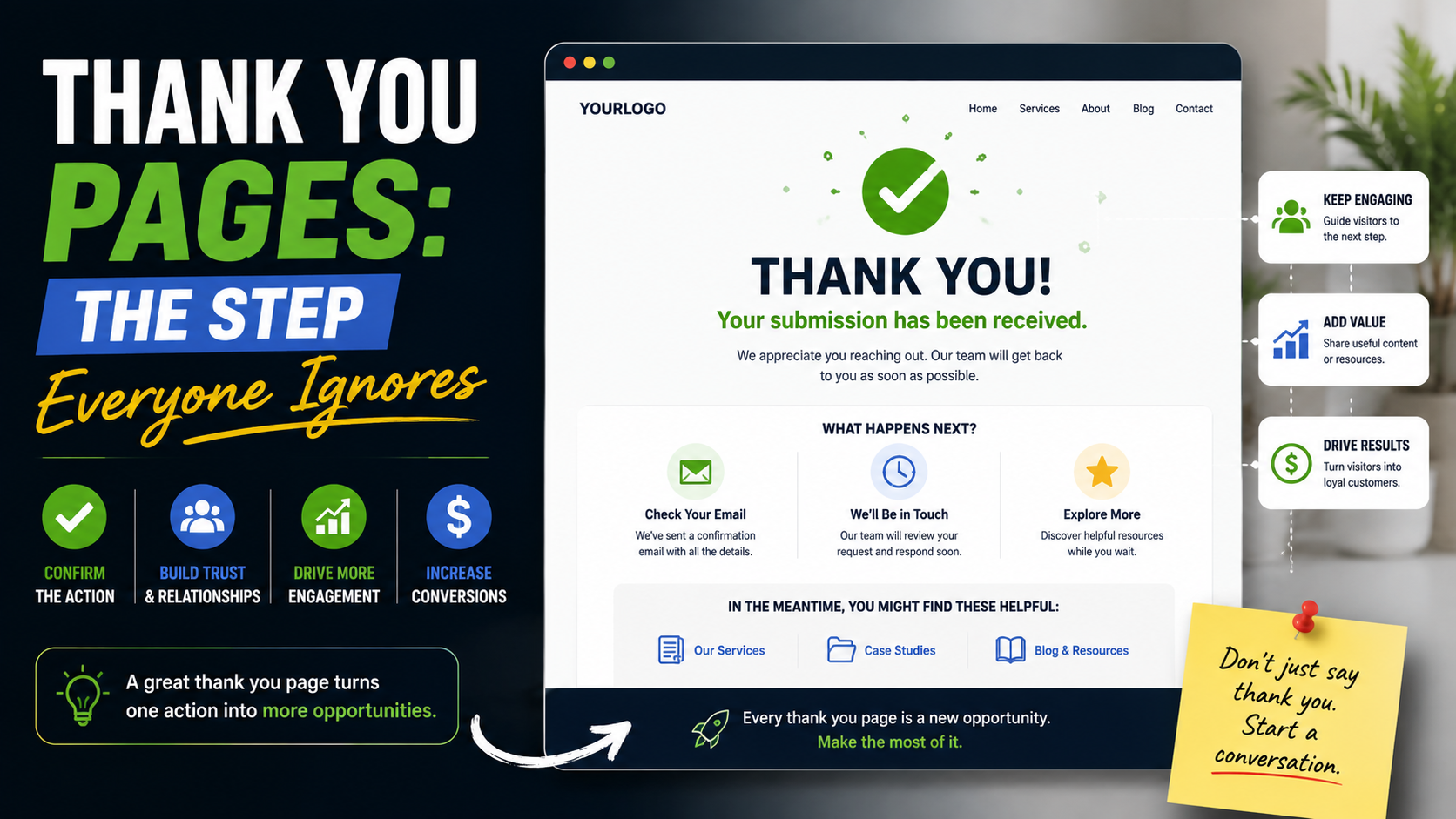
I have seen businesses spend weeks improving a landing page and almost no time thinking about what happens after the conversion.
The headline gets tested.
The form gets shortened.
The CTA gets rewritten.
The testimonials are moved higher.
Tracking is installed.
Then someone submits the form and lands on:
Thank you. Your submission has been received.
That is it.
No next step.
No explanation.
No confirmation of what they actually asked for.
No idea when someone will reply.
No useful resource.
No appointment option.
No chance to keep the visitor engaged.
It always feels strange because the business did the hard part already.
The visitor trusted the company enough to take action.
They filled out the form.
Shared their contact information.
Booked something.
Bought something.
Downloaded something.
That moment should not be treated like the end of the journey.
A good thank you page should confirm the action, reduce uncertainty, and help the customer understand what happens next.
In some cases, it can also create another useful action without becoming pushy.
That is why I think thank you pages are one of the most overlooked parts of website conversion.
The Conversion Is Not Finished When the Form Submits
This is the first mindset shift.
A form submission is not the same as a customer.
A quote request still needs a response.
A demo request still needs scheduling.
A download still needs delivery.
A purchase may still need shipping information.
An appointment may still need preparation.
The thank you page sits directly between:
“I took action”
and:
“What happens now?”
That makes it important.
A weak thank you page creates uncertainty.
A strong one removes it.
Start by Confirming Exactly What Happened
Do not make the visitor guess whether the form worked.
The first message should be clear.
Instead of:
“Thanks!”
try:
Thanks, we received your quote request.
Or:
Your consultation request has been submitted.
Or:
Your guide is ready to download.
Or:
Your appointment is confirmed for Tuesday at 2:00 PM.
Specific confirmation reassures the user.
This is especially important if the form took time to complete.
People often wonder:
“Did that actually go through?”
Make the answer obvious.
Tell Them What Happens Next
This is probably the most important thing a thank you page should do.
For example:
What happens next
- We review your project details.
- A team member will contact you within one business day.
- If the project looks like a fit, we’ll arrange a short call or site visit.
Now the visitor knows what to expect.
That reduces uncertainty.
Compare that with:
“Thank you for contacting us.”
The second message confirms almost nothing.
Give a Realistic Response Time
If you say:
“We will reply within 10 minutes”
and nobody responds for six hours, the thank you page has created a problem.
Use a timeframe the business can genuinely meet.
Examples:
“Within one business day.”
“By the end of the next working day.”
“Within 2–4 business hours.”
“Someone from our emergency team will call shortly.”
The right timeframe depends on the service.
For emergency plumbing, tomorrow is too slow.
For architectural consulting, a same-day response may not be necessary.
Be realistic.
A Thank You Page Can Reduce Duplicate Enquiries
This happens more than people realize.
Someone submits a form.
Nothing obvious happens.
They wonder whether it worked.
So they submit again.
Then they call.
Then they email.
Now the business has three versions of the same lead.
A clear thank you page prevents that.
For example:
Your request was submitted successfully. There’s no need to send it again. We’ll be in touch within one business day.
Simple.
Useful.
Use the Page to Prepare the Lead
For high-value services, the thank you page can help the next conversation go better.
Imagine someone requests a kitchen remodeling estimate.
The thank you page could say:
Before we speak, it helps to have:
- A few photos of the space
- Approximate room dimensions
- Your preferred timeline
- Any inspiration images
- A rough budget range
Now the visitor knows what to prepare.
That makes the sales call more productive.
The business gets better information.
The customer feels more organized.
Everyone wins.
Let Visitors Upload Helpful Information
In some industries, the next step may involve:
Photos.
Plans.
Documents.
Measurements.
Screenshots.
Reports.
Instead of making the person wait for an email, the thank you page can offer an optional upload.
For example:
Have photos of the damage? Upload them here so our team can review them before calling.
This works well for:
Roofing.
Water damage.
Landscaping.
Interior design.
Architecture.
Web development.
Technical support.
Only ask for files if they genuinely help.
Do not turn the thank you page into another giant form.
Offer Scheduling When It Makes Sense
Sometimes the best next step is obvious:
Book the call.
If someone has already requested a consultation, do not necessarily make them wait for your team to email back and ask:
“What time works for you?”
You can offer scheduling immediately.
For example:
Want to speed things up? Choose a time for your consultation below.
Then use:
Calendly.
Acuity Scheduling.
HubSpot Meetings.
Google Calendar booking tools.
Industry-specific scheduling software.
This can remove several back-and-forth emails.
Do Not Force Scheduling if Review Comes First
There is an important exception.
Some businesses need to review the lead before booking.
For example:
Custom development.
High-ticket consulting.
Large commercial projects.
Specialist legal work.
If you first need to determine whether the project is a fit, do not automatically allow every lead to book time.
Instead:
“Thanks. We’ll review your details first. If it looks like a fit, we’ll send available meeting times.”
The thank you page should reflect the real process.
Give Downloads Immediately
If the visitor submitted a form to get:
Checklist.
Guide.
Template.
Workbook.
Pricing sheet.
Do not make them search their inbox if you can avoid it.
You can still email the resource.
But also provide:
Download Your Guide
directly on the thank you page.
This reduces frustration caused by:
Slow email delivery.
Spam folders.
Mistyped email addresses.
Promotions tabs.
The visitor gets what you promised immediately.
The Email Should Still Arrive
Even if the resource is downloadable on the page, send it by email too.
Why?
The visitor may close the page.
They may want to access the file later.
A simple confirmation email gives them another route back.
For example:
“Thanks for downloading the Commercial Landscaping Planning Checklist. You can access it here anytime.”
Useful.
No unnecessary sales pitch required.
A Thank You Page Can Continue the Conversation
This is where things get interesting.
The visitor has already taken one action.
You can now offer a logical second step.
The keyword is logical.
For example:
Someone downloads:
Roof Replacement Cost Guide
Thank you page:
“Planning a project soon? Request a free roof inspection.”
That makes sense.
Someone downloads:
Local SEO Checklist
Thank you page:
“Want help identifying which issues matter most? Request an SEO review.”
Again, connected.
The second action should be related to the first.
Do Not Immediately Ask for Five More Things
This is where businesses go too far.
The visitor just submitted a form.
Then the thank you page asks them to:
Follow Instagram.
Join Facebook.
Subscribe to YouTube.
Book a call.
Download another guide.
Refer a friend.
Read three blog posts.
Leave a review.
That is too much.
Prioritize one useful next step.
Maybe two.
The thank you page should feel helpful, not desperate.
Thank You Pages Are Great for Setting Expectations
If the sales process has several steps, explain them.
Example for a contractor:
What happens next
- We review the project details.
- We call to confirm the scope.
- If needed, we arrange a site visit.
- You receive a written estimate.
- Work is scheduled once approved.
This removes uncertainty before the first conversation even happens.
It can also reduce repetitive questions for the sales team.
Use Real Contact Details
If the visitor needs help after submitting, make it easy.
You can include:
Phone number.
Email.
Office hours.
Emergency number where relevant.
For example:
Need to add something to your request? Call us at [number] or reply to your confirmation email.
That gives the visitor a clear backup option.
Thank You Pages Matter for Local Service Businesses
Local businesses often rely heavily on:
Calls.
Quote forms.
Appointment requests.
A thank you page can improve the handoff.
Imagine a landscaping company.
Someone submits:
“Request an Estimate.”
A strong thank you page might say:
Thanks — your estimate request is in.
Our team will review the details and contact you within one business day.
Before we speak:
If possible, have a few photos and an approximate property address ready.
Need faster help?
Call us at [phone number].
That is much better than:
“Form submitted.”
Thank You Pages Matter for Paid Ads Too
If you are running Google Ads or Meta Ads, the thank you page can also become part of your tracking setup.
For example:
Visitor clicks ad.
Completes quote form.
Redirects to:
/thank-you/
You can track that successful page load as part of conversion measurement when the implementation is appropriate.
But do not rely only on page views if there are better ways to track actual successful submissions.
Some forms can trigger dedicated conversion events instead.
The key point is:
Track success, not just clicks on the submit button.
Do Not Count Failed Forms as Leads
This sounds basic.
Still happens.
The user clicks:
“Submit.”
Tracking fires.
Then:
“Please enter a valid phone number.”
No lead was created.
But analytics recorded one.
That creates inaccurate reporting.
The thank you page can help because only successful submissions should reach it.
Even then, test carefully.
If people can visit the URL directly, page-view-based tracking may overcount.
A proper event-based implementation is often cleaner.
Use GA4 and Google Tag Manager Carefully
Depending on your setup, you may track:
Form submitted.
Appointment booked.
Download completed.
Purchase confirmed.
Phone call.
Thank you page viewed.
Tools such as:
GA4.
Google Tag Manager.
Google Ads conversion tracking.
Meta Pixel.
CRM tracking.
can help connect the journey.
But keep your event naming clean.
Do not create:
thank_you_1
thank_you_final
form_success_new2
and then forget what they mean.
Use names that describe the action.
For example:
quote_request_submitted
consultation_booked
guide_downloaded
Much easier to maintain.
Thank You Pages Can Help With Lead Attribution
Suppose you have different forms.
Roofing quote.
Siding quote.
Commercial enquiry.
General contact.
Each can have a slightly different thank you experience or conversion event.
Now you can distinguish:
Which service generated the lead.
Which landing page produced it.
Which ad campaign drove it.
That is much more useful than lumping everything into:
“Contact Form Conversion.”
Use Hidden Form Fields for Better Context
If your forms support it, hidden fields can carry information such as:
Landing page.
Campaign.
Service page.
UTM source.
UTM campaign.
Referral source.
That information can go into the CRM.
The visitor does not need to answer:
“How did you hear about us?”
every time.
Then the thank you page can even become more relevant.
For example:
A visitor submitted from a roofing page.
Thank you message:
“Thanks for requesting a roofing estimate.”
More specific.
More reassuring.
Connect the Thank You Page to the CRM
The front end should not be the end of the process.
A good flow might look like:
Form submitted.
Thank you page appears.
Lead enters CRM.
Sales notification fires.
Lead owner is assigned.
Confirmation email sends.
Follow-up task is created.
That process can be built with:
HubSpot.
Pipedrive.
Salesforce.
Zoho CRM.
Close.
Zapier.
Make.
Or a custom integration.
The software matters less than reliability.
The thank you page confirms the action to the visitor.
The backend makes sure someone acts on it.
Test Everything Yourself
I always recommend doing a real test submission.
Do not assume the setup works because the website developer says:
“It’s connected.”
Submit the form.
Then check:
Did the thank you page load?
Did the lead reach the inbox?
Did the CRM receive it?
Did the correct source appear?
Did the confirmation email send?
Did the attachment work?
Did the automation fire?
Was the conversion recorded?
What does it look like on mobile?
You often find surprising problems.
Thank You Pages Can Be Different by Intent
You do not need one generic thank you page for everything.
A quote request may need:
Response expectations.
A guide download needs:
Download button.
A booking needs:
Appointment details.
A purchase needs:
Order confirmation.
A job application needs:
Hiring process.
Different actions deserve different follow-up.
Example: Quote Request Thank You Page
A simple version:
Thanks — we received your quote request.
Our team will review the details and contact you within one business day.
What happens next:
- We review your request.
- We contact you with any questions.
- If needed, we schedule an inspection or consultation.
- You receive clear pricing before work begins.
Need to add something?
Call us at [number].
That is enough.
Example: Consultation Thank You Page
Your consultation request is confirmed.
Check your email for the confirmation and meeting details.
Before the call, please have:
- Your main goals
- Current website or project information
- Any relevant documents
- Approximate timeline
Need to reschedule?
Use the link in your confirmation email.
Clear.
Useful.
Example: Lead Magnet Thank You Page
Your Website Conversion Checklist is ready.
[Download Checklist]
We also sent a copy to your email.
Want help applying it?
Request a website review and we’ll identify the biggest conversion issues first.
That second CTA connects naturally to the resource.
Example: Ecommerce Thank You Page
A purchase confirmation page should prioritize:
Order number.
Products purchased.
Shipping information.
Delivery expectations.
Payment confirmation.
Customer support.
Account options.
Possible secondary recommendations.
Do not immediately bury the order confirmation under:
“You may also like…”
The customer first wants reassurance that the payment worked.
Ecommerce Upsells Can Work After Purchase
Post-purchase offers can work when they genuinely complement the order.
For example:
Customer buys a camera.
Offer:
Memory card.
Protective case.
Extra battery.
That is relevant.
Customer buys running shoes.
Offer:
Running socks.
Maybe useful.
Do not turn the thank you page into another aggressive sales page.
The order confirmation must remain the priority.
Ask for Account Creation at the Right Time
For ecommerce, you may let a guest customer purchase without creating an account.
After the order:
Want to track your order more easily? Create a password for your account.
This can be a good moment.
The customer already completed the purchase.
The account now provides an obvious benefit.
Referral Offers Can Work, but Timing Matters
A first-time lead who has not even used the service yet is not the best person to ask:
“Refer three friends!”
They do not know whether they like you.
Referral prompts make more sense after:
Successful project.
Completed appointment.
Positive review.
Repeat purchase.
Thank you pages should match the stage of the relationship.
Do Not Ask for Reviews Too Early
This is a common mistake.
Someone books an appointment.
Thank you page:
“Leave us a 5-star review!”
They have not experienced the service yet.
Wait.
Ask after you have delivered value.
Review requests belong later in the customer journey.
Thank You Pages Can Show Helpful Content
If there is a waiting period before the next step, recommend useful content.
For example, after requesting a website consultation:
While you wait:
- How Much Does a Small Business Website Cost?
- Homepage vs Landing Page
- Website Redesign Checklist
This can help the prospect arrive better informed.
But keep it focused.
Do not dump the entire blog archive.
Video Can Work Well Here
A short video can add a human touch.
For example:
“Thanks for reaching out. I’m James, one of the project managers. Our team will review your details today. Here’s what happens next…”
This can be particularly effective for:
Consultants.
Agencies.
Contractors.
Coaches.
High-ticket services.
Keep it short.
The customer already took action.
They do not need another ten-minute sales video.
Photos Can Build Trust After Conversion Too
The thank you page can introduce:
The person who will call.
The project manager.
The clinic team.
The estimator.
For example:
You’ll likely hear from Sarah, our project coordinator.
Real photo.
Short introduction.
Now the follow-up call feels less anonymous.
Make the Page Mobile-Friendly
Many forms are submitted from phones.
The thank you page should work there too.
Check:
Headline size.
Download button.
Calendar embed.
Phone links.
Video size.
Spacing.
Contact details.
Any secondary CTA.
Do not create a clean mobile form and then send people to a desktop-only thank you page.
Keep It Fast
There is rarely a reason for the thank you page to be heavy.
The visitor needs:
Confirmation.
Next steps.
Useful action.
You probably do not need:
Huge background video.
Animated slider.
10 third-party widgets.
Complex transitions.
Keep it fast and clear.
Avoid Auto-Redirecting Too Quickly
Some websites show:
“Thanks!”
for two seconds and automatically send the visitor somewhere else.
That can be confusing.
The person may be trying to read:
Response time.
Order number.
Download information.
Do not rush them away unless the redirect is necessary.
Let the visitor choose the next step.
Do Not Send People Back to the Homepage Automatically
This wastes the moment.
The visitor just took a specific action.
Sending them to the homepage removes all context.
Use a dedicated page that acknowledges what happened.
It feels more professional and creates better tracking opportunities.
Do Not Index Every Thank You Page
In many cases, thank you pages do not need to appear in search results.
You do not want people finding:
“Thanks for requesting your roofing estimate”
through Google without ever completing the form.
Depending on your setup, you may use appropriate indexing controls to keep conversion-only pages out of search results.
This is also useful when page visits are part of conversion tracking.
Discuss the implementation with your SEO or development team.
Common Thank You Page Mistakes
Only Saying “Thanks”
No next step.
No Response Time
The visitor has no idea when someone will reply.
No Confirmation
They are not sure what they submitted.
No Contact Option
They cannot correct or add information.
Asking for Too Much Immediately
The visitor feels pressured.
Showing Irrelevant Offers
The experience loses focus.
No Tracking
Marketing cannot measure completed actions.
Tracking the Button Click Instead of Success
Failed submissions appear as leads.
No CRM Connection
The visitor gets confirmation, but nobody follows up.
Broken Download Links
The promised lead magnet cannot be accessed.
Asking for a Review Before Service
Wrong stage of the journey.
Generic Page for Every Action
The message feels disconnected.
A Simple Thank You Page Framework
If I were building one today, I would use this structure.
1. Clear Confirmation
Thanks, we received your request.
2. Next-Step Explanation
Tell them exactly what happens.
3. Response Time
Give a realistic expectation.
4. Helpful Preparation
What should they have ready?
5. Contact Option
Phone or email if they need help.
6. One Relevant Secondary Action
Book a call.
Download resource.
Read related guide.
Upload files.
7. Tracking
Make sure the action is measured correctly.
That is enough for most service businesses.
A More Advanced Setup
For businesses with more mature marketing systems, the page can adapt based on:
Lead source.
Service requested.
Location.
Customer type.
Campaign.
For example:
Someone requests:
Commercial Landscaping
They see:
Thanks for requesting a commercial property assessment.
Someone requests:
Residential Landscape Design
They see:
Thanks for telling us about your backyard project.
That extra relevance makes the experience feel more intentional.
The Thank You Page Is Also a Quality-Control Tool
One thing I like about building proper thank you flows is that they expose weak internal processes.
You start asking:
Who gets this lead?
How fast do we reply?
What happens if nobody owns it?
What should the customer prepare?
When do we send pricing?
What gets tracked?
Suddenly the project is not just:
“Design a nicer page.”
It becomes:
“Improve the handoff between marketing and sales.”
That is much more valuable.
The Biggest Mistake Is Treating the Lead Like the Job Is Done
Someone submitting a form feels like success.
Marketing reports:
“50 leads this month.”
Great.
But what happened afterward?
Did they receive confirmation?
Did somebody call?
Was the call fast enough?
Was the lead qualified?
Did they book?
Did they buy?
The thank you page sits at the beginning of that second half.
It should support the process, not simply celebrate the form submission.
A Good Thank You Page Should Feel Reassuring
That is the word I would use.
Reassuring.
The visitor should think:
“Good. That worked.”
“I know what happens next.”
“I know when they will reply.”
“I know who to contact if I need something.”
“I have what I asked for.”
That is a much better experience than:
“Submission successful.”
There is no complicated trick here.
A thank you page is simply an opportunity to finish the interaction properly.
The customer has already raised their hand.
Do not make them wonder whether anyone noticed.
Confirm the action.
Set expectations.
Give them one useful next step.
Then make sure the business follows through.
That last part matters most.
Because the best thank you page in the world cannot save a lead that sits unanswered in an inbox for three days.
But when the page, confirmation email, CRM, and follow-up process all work together, the experience feels organized from the very first interaction.
And that is exactly what customers want when they are deciding whether to trust a business.