One of the easiest mistakes to make with a website is changing something because it “feels better” and then assuming the change worked.
I have seen this happen with headlines, forms, buttons, landing pages, and entire homepage redesigns.
Someone says:
“The shorter headline looks cleaner.”
Another person says:
“I think the green button stands out more.”
The designer prefers one version.
The business owner prefers another.
Then everyone spends 30 minutes debating opinions.
The funny thing is that the visitors are the only people whose behavior actually answers the question.
That is where A/B testing becomes useful.
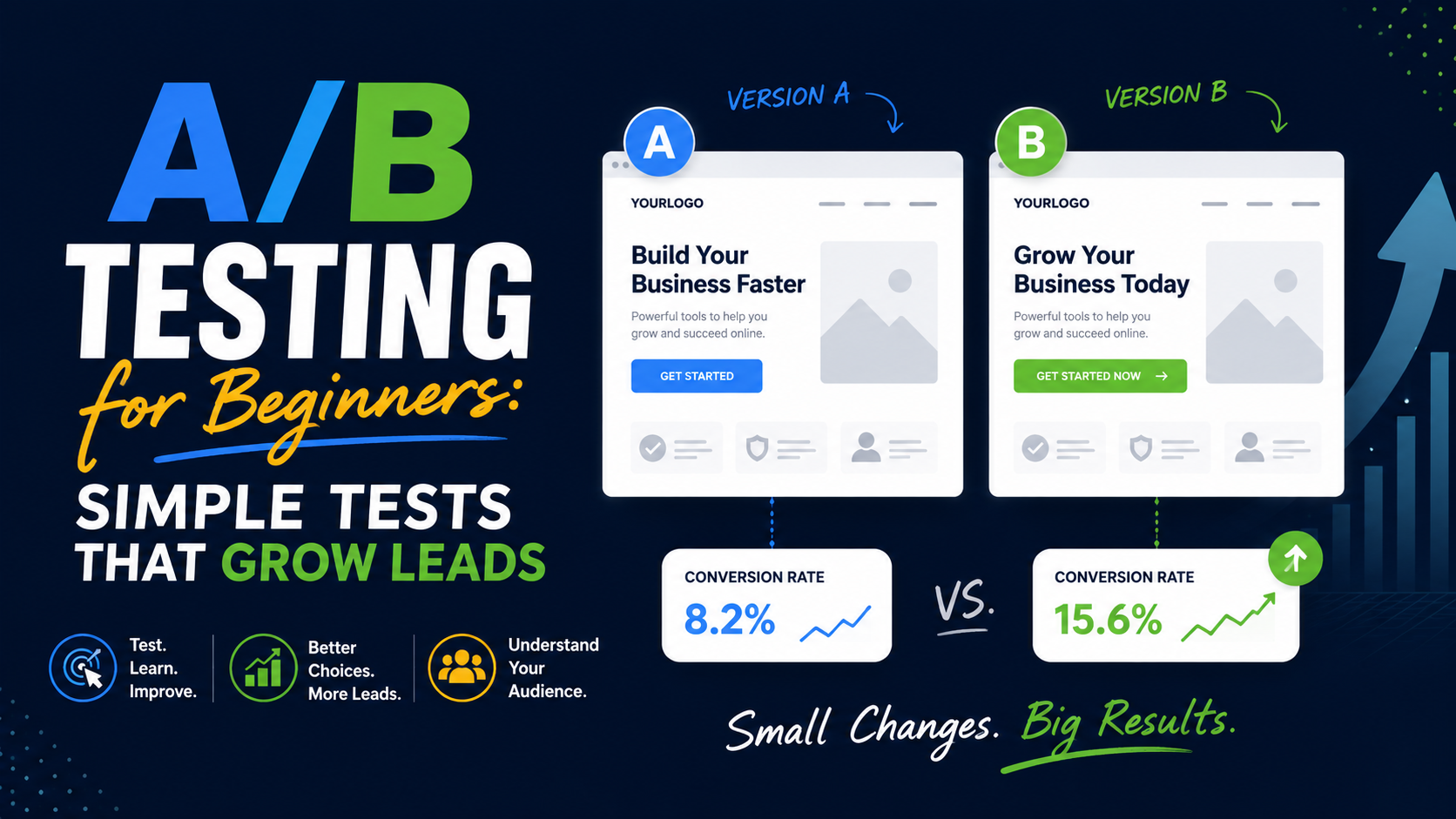
Instead of arguing about whether Version A or Version B is better, you let real visitors experience both versions and measure what they do.
Did more people request quotes?
Did more people book appointments?
Did more people call?
Did more people start trials?
That sounds simple, and the basic idea really is simple.
The hard part is running tests that actually teach you something.
You do not need to test every button color.
You do not need a data science department.
And you definitely do not need to change ten things at once.
For most small businesses, a few sensible tests around the headline, offer, CTA, form, and trust proof can teach you much more than endlessly redesigning the website based on personal preference.
What A/B Testing Actually Means
An A/B test compares two versions of the same experience.
Version A is usually the current version.
This is often called the control.
Version B contains the change you want to test.
Visitors are divided between the versions.
Some see A.
Some see B.
Then you compare the outcome.
For example:
Version A
Request a Consultation
Version B
Get a Free Project Estimate
If Version B consistently creates more qualified enquiries under a properly run experiment, you have evidence that the wording may be better for that audience.
Modern experimentation platforms such as Optimizely still use this basic model: visitors are assigned to different variations, and their actions are measured against defined conversion goals. VWO also currently supports A/B and related experimentation methods for website testing.
The technology can become sophisticated.
The underlying question stays simple:
Which version helps more visitors complete the action we care about?
A/B Testing Is Better Than “We Changed It and Leads Went Up”
This distinction matters.
Imagine your landing page gets:
50 leads in March.
You redesign the headline in April.
Now it gets:
70 leads.
Did the new headline increase leads?
Maybe.
But perhaps:
Traffic increased.
Google Ads spent more money.
Seasonal demand changed.
A competitor stopped advertising.
Your rankings improved.
Traffic quality changed.
The sales promotion changed.
That is why simple before-and-after comparisons can be misleading.
With a proper A/B test, Versions A and B run during the same general period.
They share much more of the same:
Traffic.
Seasonality.
Campaign environment.
Market conditions.
That makes the comparison cleaner.
Start With the Conversion You Want to Improve
Before testing anything, answer:
“What result are we trying to increase?”
For a local service business, it might be:
Successful quote requests.
Booked appointments.
Qualified phone calls.
Consultation requests.
For SaaS:
Demo bookings.
Free trials.
Account registrations.
For ecommerce:
Purchases.
Add-to-cart actions.
Checkout completions.
Do not start with:
“I want to test the hero image.”
Start with:
“I want more qualified consultation requests.”
Now you can ask whether changing the hero image is likely to influence that goal.
That keeps testing connected to the business.
Do Not Test Because You Are Bored With the Website
This is surprisingly common.
Someone has looked at the homepage every day for two years.
They are tired of it.
Customers may not be.
A visitor usually sees your page for the first time.
Your internal design fatigue is not evidence that something is underperforming.
A better reason to test is:
The form has a low completion rate.
Users are not clicking the main CTA.
Paid traffic is converting poorly.
People keep asking a question the page should answer.
Mobile visitors convert much worse than desktop visitors.
Users abandon near pricing.
That gives you a real problem to investigate.
Use Behavior Data to Find Test Ideas
Instead of randomly changing elements, look for friction first.
Tools such as Microsoft Clarity can show heatmaps and session recordings, including where visitors click, how far they scroll, and where they appear to struggle.
Suppose you notice visitors repeatedly clicking an image that is not actually a button.
That is a test idea.
Maybe make the image clickable.
Suppose almost nobody scrolls far enough to reach your testimonial section.
That is another test idea.
Move important proof higher.
Suppose users start the quote form but abandon at:
“Annual Household Income.”
Maybe that field is unnecessary.
Now your experiment comes from observed behavior rather than:
“Let’s make the button orange.”
Test #1: Your Main Headline
If I were choosing beginner tests, headlines would be near the top of my list.
The headline controls how quickly visitors understand the page.
Consider a landscaping business.
Version A
Outdoor Spaces Designed for Better Living
Sounds polished.
But what exactly does the company do?
Version B
Landscape Design and Installation for Austin Homeowners
Much clearer.
Or consider an accountant.
Version A
Financial Clarity for Modern Businesses
Version B
Monthly Bookkeeping for Ecommerce Businesses
Version B is much more specific.
That does not automatically mean it will win.
That is why you test.
But clarity is a strong hypothesis.
Write a Hypothesis Before Starting
A simple hypothesis forces you to explain why the change might work.
For example:
Because visitors may not immediately understand our service, we believe changing the generic headline to a service-specific headline will increase quote requests.
That is enough.
You do not need academic language.
Use this simple format:
Because [problem], we believe [change] will improve [result].
For example:
Because visitors may not understand what happens after submitting the form, we believe adding response-time information will increase form completions.
Now the test has a reason.
Test #2: Your Call to Action
CTA wording can affect how much commitment the action appears to require.
Imagine a contractor.
Version A
Contact Us
Version B
Request a Free Estimate
The second tells the visitor exactly what happens.
For a dental clinic:
Version A
Get Started
Version B
Book an Appointment
For an agency:
Version A
Submit
Version B
Request My Website Review
Specific CTA copy is worth testing because it changes how the visitor understands the next step.
Do Not Test Five CTA Changes at Once
Suppose Version B changes:
Button wording.
Button color.
Button size.
Button position.
Icon.
Now B performs better.
What did you learn?
Maybe the wording helped.
Maybe position mattered.
Maybe both mattered.
If you want a clean answer, change one major variable at a time.
There are cases where testing a completely different page experience makes sense.
But for a beginner trying to learn why something works, controlled changes are easier to interpret.
Test #3: Form Length
This can be a very useful lead-generation experiment.
Imagine your form asks for:
Name.
Email.
Phone.
Company.
Website.
Budget.
Timeline.
Project description.
How they heard about you.
Maybe you do not need all of that before the first conversation.
Test a shorter version.
Version A
9 fields.
Version B
5 fields.
Measure:
Total submissions.
Qualified leads.
Not just form completion rate.
This last part matters.
A shorter form may produce more leads but lower quality.
A longer form may reduce submissions but help qualification.
You need to know which outcome is better for the business.
More Leads Are Not Always Better
Imagine:
Version A
100 leads.
10 qualified.
Version B
70 leads.
25 qualified.
If you only look at raw lead volume, A wins.
If your sales team wants real opportunities, B may be far better.
This is why I would track:
Lead.
Qualified lead.
Appointment.
Proposal.
Customer.
Revenue.
The further you can connect your experiment to business outcomes, the more useful your tests become.
Test #4: Your Offer
Sometimes the problem is not the design.
It is what you are asking people to do.
Suppose a marketing agency’s CTA is:
Book a 60-Minute Strategy Call
That is a big commitment from someone who just discovered the company.
You might test:
Get a Free Website Conversion Review
Now the first step feels smaller and more specific.
For a roofer:
Version A
Contact Us
Version B
Book a Free Roof Inspection
For an interior designer:
Version A
Schedule Consultation
Version B
Send Us Your Project Details
Different offers appeal to different levels of buying intent.
This can be a more meaningful test than changing the design around a weak offer.
Test #5: Trust Proof Near the Form
Visitors often hesitate right before submitting.
That is a good place to test reassurance.
Version A
Form by itself.
Version B
Form plus:
“4.9/5 from 180+ customer reviews.”
Or:
“Licensed and insured.”
Or:
A relevant testimonial.
Or:
A short case-study result.
Use only proof that is real.
You may find that visitors do not need more sales copy.
They simply need more confidence.
Test #6: Testimonial Placement
Many websites hide reviews near the bottom.
You could test moving one strong testimonial closer to the first CTA.
For example:
Hero.
CTA.
Short customer quote.
Then services.
Instead of:
Hero.
Services.
About.
Process.
Team.
FAQ.
Testimonials.
At that point, many visitors may never see your proof.
The test is not:
“Do testimonials work?”
It is:
“Does showing relevant proof earlier help visitors take the next step?”
That is much more useful.
Test #7: Generic vs Specific Testimonials
You can also test the type of proof.
Version A
“Excellent company. Highly recommend!”
Version B
“They replaced our damaged roof in two days, explained the estimate clearly, and kept us updated throughout the job.”
Version B answers real concerns.
Or for B2B:
Version A
Client logo wall.
Version B
One detailed case study from a company similar to the target customer.
Different audiences respond to different types of evidence.
Test #8: Hero Image
Images can be worth testing when they affect trust or understanding.
Suppose a local contractor uses:
Version A
Polished stock photo of a luxury house.
Version B
Real photograph of the company’s crew at a completed local project.
I would be interested in that test.
Why?
Because it changes credibility.
That is very different from testing:
Photo of house facing left vs photo of house facing right.
Prioritize experiments with a reasonable business hypothesis.
Test #9: Pricing Visibility
This can be powerful for services.
Suppose your current page says:
“Contact us for pricing.”
Visitors may worry that the service is far outside their budget.
Test:
Projects typically start at $3,500. Final pricing depends on scope.
You may get fewer enquiries.
But perhaps more of them are qualified.
Again, this is why lead quality matters.
A drop in form submissions is not automatically a losing test.
If sales conversion improves, the new version may be better.
Test #10: Short Page vs Long Page
You will hear strong opinions about this.
“Landing pages should be short.”
“Long-form pages always convert better.”
Neither is universally true.
A customer booking a basic $40 service may need very little information.
A company considering a $25,000 software contract may need:
Features.
Case studies.
Security information.
Integrations.
Process.
FAQ.
Proof.
Pricing context.
Test based on the buying decision.
You might create:
Version A
Short landing page.
Version B
Longer page with case study, process, FAQ, and additional proof.
Measure actual leads and quality.
Test #11: CTA Position
Suppose your only quote button appears after 1,500 words.
High-intent visitors have to scroll even though they are already ready.
Test adding the CTA near the top.
You can also compare:
Hero CTA only.
vs:
Hero + mid-page + final CTA.
The goal is not filling the page with buttons.
It is making the next step available at natural decision points.
Test #12: Phone Call vs Form as the Primary Action
This can be especially interesting for local businesses.
Suppose an emergency HVAC landing page currently emphasizes:
Request Service Online
Maybe visitors would rather call.
Test making:
Call Now
the primary CTA while keeping the form secondary.
For a high-ticket consulting service, the opposite may happen.
Visitors may prefer a form where they can explain what they need before speaking.
Match the test to customer intent.
Test #13: Showing Response Time
Visitors sometimes hesitate because they do not know what happens after the form.
Version A
Request a Quote
Version B
Request a Quote
“Send your details and we’ll respond within one business day.”
That small sentence reduces uncertainty.
The hypothesis is straightforward:
If visitors know what happens next, more may feel comfortable submitting.
Test #14: Multi-Step vs Single-Step Form
Suppose you genuinely need eight questions.
A long form may look intimidating.
Version A:
All eight fields visible.
Version B:
Step 1: Service.
Step 2: Project information.
Step 3: Contact details.
The total work may be similar.
But the experience feels different.
Test:
Completion rate.
Lead quality.
Mobile performance.
Do not assume multi-step automatically wins.
Sometimes people prefer seeing everything upfront.
Test #15: Remove Distractions
This is useful for paid landing pages.
Version A might include:
Full navigation.
Blog links.
Social links.
Five service options.
Footer navigation.
Version B might keep:
Logo.
Offer.
Proof.
CTA.
Essential trust links.
The hypothesis:
Removing unrelated exits may keep more visitors focused on the campaign goal.
But do not remove so much that the page feels untrustworthy.
For high-ticket services, visitors may still want access to:
About.
Case studies.
Privacy.
Company information.
Testing helps you find the right balance.
Do Not Start With Button Color
Button-color testing has become almost a joke in conversion optimization.
There is nothing wrong with testing color if you have a specific reason.
For example, your existing CTA has almost no contrast and users appear to miss it.
That makes sense.
But if your landing page has:
Confusing headline.
Weak offer.
No proof.
Ten-field form.
and you choose to test:
Blue vs green button,
you are working on the smallest problem first.
Test what is most likely to affect the decision.
Start With Big Questions
I would prioritize tests roughly like this:
Offer.
Headline.
CTA.
Form.
Pricing.
Trust.
Page structure.
Then smaller design details.
The bigger the customer decision affected by the change, the more interesting the experiment.
One Test Does Not Prove a Universal Rule
Suppose:
“Request a Free Quote”
beats:
“Contact Us”
on your landscaping page.
That does not mean:
“Request a Free Quote always converts better on every website.”
Maybe your audience preferred it.
Maybe the service made it natural.
Maybe the traffic source influenced the result.
Experiment results belong to a context.
Use them to learn about your customers.
Not to create universal internet laws.
Do Not Stop a Test Because B Is Winning Today
This is one of the biggest beginner mistakes.
Monday:
A = 4 conversions.
B = 8 conversions.
Everyone gets excited.
“B wins!”
By Friday:
A = 22.
B = 20.
Early results can move around.
Do not stop the experiment the moment your preferred variation gets ahead.
Testing platforms use statistical methods to evaluate results, and their reporting should be interpreted according to the platform’s methodology rather than by simply choosing whichever number is currently larger.
Give the experiment enough time and traffic to produce meaningful evidence.
There Is No Magic Number of Visitors
People often ask:
“How many visitors do I need?”
There is no single answer that works for every experiment.
It depends on things such as:
Your normal conversion rate.
How large the improvement is.
Traffic volume.
Statistical method.
How much uncertainty you can tolerate.
A page converting at 1% may require a very different amount of traffic from one converting at 30%.
A tiny expected improvement is harder to detect than a huge one.
Use the sample-size and statistical guidance provided by your testing platform rather than choosing an arbitrary:
“1,000 visitors is enough.”
Low-Traffic Websites Need a Different Approach
This is important for small businesses.
If your service page gets 100 visitors per month, a traditional A/B test may take a very long time to produce a meaningful answer.
That does not mean you cannot improve the website.
It means you should be selective.
Instead of testing:
Button color.
Font size.
Icon style.
focus on larger changes.
For example:
Different offer.
Completely different headline.
Short form vs long form.
Pricing hidden vs starting price displayed.
You can also use:
Customer interviews.
Sales-call feedback.
Heatmaps.
Session recordings.
Form analytics.
User testing.
Those methods can expose obvious problems without waiting months for an experiment.
Sometimes You Should Just Fix the Problem
Not everything needs an A/B test.
Suppose your mobile form submit button is hidden behind a chat widget.
Fix it.
Do not run:
Version A: Broken.
Version B: Working.
Suppose your hero says:
“Transforming Possibility Into Performance”
and nobody can identify what your company sells.
You may have enough evidence to improve clarity immediately.
Testing is useful for genuine uncertainty.
It is not an excuse to leave obvious usability problems live.
A/B Testing Is Different From User Testing
These two are useful together.
A/B testing tells you:
Which version performed better?
User testing can help explain:
Why are people struggling?
Imagine Version B converts better.
An A/B platform can show the difference.
Session recordings might reveal that visitors understand the CTA more quickly.
Customer interviews may reveal that the old wording sounded too sales-heavy.
Quantitative data tells you what happened.
Qualitative research helps explain why.
Heatmaps Are for Ideas, Not Proof
A heatmap may show:
Lots of people click a certain area.
That does not automatically prove making it a CTA will increase leads.
It gives you a hypothesis.
Then test it.
Microsoft Clarity currently provides click and scroll heatmaps as well as session recordings, making it useful for spotting possible friction and generating experiment ideas.
Think:
Observe.
Hypothesize.
Test.
Learn.
That is a healthier process than:
Heatmap looks red here, so change everything.
Pick One Primary Metric
Before launching the experiment, define the main outcome.
For example:
Primary metric: Successful quote requests.
You may also monitor:
Phone clicks.
Form starts.
Scroll depth.
Qualified leads.
But one primary metric keeps the decision clear.
Otherwise you can end up saying:
Version A got more form submissions.
Version B got more button clicks.
Version A got more scrolling.
Version B got more time on page.
So… who won?
Define success before looking at results.
Watch Guardrail Metrics Too
A test can improve one thing while damaging another.
Imagine you remove nearly every field from the form.
Submissions increase 40%.
Great.
But spam doubles.
Lead quality drops.
Sales wastes more time.
Not so great.
Your primary metric might be:
Lead submissions.
But a guardrail could be:
Qualified lead rate.
For ecommerce:
Primary:
Purchases.
Guardrail:
Average order value or refund rate.
This stops you from optimizing one number at the expense of the business.
Segment Results Carefully
Sometimes mobile and desktop behave differently.
Paid traffic and organic traffic may behave differently.
New visitors and returning visitors may behave differently.
That can be useful.
But beginners can over-segment quickly.
If you divide a small experiment into:
Desktop.
Mobile.
Tablet.
Google Ads.
SEO.
Facebook.
New.
Returning.
Five locations.
you may end up with tiny groups and noisy conclusions.
Start with the main result.
Explore segments when you have enough data and a genuine reason.
Test One Audience at a Time When Intent Is Different
Imagine the same landing page receives:
Emergency service traffic.
General informational SEO traffic.
Branded searches.
Those people have completely different intent.
An A/B test across the combined audience may be difficult to interpret.
Where practical, run experiments on a reasonably coherent audience.
For example:
Google Ads visitors to the emergency plumbing landing page.
That gives you a more useful question:
“What works better for people actively searching for emergency plumbing?”
QA the Experiment Before Launching
Always test both versions yourself.
Check:
Desktop.
Mobile.
Forms.
Phone links.
Analytics.
Thank-you page.
Buttons.
Navigation.
Load speed.
Different browsers where important.
Experimentation platforms themselves emphasize QA before launch; Optimizely’s current documentation specifically recommends checking variation behavior, targeting, and metric tracking before publishing an experiment.
A broken Version B can produce a very convincing but completely useless “result.”
Check That Your Conversion Tracking Works
This deserves extra attention.
Suppose Version B generates 30 leads.
But its form event is broken.
Analytics reports:
You declare Version A the winner.
The experiment did not fail.
Your tracking did.
Before launch:
Submit Version A.
Confirm the conversion records.
Submit Version B.
Confirm it records too.
Test invalid submissions.
Make sure they do not count.
Good experiments depend on good measurement.
Do Not Run Too Many Overlapping Tests
Imagine you test the headline while another experiment changes the entire hero section on the same visitors.
Now interpretation gets harder.
Experienced experimentation teams can design concurrent testing programs carefully.
Beginners should keep things simpler.
Know which experiments are running.
Avoid overlapping changes that make the outcome difficult to understand.
Which A/B Testing Tools Can You Use?
The tool landscape has changed over the years.
One important point: Google Optimize is no longer an option. Google shut down Google Optimize and Optimize 360 on September 30, 2023, and Google’s current documentation points businesses toward third-party experimentation integrations including AB Tasty, Optimizely, and VWO.
Current options include platforms such as:
VWO.
Optimizely.
AB Tasty.
Convert.
Other specialized experimentation systems.
The right choice depends on:
Traffic.
Budget.
Technical stack.
Experiment complexity.
Reporting needs.
For a small business, do not buy an enterprise experimentation platform before you have a clear testing program.
The software does not create good hypotheses for you.
Can You Build A/B Tests Yourself?
Yes, technically.
A developer can build custom traffic splitting and event measurement.
This may make sense for:
Custom applications.
SaaS products.
Server-side testing.
Feature experiments.
But for a normal small-business website, a dedicated tool is often easier because it can manage:
Traffic allocation.
Variations.
Experiment reporting.
Targeting.
Statistics.
QA.
The most important thing is reliable random assignment and accurate measurement.
Simply showing Version A this week and Version B next week is not the same as a proper concurrent A/B experiment.
Do Not Personalize the Test Midway
Suppose your experiment is running.
B starts losing.
You think:
“Maybe change the headline slightly.”
Do not quietly edit it halfway through and treat the result as one test.
You now tested two different versions of B under different conditions.
If you need a meaningful change:
Stop.
Document what happened.
Create a new experiment.
Clean testing makes future learning much easier.
Record Every Experiment
Keep a simple testing log.
You can use:
Google Sheets.
Notion.
Airtable.
Excel.
Project-management software.
Track:
Test name.
Date.
Page.
Hypothesis.
Version A.
Version B.
Primary metric.
Result.
What you learned.
Next action.
This prevents teams from repeating the same experiment six months later because nobody remembers it.
Losing Tests Are Still Useful
This mindset makes experimentation much healthier.
Suppose you believe showing pricing will increase qualified leads.
You test it.
It performs worse.
Was the test wasted?
No.
You learned something.
Maybe your visitors need more context before seeing price.
Maybe your pricing presentation created confusion.
Maybe price transparency reduced raw leads but improved customer quality.
Investigate.
A losing variation can still teach you about the buying process.
Do Not Hide “Bad” Results
Sometimes teams become emotionally attached to an idea.
The redesigned hero took weeks.
Everyone loves it.
Then the old version performs better.
That is uncomfortable.
But the point of testing is learning, not proving that the newest design is automatically better.
If you only accept experiments that confirm what you already believed, you are not really testing.
Example: Local Roofing Company
Imagine a roofing landing page receives paid traffic.
Current page:
Quality Roofing Solutions You Can Trust
CTA:
Contact Us
You notice visitors are clicking but relatively few request inspections.
Hypothesis
Visitors may not understand the specific next step.
Version A
Quality Roofing Solutions You Can Trust
Contact Us
Version B
Roof Repair and Replacement in Phoenix
Book a Free Roof Inspection
Primary metric:
Successful inspection requests.
Guardrail:
Qualified inspection rate.
Run the test properly.
Then evaluate.
Notice that this experiment changes something meaningful:
Clarity and offer.
Not just decoration.
Example: Accounting Firm
Current page:
Let’s Talk About Your Business
Form asks nine questions.
Sales says many visitors start but do not finish.
Hypothesis
The initial form requires too much effort.
Version A
9 fields.
Version B
4 fields:
Name.
Work email.
Company.
What do you need help with?
Primary metric:
Successful enquiry.
Guardrail:
Qualified lead rate.
Now you learn whether reducing friction actually helps the business.
Example: Dental Practice
Current CTA:
Learn More
The page is for Invisalign consultations.
Test
Version A:
Learn More
Version B:
Book an Invisalign Consultation
Primary metric:
Booked appointments.
This is a simple experiment that directly connects page wording with customer intent.
Example: Commercial Cleaning Company
Current landing page contains:
Hero.
Services.
Process.
FAQ.
Testimonials at the bottom.
Session recordings suggest many visitors never reach the testimonials.
Hypothesis
Showing commercial-client proof earlier will increase quote enquiries.
Version A:
Existing layout.
Version B:
Move a relevant property-manager testimonial directly below the hero.
That is a logical test based on observed behavior.
A Simple Beginner A/B Testing Process
If I were starting from scratch, I would use this process.
Step 1: Choose One Important Page
Start with a page that receives meaningful traffic.
Usually:
Homepage.
Paid landing page.
Main service page.
Pricing page.
High-traffic product page.
Do not start with a page nobody visits.
Step 2: Confirm Tracking
Make sure you can measure the real conversion.
For example:
Successful form submission.
Appointment.
Purchase.
Qualified call.
Step 3: Find the Biggest Friction Point
Use:
Analytics.
Heatmaps.
Session recordings.
Sales feedback.
Customer questions.
Form abandonment.
Step 4: Write a Hypothesis
Because [problem], we believe [change] will improve [result].
Step 5: Make One Meaningful Change
Keep the variation understandable.
Step 6: Choose the Primary Metric
Know what success means before launch.
Step 7: QA Both Versions
Desktop and mobile.
Tracking too.
Step 8: Split Traffic Properly
Use an experimentation tool or reliable implementation.
Step 9: Let the Test Run Properly
Do not stop because one version gets ahead early.
Step 10: Review Lead Quality
Do not judge only raw conversions.
Step 11: Record What You Learned
Win or lose.
Step 12: Choose the Next Test
Use the previous result to form the next hypothesis.
That creates a real optimization process.
Common A/B Testing Mistakes
Testing Random Things
No hypothesis means little useful learning.
Stopping Too Early
Early results can be unstable.
Testing Too Many Changes
You cannot tell what caused the difference.
Ignoring Lead Quality
More forms do not necessarily mean more customers.
Broken Tracking
The entire result becomes unreliable.
Running Tests on Tiny Traffic
Results may take too long to become meaningful.
Testing Obvious Bugs
Just fix them.
Copying Competitors’ Tests
Their customers are not necessarily yours.
Only Celebrating Winners
Losing tests can teach you a lot.
Ignoring Mobile
One version may break on smaller screens.
Chasing Tiny Design Details
Major conversion problems remain untouched.
Running Experiments Without Documentation
The team keeps relearning the same lessons.
What Should Beginners Test First?
If you have a lead-generation website, I would usually look at these areas first:
- Headline clarity.
- Offer.
- Primary CTA wording.
- Form length.
- Pricing visibility.
- Trust proof placement.
- Relevant testimonials.
- CTA placement.
- Page length.
- Phone vs form emphasis.
- Response-time reassurance.
- Single-step vs multi-step forms.
Those have a much clearer relationship with buying decisions than:
Button corner radius.
Tiny icon changes.
Background shade.
A/B Testing Is Really Structured Learning
This is the part that made testing click for me.
The point is not simply:
Make conversion rate go up.
The deeper goal is:
Learn why people behave the way they do.
You may learn:
Customers want pricing information sooner.
Visitors respond better to service-specific headlines.
Short forms produce too many poor leads.
Real project photos build more trust than stock images.
Mobile customers prefer calling.
Case studies matter more than client logos.
That knowledge can improve more than one page.
It can improve:
Ads.
Emails.
Sales calls.
Proposals.
Website copy.
Lead forms.
Marketing offers.
That is where experimentation becomes genuinely valuable.
You Do Not Need to Test Everything Forever
Testing can become another form of procrastination.
At some point, a page works.
Your traffic may be better spent testing another weak part of the funnel.
If your quote page converts strongly but 60% of leads never answer sales calls, another headline experiment may not be the highest priority.
Maybe follow-up is the real bottleneck.
Always look at the entire customer journey.
Traffic.
Landing page.
Lead.
Qualification.
Appointment.
Sale.
Revenue.
Improve the part that is actually holding growth back.
Start With One Useful Question
If you are new to A/B testing, do not create a testing roadmap with 50 ideas tomorrow.
Pick one question.
For example:
Would a shorter quote form create more qualified enquiries?
Or:
Would showing starting prices reduce poor-fit leads?
Or:
Would a specific headline generate more consultation requests than our generic one?
Set up the measurement properly.
Run the experiment.
Learn.
Then ask the next question.
That is enough.
A/B testing works best when it replaces opinion with evidence without turning the website into a laboratory where every pixel is constantly changing.
You do not need to test everything.
Test the things that affect whether someone understands your offer, trusts your business, and feels comfortable taking the next step.
Those are the experiments most likely to help you grow leads.
And even when a variation loses, you come away knowing something you did not know before.
That is a much better way to improve a website than sitting in a meeting debating which button “looks more clickable.”