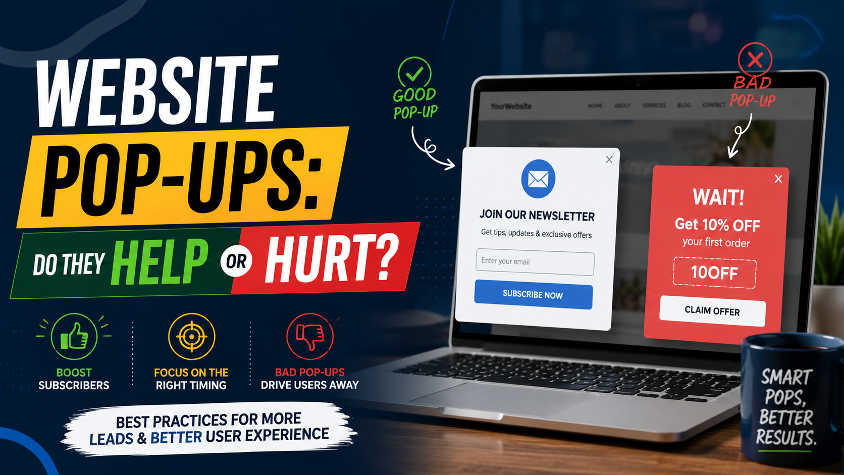
I have worked on websites where removing a pop-up made the site feel immediately better.
I have also seen pop-ups capture leads that probably would have disappeared otherwise.
That is what makes this topic frustrating.
Pop-ups are not automatically good.
They are not automatically bad either.
The result depends almost entirely on what you show, when you show it, who sees it, and how easy it is to dismiss.
The worst version is familiar.
You click a Google result.
Before you can read the headline, a giant box covers the screen:
WAIT! GET 15% OFF!
You close it.
A cookie banner is underneath.
Then a chat widget appears.
Then another notification asks whether you want browser alerts.
At that point, the website has asked you to do four things before you have even figured out whether the business sells what you need.
That is not conversion optimization.
That is interruption.
A good pop-up works differently.
It appears at a useful moment, gives the visitor something relevant, and does not prevent them from using the website.
That difference matters both for customers and search visibility. Google’s current guidance specifically recommends avoiding intrusive dialogs and interstitials that obscure the main content, and suggests smaller banners where possible. Google also notes that overly intrusive interstitials can frustrate users and make content harder for search engines to understand.
So, do website pop-ups help or hurt?
Both.
Here is how I decide whether one is worth using.
What Exactly Counts as a Pop-Up?
The term covers several different things.
You might have:
An email signup box.
A discount offer.
An exit-intent message.
A quote request form.
A cookie notice.
An age verification screen.
A newsletter prompt.
A promotional banner.
A full-screen interstitial.
A slide-in box.
A chat invitation.
These experiences are not equal.
A small slide-in offering a relevant guide is very different from a full-screen promotion that appears the instant someone lands on the page.
That is why I would never make a blanket rule such as:
“Never use pop-ups.”
The better question is:
Does this particular pop-up help the visitor at this particular moment?
Why Businesses Use Pop-Ups
The reason is simple.
They get attention.
A visitor might scroll past an email signup form in the footer without noticing it.
Put that same offer in the middle of the screen and they will notice.
That visibility can make pop-ups useful for:
Email capture.
Discount codes.
Free estimates.
Lead magnets.
Webinar registrations.
Product launches.
Limited promotions.
Abandoned-cart recovery.
Appointment booking.
But attention is not automatically positive.
You can get someone’s attention by shouting in their face too.
The real challenge is getting attention without damaging the experience.
A Pop-Up Works Best When the Offer Matches Intent
This is the biggest thing I look at.
Imagine someone is reading:
How Much Does a Kitchen Remodel Cost?
A useful pop-up might offer:
Download Our Kitchen Remodel Budget Checklist
That makes sense.
The visitor is already researching cost.
Now imagine the same visitor gets:
Subscribe to Our Weekly Company Newsletter!
Much weaker.
Or:
Need Commercial Roofing? Get a Quote!
Completely irrelevant.
Pop-ups perform better when they feel like a natural extension of what someone is already doing.
Good Pop-Up Example for a Local Contractor
Suppose someone is reading a roofing service page.
After they scroll through:
Roof types.
Project photos.
Reviews.
Process.
You could show:
Planning a Roof Replacement?
Get a free inspection and written estimate.
Request Inspection
That can be useful because the person has already shown interest.
I would not necessarily show it two seconds after arrival.
Timing changes everything.
Good Pop-Up Example for Ecommerce
A visitor has spent a few minutes browsing products.
A reasonable offer might be:
Get 10% Off Your First Order
Enter your email to receive the code.
That makes sense if the discount is real.
It gives the visitor something tangible.
But even here, timing matters.
Showing the offer before someone has seen a single product may be too aggressive.
Let them understand the store first.
Good Pop-Up Example for a B2B Website
Imagine someone has read 70% of a guide about improving Google Ads performance.
A relevant slide-in might say:
Want the PPC Audit Checklist?
Download the 18-point checklist we use when reviewing campaigns.
That feels much more useful than:
BOOK A SALES CALL NOW
The visitor may not be ready for a sales conversation.
Give them a smaller next step.
Timing Is Probably More Important Than Design
A beautifully designed pop-up at the wrong time is still irritating.
I generally think about timing in four ways.
Immediate Pop-Ups
These appear almost instantly after someone lands.
I use these very carefully.
The visitor has not yet had time to understand:
Who you are.
What you offer.
Whether the page is useful.
Asking for an email at that moment is basically saying:
“You don’t know us yet, but give us your contact information.”
Sometimes this can work for a very clear promotion.
For example:
“Free Shipping This Weekend.”
But for most service websites, I would give people time first.
Time-Delayed Pop-Ups
These appear after someone spends a certain amount of time on the page.
For example:
30 seconds.
45 seconds.
One minute.
This is better than instantly interrupting the page, but time alone is not a perfect signal.
Someone may leave the tab open while answering a message.
Thirty seconds later, the pop-up appears even though they have barely looked at the website.
I prefer combining timing with engagement when the software allows it.
Scroll-Based Pop-Ups
These appear after someone reads part of the page.
For example:
50% scroll.
70% scroll.
90% scroll.
I like this approach because the visitor has demonstrated some engagement.
If someone has read most of your article about local SEO, offering an SEO checklist becomes more reasonable.
They have already shown interest.
Exit-Intent Pop-Ups
Exit-intent systems try to detect when a visitor appears ready to leave.
On desktop, this often involves mouse movement toward the top of the browser.
The page might show:
Before You Go — Want a Free Quote?
These can work, but I would not expect miracles.
If someone is leaving because they dislike your offer, a pop-up may not change anything.
If they are leaving because they have not found the right next step, it might help.
The offer still matters more than the trigger.
Exit Intent Is Harder on Mobile
Phones do not have a mouse cursor.
That makes traditional exit-intent detection less straightforward.
Some tools use:
Back-button behavior.
Scroll patterns.
Inactivity.
Other behavioral signals.
Be careful with aggressive mobile implementations.
Mobile screens are small.
A poorly timed full-screen overlay can make the page almost impossible to use.
Google’s current search guidance specifically advises against promotional interstitials that obscure the full page and recommends less intrusive banners instead.
Mobile Is Where Pop-Ups Usually Go Wrong
A desktop pop-up might occupy 30% of the screen.
On mobile, the same box can occupy nearly everything.
Then you add:
Keyboard.
Cookie banner.
Chat bubble.
Sticky CTA.
Now the user can barely see the website.
Every pop-up should be tested on a real phone.
Check:
Is the close button visible?
Is it easy to tap?
Does the keyboard cover the form?
Can the visitor scroll?
Does the popup fit without horizontal movement?
Does it overlap the cookie banner?
Does it block the main CTA?
Can someone dismiss it immediately?
If any of those are difficult, redesign it.
The Close Button Is More Important Than You Think
I have seen pop-ups where the close icon is:
Tiny.
Low contrast.
Hidden outside the visible screen.
Placed in an unexpected corner.
That feels manipulative.
If a visitor does not want your offer, let them close it.
Do not make dismissal a game.
A visitor who closes the pop-up may still:
Call.
Submit a form.
Buy something.
Read another page.
A visitor who gets angry trying to close it may simply leave.
Never Hide the Close Button
Some marketers intentionally delay the close button for several seconds.
I rarely like this.
There may be special situations where a mandatory interstitial is needed, such as certain legal or age-verification requirements, but promotional pop-ups should generally remain easy to dismiss.
Google also distinguishes legally required interstitials from ordinary promotional interruptions in its guidance.
For marketing pop-ups, user control matters.
Do Not Show the Same Pop-Up Repeatedly
This is one of the fastest ways to make a website feel broken.
Visitor closes:
“Join Our Newsletter.”
Clicks another page.
Newsletter popup appears again.
Closes it.
Visits a service page.
It appears again.
By the fourth page, the visitor is fighting the website.
Use cookies, local storage, or the targeting controls in your pop-up platform to limit frequency appropriately.
For example:
Do not show again for seven days after dismissal.
Or:
Do not show again during this session.
The exact setting depends on the offer.
But repeated interruption is rarely a good strategy.
Stop Showing It After Someone Converts
This sounds obvious.
It still gets missed.
Someone enters their email.
Two pages later:
JOIN OUR EMAIL LIST!
That tells the customer your systems are not connected.
Once someone completes the action, suppress that specific offer.
The same applies to:
Downloaded guide.
Booked demo.
Requested quote.
Created account.
Purchased product.
Do not keep asking for something they already gave you.
The Offer Matters More Than the Pop-Up Technology
Businesses sometimes spend a lot of time comparing:
OptinMonster.
Popup Maker.
Elementor Popups.
Klaviyo.
Privy.
HubSpot.
ConvertFlow.
Mailchimp.
Other tools.
The tool matters.
But the offer matters more.
A perfect targeting engine showing:
“Subscribe to our newsletter”
may still underperform.
A simple box offering:
“Download the 2026 Commercial Landscaping Cost Guide”
may do much better because the offer is useful.
Start with:
What would the visitor actually want?
Then choose software.
Discounts Can Work, but Be Careful
Ecommerce pop-ups frequently use discounts.
For example:
10% Off Your First Order
This can be effective.
But discounts have trade-offs.
If every visitor immediately receives a discount, you may train customers to wait for one.
You also reduce margin.
And if the pop-up appears before the visitor even sees the product, you are discounting before creating value.
Test the economics, not only email capture.
Ask:
How many signups?
How many purchases?
Average order value?
Profit after discount?
Repeat purchase rate?
A high popup conversion rate does not automatically mean the promotion is profitable.
Lead Magnets Work Well for Research-Heavy Services
For B2B and high-ticket services, a lead magnet may be better than a discount.
Examples:
Checklist.
Template.
Calculator.
Pricing guide.
Planning worksheet.
Comparison guide.
Audit.
Industry benchmark.
Imagine an architecture company.
A visitor is reading about home renovation.
Pop-up:
Planning a Renovation?
Download our pre-design planning checklist.
That feels relevant.
It does not force the visitor into:
“Book a Consultation”
before they are ready.
Quote Pop-Ups Can Work for High-Intent Pages
For local service businesses, the CTA itself can open a popup.
For example:
Button:
Get a Free Estimate
Click.
A short form appears.
This is different from an unsolicited popup.
The user asked for it.
I generally like these because they preserve the page while making conversion quick.
The visitor does not need to load another page.
Just make sure:
Form loads quickly.
Close button works.
Mobile experience is clean.
Confirmation is clear.
Form submission is tracked.
Click-Triggered Pop-Ups Are Usually Less Annoying
This is an important distinction.
If I click:
“See Pricing”
and a pricing modal opens, that is expected.
If I am reading a paragraph and a pricing modal appears without asking, that is interruption.
Click-triggered dialogs can be very useful for:
Forms.
Calendars.
Product details.
Image galleries.
Video demos.
Pricing.
Downloads.
The user initiated the action.
That usually creates a much better experience.
Full-Screen Pop-Ups Need Extra Caution
There are situations where full-screen experiences make sense.
For example:
Age verification.
Certain legal requirements.
Login access.
A deliberately triggered application flow.
But for normal promotional messages, full-screen interruption is usually too aggressive.
Google’s current documentation specifically warns against obscuring the entire page with promotional interstitials and suggests banners that use only a small portion of the screen instead.
If you can communicate the same offer with a smaller dialog or banner, I would usually choose that.
Slide-Ins Are Often a Good Middle Ground
A slide-in appears from the bottom or side of the page without completely blocking the content.
For example:
Want the Free SEO Checklist?
Download it here.
The visitor can still read.
They can ignore it.
They can close it.
That is often a better compromise.
Especially for blog content.
Announcement Bars Can Be Better Than Pop-Ups
Sometimes you do not need a popup at all.
Suppose you want to announce:
Free shipping.
New location.
Holiday hours.
Limited promotion.
Upcoming webinar.
A thin announcement bar at the top of the page may work perfectly.
It gives the message visibility without blocking content.
This matches Google’s recommendation to prefer smaller banners over full-page promotional interstitials where possible.
Simple solutions are often better.
Do Not Use Pop-Ups to Fix Weak Website Messaging
This is important.
If visitors cannot understand your offer, a popup will not solve it.
If nobody can find your quote button, improve the CTA.
If your pricing is confusing, fix the pricing page.
If service areas are unclear, show them.
If people keep asking:
“Do you serve commercial properties?”
put that information on the page.
Pop-ups should support a good website.
They should not compensate for a bad one.
Pop-Ups Can Reveal What Visitors Want
There is a useful side effect.
Suppose you test two offers.
Offer A:
“Join Our Newsletter.”
Offer B:
“Download Our Local SEO Checklist.”
Offer B gets five times more signups.
That tells you something.
People want practical SEO help.
You can use that insight for:
Content.
Email.
Services.
Landing pages.
Sales materials.
Pop-ups can become small market-research tools.
Use Different Pop-Ups on Different Pages
A generic site-wide popup is easy.
It is not always best.
Imagine a digital agency.
SEO page:
Download Our Technical SEO Checklist
Google Ads page:
Get the PPC Audit Template
Web Design page:
Download the Website Planning Worksheet
Each offer matches the page.
That is more work.
It is also much more relevant.
Do Not Over-Segment Too Early
There is an opposite problem too.
Businesses build:
17 pop-up campaigns.
26 audience rules.
Different offers by device.
Different offers by traffic source.
Different exit conditions.
Now nobody knows what is happening.
Start simple.
One useful offer.
One important audience.
One trigger.
Measure it.
Then expand.
Paid Traffic Needs Extra Care
If you are paying for a click, do not immediately cover the landing page with another message.
Imagine a Google Ad says:
Get a Free Roofing Estimate
Visitor clicks.
Landing page loads.
Immediately:
Join Our Newsletter!
Why?
The visitor already came with strong intent.
Let them complete the action they came for.
Paid landing pages should generally stay focused.
If you use a popup, it should reinforce the same offer.
For example:
Exit popup:
Still Comparing Roofing Companies?
Get a written roof inspection estimate before you leave.
At least the message stays aligned.
SEO Traffic Needs Content Access
Someone clicks a search result because they want information.
Give them the information.
Google’s latest guidance says intrusive interstitials can make content harder for users and search engines to access, and recommends keeping the main content readily available.
That means I would be particularly careful with immediate promotional overlays on pages receiving organic search traffic.
Let the page earn attention before asking for something.
Pop-Ups Can Affect Trust
Picture two websites.
Website A:
Loads article.
You start reading.
After a while, a small slide-in offers a relevant guide.
Website B:
Full-screen email capture immediately.
Close.
Push-notification request.
Close.
Chat opens.
Close.
Discount wheel starts spinning.
Which business feels more professional?
Usually Website A.
Trust is part of conversion.
Do not sacrifice it for one more email address.
Spin-to-Win Pop-Ups Are Not Right for Every Brand
Gamified pop-ups can work in ecommerce.
Examples:
Spin wheel.
Scratch card.
Mystery discount.
They can make sense for:
Fashion.
Beauty.
Consumer products.
Promotional brands.
They may feel completely wrong on:
Law firm.
Financial advisory site.
Architectural studio.
Medical practice.
Luxury consultant.
B2B software company.
Conversion tactics should match brand expectations.
Watch Performance
Pop-up tools often add JavaScript and third-party requests.
One script may not matter much.
But your site may already have:
Analytics.
Meta Pixel.
Chat.
Heatmaps.
Cookie management.
Review widgets.
Booking tools.
A/B testing.
Marketing automation.
Then you add another platform.
Check performance.
Use PageSpeed Insights before and after major additions.
If your popup software noticeably affects important landing pages, investigate:
Delayed loading.
Page-specific loading.
Removing unused functionality.
Using a lighter implementation.
A lead-capture tool should not make the entire website harder to use.
Accessibility Matters Too
A pop-up should not trap people.
Think about:
Keyboard navigation.
Visible focus.
Readable contrast.
Close button.
Screen readers.
Logical tab order.
Background behavior.
A visitor should be able to understand and dismiss the dialog without difficulty.
Accessibility is not separate from usability.
Good accessible implementation usually makes the experience better for everyone.
Do Not Put Important Content Only Inside a Pop-Up
Suppose your pricing exists only inside a popup.
Or your contact form can only be accessed through a JavaScript modal.
What happens if:
Script fails?
User blocks scripts?
Popup breaks on mobile?
Search engine cannot access the content properly?
Important information should generally have a stable page or accessible alternative.
Popups are interfaces.
They should not become single points of failure.
Measure More Than Signup Rate
This is one of the biggest mistakes.
You launch a popup.
Before:
100 email subscribers per month.
After:
Success?
Maybe.
Now check:
How many opened emails?
How many became leads?
How many purchased?
How many immediately unsubscribed?
How many visitors abandoned the page?
Did conversion elsewhere fall?
Did mobile engagement worsen?
A popup might increase email signups while hurting overall sales.
Look at the whole funnel.
Track Pop-Up Assisted Conversions
Sometimes the popup does not create the sale immediately.
Someone downloads:
Kitchen renovation guide.
Receives emails.
Returns two weeks later.
Requests a quote.
That popup helped.
If possible, connect:
Popup signup.
CRM contact.
Lead status.
Customer.
Revenue.
Tools such as HubSpot, Klaviyo, Mailchimp, ActiveCampaign, or other marketing platforms can help depending on your business.
You do not need perfect attribution.
But try to understand whether captured leads have actual value.
Run A/B Tests When Traffic Supports It
You can test:
Timing.
Offer.
Headline.
Form length.
Design.
Trigger.
Placement.
For example:
Version A
Show after 10 seconds.
Version B
Show after 60% scroll.
Which creates better leads?
Or:
Version A
“Join Our Newsletter.”
Version B
“Get the Free Local SEO Checklist.”
Do not assume the highest signup rate wins.
Look at:
Lead quality.
Sales.
Engagement.
Unsubscribes.
Revenue.
Do Not Test Tiny Things Before Fixing Big Problems
Businesses love testing:
Green button.
Blue button.
Rounded corners.
Square corners.
Meanwhile, the popup says:
“Join Our Newsletter.”
Nobody wants it.
Fix the offer first.
Then:
Timing.
Targeting.
Friction.
Only after that would I spend much energy on small design details.
Common Website Pop-Up Mistakes
Showing It Immediately
The visitor has not even seen the site.
Covering the Whole Mobile Screen
The content becomes inaccessible.
Tiny Close Button
The experience feels manipulative.
Showing It on Every Page
Visitors become frustrated.
Reappearing After Dismissal
The website ignores the visitor’s choice.
Showing It After Conversion
Bad targeting.
Asking for Too Much
A newsletter signup does not need eight fields.
Irrelevant Offers
The popup has nothing to do with the page.
Fake Urgency
Trust suffers.
Too Many Pop-Ups
Newsletter, chat, discount, cookies, notifications all compete.
No Performance Testing
Another third-party script quietly slows the site.
Measuring Only Email Captures
Business outcomes get ignored.
A Better Pop-Up Setup for a Local Service Business
Suppose you run a landscaping company.
I would probably not show a newsletter popup immediately.
Instead, on a service page after meaningful engagement:
Planning a Landscaping Project?
Tell us what you’re working on and we’ll help you figure out the next step.
Request a Free Estimate
Short form:
Name.
Phone or email.
Service needed.
That is relevant.
Or use a click-triggered form when the visitor presses:
“Request Estimate.”
Even cleaner.
A Better Setup for Ecommerce
You might test:
Get 10% Off Your First Order
Email field.
Button:
“Send My Code.”
Show it after:
Product browsing.
Meaningful scroll.
Or a short delay.
Not necessarily immediately.
After signup:
Suppress the popup.
Deliver the code instantly.
Track whether those subscribers actually purchase.
A Better Setup for a B2B Website
Suppose you provide accounting software.
On an article about monthly financial reporting:
Free Monthly Close Checklist
Download the exact checklist used to organize month-end reporting.
Email.
Company optional.
That creates a relevant lead.
I would probably not interrupt every blog reader with:
“BOOK A DEMO!”
The lead magnet matches their stage better.
A Better Setup for a Restaurant
A restaurant may not need traditional popups at all.
Useful actions are usually:
View Menu.
Reserve.
Order Online.
Directions.
Call.
An intrusive newsletter popup may simply slow the customer down.
An announcement bar saying:
“Valentine’s Day reservations now open”
could be much more useful.
Always match the tactic to the business.
A Practical Pop-Up Checklist
Before publishing a popup, I would ask:
Offer
Is it genuinely useful?
Relevance
Does it match the page?
Timing
Has the visitor had time to engage?
Size
Does it block too much content?
Mobile
Does it work comfortably on a phone?
Dismissal
Can someone close it immediately?
Frequency
Will it stop appearing after dismissal?
Conversion
Does it stop showing after the visitor completes the action?
Performance
Does the script noticeably slow the site?
Tracking
Can we measure what happens after signup?
Brand
Does this experience fit the business?
If several answers are no, I would not launch it yet.
So, Do Website Pop-Ups Help or Hurt?
A good pop-up can help.
It can:
Capture an email.
Generate a quote request.
Offer a useful resource.
Recover a hesitant shopper.
Promote an important campaign.
Make a relevant next step easier.
A bad pop-up can:
Annoy visitors.
Cover important content.
Make mobile frustrating.
Slow the website.
Reduce trust.
Distract people from the action they were already trying to take.
Create a poor search experience.
Google’s current guidance is straightforward on the usability side: avoid intrusive promotional interstitials that obscure the main content, keep content accessible, and prefer less intrusive approaches such as smaller banners when possible.
That is also good conversion advice.
The best pop-up does not feel like something the visitor needs to escape from.
It feels like:
“That’s actually useful.”
If I were deciding whether to add one, I would start with three questions:
What does this visitor want right now?
Does the popup make that easier?
Would I personally find this annoying if I landed here from Google on my phone?
That last question catches a surprising number of bad ideas.
Pop-ups are tools.
Use them when they improve the journey.
Skip them when they only exist because someone told you every website needs an email capture box.
The goal is not to get as many people as possible to interact with the popup.
The goal is to help more of the right visitors become customers without making everyone else fight their way through the website.