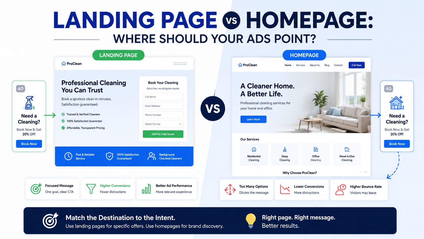
One of the easiest ways to waste money on paid ads is surprisingly simple:
Send every click to the homepage.
I have seen this happen with businesses that had decent ads, good offers, and enough budget to generate traffic.
The ad would say:
“Emergency Roof Repair in Dallas”
The customer would click.
Then the homepage would open with:
“Building Better Homes Since 1998.”
Below that:
Kitchen remodeling.
New construction.
Commercial projects.
About us.
Careers.
Recent blog posts.
Roofing was somewhere halfway down the page.
The ad did its job.
It attracted someone with a very specific problem.
The website immediately made them search for the solution again.
That disconnect is where a lot of paid traffic gets lost.
At the same time, I would not say that every ad must always go to a dedicated landing page.
Sometimes the homepage genuinely makes sense.
The real question is:
Which page gives this visitor the shortest, clearest path from the promise in the ad to the action you want them to take?
That is how I decide between a landing page and a homepage.
First, Understand the Difference
A homepage has a broad job.
It needs to introduce the business to different types of visitors.
Someone may be:
Looking for services.
Researching the company.
Trying to find contact information.
Checking careers.
Reading reviews.
Looking for a specific location.
Exploring several solutions.
That is why homepages usually contain multiple navigation links and several sections.
A landing page has a much narrower job.
It is typically created around:
One audience.
One offer.
One traffic source.
One problem.
One main conversion action.
For example:
Homepage:
“ABC Dental Group”
Landing page:
“Invisalign Consultations in Austin — Book Your Free Assessment”
The homepage represents the whole business.
The landing page represents one conversation.
That difference matters when you are paying for every click.
Paid Traffic Is Different From Normal Website Traffic
Someone browsing your website organically may be happy to explore.
An ad visitor usually arrives with more context.
They clicked because something specific caught their attention.
For example:
“Bookkeeping for Ecommerce Businesses”
“Same-Day AC Repair”
“Commercial Cleaning Quote”
“Free SaaS Demo”
“Kitchen Remodeling Consultation”
Your landing page should continue that exact conversation.
If the ad says:
“Free Roof Inspection in Phoenix”
and the page headline says:
“Welcome to Smith Construction”
you have created friction.
The visitor now has to figure out:
Do they actually offer roof inspections?
Is it free?
Do they serve Phoenix?
Where do I book?
Every unanswered question weakens momentum.
This Is Why Landing Pages Often Work Better for Ads
A good landing page removes choices that are not relevant to the campaign.
Imagine someone clicks an ad for:
“PPC Management for Law Firms.”
A focused landing page might contain:
Headline:
“Google Ads Management for Law Firms”
Short explanation.
Law-firm-specific results.
Relevant case study.
How the service works.
Testimonials from legal clients.
CTA:
“Request an Ad Account Review.”
That is a very coherent experience.
Now compare it with sending the same person to an agency homepage offering:
SEO.
Web design.
Social media.
Email marketing.
Ecommerce.
PPC.
Branding.
The visitor came for PPC.
Why make them navigate through everything else?
Message Match Matters More Than Most Design Tricks
One of the first things I check on an ad landing page is what marketers often call message match.
That simply means:
Does the page match what the ad promised?
For example:
Ad
“Commercial Cleaning for Medical Offices in Houston”
Good Landing Page Headline
“Reliable Commercial Cleaning for Houston Medical Offices”
Strong match.
Weak Homepage Headline
“Cleaning Solutions You Can Trust”
Not terrible.
But weaker.
The visitor has to make the connection themselves.
Your landing page should make them think:
“Yes, this is exactly what I clicked for.”
Your Ad Already Did Some of the Selling
This is something businesses forget.
A visitor did not randomly arrive.
The ad already introduced an idea.
Maybe they searched:
“accountant for Amazon sellers”
and saw:
“Accounting for Amazon Sellers — Monthly Bookkeeping & Tax Support”
By clicking, the person showed interest in that specific offer.
You do not need to restart the conversation at:
“Welcome to our accounting firm.”
Continue from where the ad left off.
Talk about:
Amazon sellers.
Ecommerce bookkeeping.
Inventory accounting.
Sales tax considerations.
Financial reporting.
The page should feel like the natural next sentence after the ad.
When I Would Use a Landing Page
There are several situations where I would strongly prefer a dedicated landing page.
1. You Are Advertising One Specific Service
Suppose a company offers:
Roof replacement.
Roof repair.
Gutter installation.
Siding.
Windows.
The campaign is specifically advertising:
Emergency Roof Repair.
Send that traffic to an emergency roof repair page.
Do not make emergency customers browse through five services.
2. You Have a Specific Offer
Examples:
Free consultation.
20% off first service.
Free inspection.
Free trial.
Demo.
Download.
Special financing.
The landing page can explain the exact offer without cluttering the main website.
3. You Are Targeting a Specific Audience
For example:
Accounting for dentists.
Web design for law firms.
Recruiting for SaaS companies.
Commercial landscaping for property managers.
The page can speak directly to that audience.
4. You Are Targeting a Specific Location
If the ad says:
“AC Repair in Scottsdale”
the page should make Scottsdale obvious.
That gives the visitor confidence that the business actually serves them.
5. You Want to Measure Campaign Performance Clearly
Dedicated landing pages make it easier to understand how specific traffic sources behave.
You can track:
Visitors.
Form submissions.
Calls.
Bookings.
Qualified leads.
Sales.
You have less confusion about what the visitor was trying to do.
When a Homepage Can Still Make Sense
There are situations where sending ads to the homepage is completely reasonable.
I would not create a landing page simply because “landing pages convert better” if the campaign itself is broad.
Scenario 1: Branded Search
Someone searches:
“ABC Landscaping”
They are clearly looking for the business.
A homepage is often the right destination.
They may want:
Phone number.
Services.
Locations.
Reviews.
About information.
The whole company is relevant.
Scenario 2: Broad Brand Awareness
Suppose you are running awareness ads introducing the entire company rather than promoting one product.
The homepage may be appropriate because the visitor needs an overview.
Scenario 3: You Only Sell One Main Service
Imagine a small company does one thing:
Residential solar panel cleaning.
Its homepage already contains:
Clear service explanation.
Pricing.
Reviews.
Service areas.
Quote form.
If the homepage is effectively already a focused landing page, building another almost identical page may not add much.
Scenario 4: The Homepage Is Already Highly Focused
Some service business homepages are essentially long-form sales pages.
They have one audience.
One main service.
One CTA.
In that case, the distinction between homepage and landing page becomes less important.
Focus on the experience rather than the URL.
Think About Search Intent
Google Ads becomes much easier to understand when you think in terms of what the person actually searched.
Consider these two searches:
“roofing companies”
and:
“emergency roof leak repair near me”
The second person has much stronger and more specific intent.
I would give them a much more specific page.
A good rule:
The more specific the search or ad, the more specific the destination page should usually be.
Broad query?
Broader page may work.
Specific query?
Specific landing page.
Facebook and Instagram Ads Need the Same Logic
This is not only a Google Ads problem.
Social ads often fail for the same reason.
Imagine someone sees a Meta ad saying:
“Download Our Free Restaurant Marketing Checklist.”
They click.
Then they land on the agency homepage.
Now they have to search for the checklist.
That is terrible.
The landing page should immediately say:
“Free Restaurant Marketing Checklist”
with:
A short explanation.
What is included.
Who it is for.
Simple form.
Download button.
That is it.
Do not make people hunt for the offer they already clicked.
Landing Pages Should Have Fewer Distractions
This is one of the main practical differences.
A normal homepage may include navigation to:
About.
Blog.
Careers.
Services.
Locations.
Shop.
Contact.
A campaign landing page may not need all of that.
Every additional option creates another possible exit.
If someone came to request a commercial cleaning quote, you probably do not need to encourage them to read:
“Our Founder’s Story.”
That content may be useful somewhere else.
Not necessarily right now.
Do Not Remove Every Navigation Element Blindly
There is a popular conversion idea that landing pages should have absolutely no navigation.
Sometimes that works.
Sometimes it hurts trust.
For a high-ticket service, visitors may want to check:
About.
Case studies.
Privacy policy.
Main website.
Company information.
I do not believe in blindly removing everything.
Instead, ask:
Does this link help the buying decision or distract from it?
Keep what builds confidence.
Remove what sends the visitor somewhere irrelevant.
Your Landing Page Should Have One Primary CTA
That does not mean only one button.
It means one main action.
For example:
“Request a Quote.”
You may repeat that button several times.
At the top.
After benefits.
After testimonials.
Near the bottom.
But the action stays consistent.
Avoid:
Request a Quote.
Download Brochure.
Join Newsletter.
Watch Webinar.
Follow Instagram.
Read Blog.
Book Demo.
Call Sales.
all competing on the same campaign page.
Decide what success means.
A Good Landing Page Structure
I usually keep the page fairly simple.
1. Headline
Match the ad.
Example:
“Commercial Landscaping for Property Managers in Phoenix”
2. Supporting Copy
Explain the outcome.
“Reliable landscape maintenance across multiple properties with one point of contact.”
3. CTA
“Request a Property Quote”
4. Trust
Reviews, client logos, certifications, or a relevant result.
5. Problem
Show that you understand what the customer deals with.
6. Solution
Explain how the service solves it.
7. Proof
Case studies, photos, testimonials.
8. Process
Show what happens after contacting you.
9. FAQ
Remove common objections.
10. Final CTA
Give them another easy chance to act.
You can build excellent pages without making them complicated.
The Hero Section Matters More Than People Think
Paid visitors make decisions quickly.
The top of the page should answer:
Am I in the right place?
Is this for me?
What is being offered?
What should I do?
Imagine an ad for:
“Google Ads for Dental Practices.”
The landing page opens with:
“Scale Smarter With Data-Driven Growth Solutions.”
That is weak.
Try:
“Google Ads Management for Dental Practices That Need More Qualified Patient Enquiries”
Then:
“We manage search campaigns, landing pages, and conversion tracking for dental practices.”
CTA:
“Request an Ads Review.”
Much clearer.
Use the Same Language as the Ad
If your ad says:
“Free Estimate”
do not suddenly call it:
“Project Discovery Consultation”
on the page.
If your ad says:
“Book a Demo”
keep that language.
Consistency reduces doubt.
The visitor should not wonder whether they clicked the wrong thing.
Landing Page Forms Should Match Buying Intent
Do not use the same giant form for every campaign.
A low-commitment ad might ask for:
Name.
Email.
Phone.
A high-ticket B2B campaign might reasonably ask:
Name.
Work email.
Company.
Company size.
Short project details.
The form should collect enough information for the next step without making the visitor feel like they are applying for a mortgage.
Multi-Step Forms Can Help With Complex Leads
For complicated services, one huge form can look intimidating.
You can break it into steps.
For example:
Step 1
What service do you need?
Step 2
Where is the property?
Step 3
When do you need the work?
Step 4
Name and contact information.
This can feel easier because each step requires less effort.
But test it.
Multi-step forms are not automatically better.
Phone Calls May Be the Better CTA for Urgent Services
Not every landing page should push forms.
For services such as:
Emergency plumbing.
HVAC repair.
Towing.
Locksmith services.
Water damage restoration.
A phone call may be the most natural conversion.
Put the number prominently.
Make it clickable on mobile.
Consider a sticky call button if it improves usability.
Do not force an emergency customer to complete a 12-field form.
Track Calls, Not Just Forms
This is a common measurement mistake.
A campaign generates:
20 form leads.
Great.
But another 35 people called.
If call tracking is not configured, the campaign looks much weaker than it actually is.
Depending on the business, use:
Google Ads call conversions.
Call tracking platforms.
CRM call records.
Dynamic number insertion where appropriate.
The goal is to understand the full lead flow.
Connect the Landing Page to Your CRM
The landing page should not become a separate island.
A good setup might look like:
Visitor clicks ad.
Landing page loads.
Form submitted.
Lead goes into CRM.
Sales team gets notification.
Lead source is recorded.
Follow-up happens.
Opportunity status changes.
Sale closes.
Revenue is attributed back to the campaign.
You can build this with tools such as:
HubSpot.
Pipedrive.
Salesforce.
Close.
Zoho CRM.
Zapier.
Make.
The exact stack does not matter as much as tracking the journey.
Use GA4 and Google Ads Conversion Tracking
If you are spending real money on ads, you should know which campaigns create meaningful actions.
Track:
Form submission.
Phone call.
Booked consultation.
Checkout.
Demo request.
Qualified lead where possible.
Do not optimize only for:
Page views.
Clicks.
Time on site.
Those metrics can provide context.
They are not the business result.
Landing Page Speed Matters More When You Pay for Every Click
A slow homepage is annoying.
A slow paid landing page is annoying and expensive.
You paid to get the person there.
Then they left before the page became usable.
Use tools such as Google PageSpeed Insights to identify:
Large images.
Slow scripts.
Heavy video.
Unused code.
Third-party widgets.
Poor mobile performance.
Do not destroy the design trying to chase a perfect score.
Just make the page fast enough that it does not become an obstacle.
Mobile Is Not an Afterthought
Always open the landing page on a real phone.
Check:
Does the headline fit?
Is the CTA visible?
Is the form easy?
Can people tap the phone number?
Does the page shift while loading?
Are popups blocking anything?
Do testimonials look readable?
Paid traffic can be heavily mobile depending on the campaign.
A page designed only for desktop can waste a large portion of the budget.
Trust Signals Should Match the Campaign
Generic trust is better than none.
Relevant trust is better.
Imagine you advertise:
“Accounting for Construction Companies.”
Which proof is stronger?
“We work with 300 businesses.”
Or:
“Helping construction firms track job costs, cash flow, and monthly reporting.”
Even better:
A testimonial from a construction client.
Same principle with:
Dentists.
Law firms.
Roofers.
SaaS companies.
Property managers.
Industry relevance reduces uncertainty.
Case Studies Work Extremely Well on High-Ticket Landing Pages
If the customer needs to spend thousands of dollars, a headline alone is not enough.
Show what happened for someone similar.
A good case study can be short.
Problem: Local roofing company was paying for clicks but getting very few quote requests.
Change: Built dedicated roofing landing pages, simplified the mobile form, and improved conversion tracking.
Outcome: More qualified inquiries from the same campaign budget.
If you have exact verified numbers, include them.
If you do not, do not invent them.
Credibility matters more than dramatic percentages.
Do Not Build One Landing Page for 30 Completely Different Keywords
This is another common shortcut.
A company has one page:
“Digital Marketing Services.”
Then it runs ads for:
SEO.
Google Ads.
Facebook Ads.
Web Design.
Local SEO.
Ecommerce Marketing.
Every ad goes to the same page.
That weakens relevance.
You do not necessarily need 30 pages.
But you may need separate pages for major intent groups.
For example:
Google Ads Management.
SEO Services.
Web Design.
Local SEO.
That creates much better message alignment.
The Same Applies to Locations
Suppose you advertise HVAC services in:
Dallas.
Fort Worth.
Plano.
Frisco.
If the campaign is location-specific, the page should reassure the visitor that the service is genuinely available there.
Do not create fake location pages simply by replacing city names automatically.
Make them useful.
Include:
Service area.
Local proof.
Relevant reviews.
Actual availability.
Contact details.
Homepage Traffic Is Harder to Diagnose
This is one reason I like landing pages for paid traffic.
If you send 10 campaigns to one homepage and conversions drop, troubleshooting becomes harder.
Was it:
The campaign?
The audience?
The offer?
The homepage?
The CTA?
The service mix?
A dedicated landing page isolates the experience.
You can say:
“This campaign sent 800 visitors to this page and produced 32 qualified inquiries.”
That is much easier to analyze.
Do Not Judge the Page Only by Conversion Rate
Conversion rate matters.
But lead quality matters too.
Suppose:
Landing Page A:
10% form conversion rate.
100 leads.
3 customers.
Landing Page B:
5% conversion rate.
50 leads.
12 customers.
Which page is better?
Probably Page B.
The first page may be generating low-quality inquiries through an overly easy offer.
Track:
Leads.
Qualified leads.
Meetings.
Quotes.
Sales.
Revenue.
That is how you understand whether the landing page actually works.
Cheap Leads Can Be Expensive
This is another lesson that takes time to appreciate.
Campaign A generates leads for $20 each.
Campaign B generates leads for $60.
At first glance, Campaign A looks much better.
Then you check sales.
Campaign A:
100 leads.
2 customers.
Campaign B:
40 leads.
10 customers.
Suddenly the $60 lead is much more valuable.
Do not optimize a landing page purely for maximum form submissions.
Optimize for useful business outcomes.
A/B Testing Can Help, but Fix Obvious Problems First
A/B testing can compare:
Headlines.
Offers.
Forms.
CTAs.
Social proof.
Layouts.
But sometimes the problem is obvious.
If the page says:
“Welcome to Our Website”
you probably do not need a six-week experiment to test whether a clearer headline helps.
Fix major usability and relevance problems first.
Test smaller choices once the fundamentals are working.
Things I Would Test First
If a landing page has enough traffic, I would usually prioritize major factors.
For example:
Test 1: Headline
Generic vs service-specific.
Test 2: Offer
“Contact Us” vs “Get a Free Estimate.”
Test 3: Form Length
Long form vs shorter form.
Test 4: Proof
Generic testimonial vs industry-specific case study.
Test 5: CTA Placement
Only at bottom vs repeated logically.
These changes can affect actual buying behavior.
Button color would be much lower on my list.
When Sending Ads to the Homepage Goes Wrong
I usually see one of these problems.
The Homepage Is Too Broad
The ad promotes one service.
Homepage promotes ten.
The Message Changes
Ad says one thing.
Homepage says something unrelated.
The CTA Is Hard to Find
The visitor is interested but does not know what to do.
Too Many Navigation Options
People leave the buying path.
No Campaign-Specific Proof
The website feels generic.
Poor Mobile Experience
Visitors bounce.
The Page Does Not Answer the Search
The person must start searching again.
When Landing Pages Go Wrong
Landing pages can fail too.
They Look Untrustworthy
Removing too much company information can make the page feel like a random sales funnel.
They Overpromise
“Guaranteed 10X Results!”
That damages credibility.
They Are Too Aggressive
Countdown timers, popups, and fake scarcity everywhere.
The Form Is Too Long
The visitor gives up.
The Page Is Too Thin
There is not enough information to support an expensive decision.
No Connection to the Real Business
Visitors cannot verify who is behind the page.
A landing page should be focused.
It should not feel fake.
A Practical Decision Framework
If I were deciding where an ad should point, I would ask five questions.
1. How Specific Is the Ad?
Specific ad = usually specific page.
2. Does the Homepage Match the Offer?
If yes, it may work.
If no, build a landing page.
3. How Valuable Is the Traffic?
If you are paying $50 per click, I would take the post-click experience very seriously.
4. Does the Visitor Need More Context?
High-ticket services need stronger proof and explanation.
5. Can We Measure the Outcome Clearly?
If not, improve tracking before increasing spend.
Example: Local Roofing Company
Ad
“Roof Repair in Austin — Same-Week Inspections”
Bad Destination
Homepage discussing:
New roofs.
Commercial roofs.
Gutters.
Siding.
Company history.
Better Destination
Roof Repair in Austin
Same-week availability.
Common repair types.
Local projects.
Reviews.
Inspection process.
Phone CTA.
Quote form.
FAQ.
The visitor gets exactly what they expected.
Example: Marketing Agency
Ad
“Local SEO for Dental Practices”
Bad Destination
Agency homepage offering:
SEO.
PPC.
Social.
Web development.
Branding.
Better Destination
“Local SEO for Multi-Location Dental Practices”
Talk about:
Google Business Profile.
Local rankings.
Location pages.
Review strategy.
Tracking.
Dental case study.
CTA:
“Request a Local Search Review.”
Much stronger.
Example: SaaS
Ad
“Automate Vendor Onboarding”
Homepage
Explains the entire platform.
Could work if vendor onboarding is the core product.
But if the software has ten major use cases, a focused landing page may be better.
Show:
Vendor onboarding problem.
Workflow.
Screenshots.
Integration options.
Proof.
Demo CTA.
That makes the buying journey easier.
Example: Ecommerce
Suppose you advertise:
“20% Off Waterproof Hiking Jackets.”
Do not send the visitor to the homepage showing:
Shoes.
Tents.
Backpacks.
Camping cookware.
Send them to:
Waterproof hiking jackets.
Or the specific promotional collection.
The same principle applies.
Continue the intention created by the ad.
What I Would Do Before Launching Any Paid Campaign
I would run through this checklist.
Step 1: Read the Ad
What exactly are we promising?
Step 2: Open the Destination Page
Does the headline reflect that promise?
Step 3: Check the CTA
Is there one obvious next step?
Step 4: Check Trust
Why should someone believe us?
Step 5: Test Mobile
Can I convert comfortably?
Step 6: Check Speed
Does it load well?
Step 7: Submit the Form
Does it actually work?
Step 8: Check Tracking
Is the conversion recorded?
Step 9: Check Lead Routing
Who receives the inquiry?
Step 10: Check Sales Follow-Up
What happens after the lead arrives?
That last step gets ignored surprisingly often.
A perfect landing page cannot fix a sales team that responds three days later.
So, Landing Page or Homepage?
If the campaign is specific, I would usually choose a dedicated landing page.
If the visitor clicked an ad for:
A specific service.
A specific product.
A specific location.
A specific audience.
A specific promotion.
A specific problem.
then the destination should normally stay just as specific.
A homepage makes more sense when:
The ad is brand-focused.
The visitor is searching specifically for your company.
You offer one core service.
The homepage is already highly focused.
Or the campaign genuinely needs to introduce the entire business.
The important thing is not whether the URL contains /landing-page/.
The important thing is whether the page continues the promise made by the ad.
That is where businesses often get this wrong.
They spend hours optimizing:
Keywords.
Audiences.
Bids.
Ad copy.
Images.
Budgets.
Then treat the destination page as an afterthought.
But the click is only the handoff.
The ad gets someone to the door.
The page still has to convince them to walk inside.
If you are paying for traffic, make that handoff as smooth as possible.
Match the message.
Remove unnecessary distractions.
Show real proof.
Make the next step obvious.
Track what happens after the form.
And judge the page by customers and revenue, not only clicks and conversion percentages.
That is usually the difference between paying for traffic and actually turning paid traffic into business.