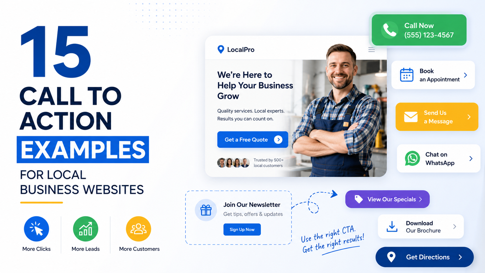
I have seen local business websites lose good leads for one very simple reason:
The visitor did not know what to do next.
The page looked fine.
The service was clearly explained.
There were reviews, photos, and contact details.
Then the main button said:
“Learn More.”
Learn more about what?
If I am standing in my kitchen with a leaking pipe, I probably do not want to “learn more.”
I want to know:
Can you fix this?
Do you serve my area?
How quickly can you come?
What will it cost?
How do I contact you?
That is why a call to action, or CTA, matters much more than people think.
A CTA is not just a button.
It is the moment where the website tells the visitor what the next step should be.
For a local business, that might mean:
Calling.
Requesting a quote.
Booking an appointment.
Checking availability.
Scheduling an inspection.
Sending project details.
The best CTA depends on the service and what the customer is trying to do.
Here are 15 call to action examples I would actually consider using on local business websites, along with where each one works best.
1. Request a Free Estimate
This is probably one of the most useful CTAs for local service businesses.
It works well for:
Roofing.
Landscaping.
Painting.
Fencing.
Concrete.
Remodeling.
Tree services.
Cleaning.
Flooring.
The reason it works is simple.
The visitor already knows they probably need the service.
Their next question is usually:
“How much will this cost?”
“Request a Free Estimate” answers that concern directly.
Good Placement
Use it:
In the hero section.
After service details.
Near project galleries.
At the bottom of service pages.
Example
Need a new patio or driveway?
Tell us about the project and we’ll provide a free estimate.
CTA: Request a Free Estimate
That is much stronger than:
“Contact Us.”
2. Call Now
Sometimes the best CTA is the simplest one.
“Call Now” works especially well for urgent services.
Examples:
Emergency plumbing.
HVAC repair.
Locksmiths.
Towing.
Water damage restoration.
Electrical repair.
Pest emergencies.
If someone has water coming through the ceiling, they probably do not want to complete a long form.
They want a phone number.
Make the Number Clickable
On mobile, the CTA should launch the call directly.
For example:
Call Now: (555) 555-1234
Do not make the visitor copy the phone number manually.
Good Placement
Header.
Hero section.
Sticky mobile bar.
Emergency service pages.
Contact section.
3. Book an Appointment
This is a good fit when the business operates on scheduled appointments.
Examples:
Dentists.
Salons.
Barbers.
Chiropractors.
Auto repair.
Clinics.
Massage therapists.
Pet groomers.
Beauty services.
The wording is very clear.
The visitor knows they are choosing a time.
Example
Ready for your next dental cleaning?
Choose a time that works for you.
CTA: Book an Appointment
If you use scheduling tools such as Calendly, Acuity Scheduling, Square Appointments, Fresha, or a specialist booking platform, this CTA can go directly to available times.
4. Schedule a Consultation
This works better for services that require a conversation before pricing or starting work.
Examples:
Law firms.
Financial advisors.
Architects.
Interior designers.
Marketing agencies.
Consultants.
Accountants.
Business services.
The word “consultation” signals that the next step is a discussion rather than an immediate purchase.
Example
Not sure which service fits your project?
Let’s discuss the requirements first.
CTA: Schedule a Consultation
For high-ticket services, this often feels more appropriate than:
“Buy Now.”
5. Get a Quote
“Get a Quote” is short, direct, and widely understood.
It works especially well for:
Insurance.
Contractors.
Cleaning.
Landscaping.
Moving companies.
Printing.
Commercial services.
Auto services.
It is slightly more direct than:
“Request More Information.”
The visitor knows what they will receive.
Example
Tell us what you need and we’ll price the job.
CTA: Get a Quote
You can also make it service-specific.
“Get a Roofing Quote”
“Get a Cleaning Quote”
“Get a Moving Quote”
Specific buttons often feel more relevant.
6. Check Availability
This is one of my favorite CTAs for businesses where scheduling is a major concern.
Examples:
Wedding photographers.
Event venues.
Contractors.
Vacation rentals.
Cleaning services.
Mobile detailers.
Interior designers.
Tutors.
Customers often wonder:
“Are they even available when I need them?”
This CTA answers that question without forcing them into a purchase.
Why It Works
It feels low-pressure.
The visitor is not agreeing to hire you.
They are simply checking whether working together is possible.
Example
Planning a wedding for October?
See whether your date is still open.
CTA: Check Availability
That is much stronger than:
“Submit.”
7. Book a Free Inspection
This works well where the business needs to inspect something before making a recommendation.
Examples:
Roofing.
Pest control.
Foundation repair.
Waterproofing.
HVAC.
Solar.
Home energy services.
Property maintenance.
Example
Not sure where the roof leak is coming from?
We’ll inspect the problem and explain the next steps.
CTA: Book a Free Inspection
Only use “free” if the inspection genuinely is free.
Do not use it as bait and then surprise the customer with a mandatory fee.
8. Request Service
This CTA is useful when the customer already knows what they need.
Examples:
Plumbing.
Electrical work.
Appliance repair.
HVAC.
Cleaning.
Pool maintenance.
Pest control.
It feels more action-oriented than:
“Contact Us.”
Example
Need your AC repaired?
Send your service request and our team will follow up.
CTA: Request Service
This works especially well on individual service pages.
9. Get Started
This CTA can work, but only when the next step is obvious.
On its own, “Get Started” is vague.
It becomes stronger when the surrounding copy explains what happens.
For example:
Ready to start your kitchen remodel?
Tell us about your space and project goals.
CTA: Get Started
Now it makes sense.
I would avoid using “Get Started” as the only explanation of the next step.
The supporting text should do some work.
10. See Pricing
Pricing is one of the biggest questions customers have.
If your business publishes prices or starting rates, “See Pricing” can be a strong CTA.
Examples:
Cleaning packages.
Salon services.
Memberships.
Software.
Photography.
Tutoring.
Fitness.
Fixed-price services.
Why It Works
It lets visitors research without immediately talking to sales.
That can reduce hesitation.
Example
Choose a cleaning plan that fits your property.
CTA: See Pricing
For custom services, you might instead use:
“View Starting Prices.”
That gives useful context without pretending every project costs the same.
11. Get My Free Consultation
This is a more personal version of:
“Schedule a Consultation.”
It can work well on landing pages.
For example:
Want to know whether local SEO makes sense for your business?
We’ll review your current setup and talk through the biggest opportunities.
CTA: Get My Free Consultation
The word “my” can make the CTA feel slightly more personal.
But do not force this style everywhere.
“Schedule a Free Consultation” may sound more natural for some brands.
12. Send Us Your Project
This is a strong CTA for visual or custom work.
Examples:
Interior design.
Architecture.
Construction.
Web design.
Landscaping.
Custom furniture.
Signage.
Printing.
Fabrication.
It immediately tells the visitor what you want from them.
Example
Have a renovation project in mind?
Send us the basic details, photos, or plans.
CTA: Send Us Your Project
This can lead to a form that asks for:
Name.
Email.
Project type.
Location.
Short description.
Optional file upload.
That is far more relevant than a generic contact form.
13. Get Directions
Not every conversion needs to happen through a form.
For physical businesses, getting someone through the door may be the real goal.
Examples:
Restaurants.
Clinics.
Retail stores.
Auto shops.
Salons.
Gyms.
Showrooms.
Dental offices.
“Get Directions” can link directly to the map listing.
Good Placement
Contact page.
Footer.
Location page.
Mobile sticky section.
Business-hours section.
Example
Visit our showroom in Scottsdale.
CTA: Get Directions
Simple and useful.
14. Message Us on WhatsApp
For businesses in markets where WhatsApp is a common business channel, this can perform extremely well.
Examples:
Contractors.
Property businesses.
Interior designers.
Clinics.
Local retailers.
Repair services.
Travel companies.
Consultants.
The visitor may feel more comfortable sending a quick message than filling out a form.
Example
Have a quick question about your project?
Send us a message and we’ll point you in the right direction.
CTA: Message Us on WhatsApp
You can prefill the WhatsApp message too.
For example:
“Hi, I’m interested in getting a quote for landscaping.”
This makes the first contact easier.
15. See Our Work
This is not always the final conversion CTA.
But for visual services, it can be an excellent middle-of-funnel action.
Examples:
Builders.
Interior designers.
Landscapers.
Photographers.
Roofers.
Painters.
Web designers.
Remodelers.
Customers often want proof before they contact you.
“See Our Work” gives them a natural next step.
Example
Wondering what a finished project looks like?
Browse recent transformations from homes across Austin.
CTA: See Our Work
Then the project gallery should include another CTA:
“Request a Quote.”
This creates a logical journey:
See proof.
Build confidence.
Take action.
The Best CTA Depends on Customer Intent
This is where many websites get it wrong.
They use the same CTA everywhere.
“Contact Us.”
Homepage?
Contact Us.
Roof repair page?
Contact Us.
Pricing page?
Contact Us.
Emergency service page?
Contact Us.
Portfolio page?
Contact Us.
Technically, it works.
But it misses an opportunity.
Different visitors are at different stages.
A homeowner with a broken furnace may need:
“Call Now.”
Someone planning a kitchen renovation may need:
“Request an Estimate.”
Someone researching an interior designer may need:
“View Our Projects.”
Someone hiring an accountant may prefer:
“Schedule a Consultation.”
The CTA should match what the visitor is ready to do.
Match the CTA to the Page
Think about each page individually.
Homepage
Primary CTA:
“Request a Quote”
Secondary CTA:
“View Our Services”
Emergency Service Page
Primary CTA:
“Call Now”
Portfolio Page
Primary CTA:
“Start Your Project”
Pricing Page
Primary CTA:
“Choose a Plan”
Location Page
Primary CTA:
“Request Service in Dallas”
Contact Page
Primary CTA:
“Send Your Enquiry”
This feels much more natural than repeating the same button across every page.
Use a Primary and Secondary CTA Carefully
Sometimes one CTA is not enough.
A visitor may not be ready for your main action.
For example:
Primary
“Request a Quote”
Secondary
“See Our Work”
That gives people two logical paths.
Ready customer?
Get quote.
Still researching?
See proof.
The problem starts when you add five equally prominent choices.
Request Quote.
Call Now.
Follow Instagram.
Download Guide.
Read Blog.
Watch Video.
Book Call.
The visitor does not know where to look.
Keep the hierarchy clear.
Your CTA Button Copy Should Explain the Action
Compare:
“Submit”
with:
“Request My Quote.”
The second is stronger because it reminds the person why they are completing the form.
Other examples:
Instead of “Submit” → “Book My Appointment”
Instead of “Click Here” → “View Available Times”
Instead of “Send” → “Send My Project Details”
Instead of “Continue” → “See My Estimate Options”
Specific copy usually creates more confidence.
Do Not Make Every CTA Aggressive
There is a belief that stronger conversion copy always needs urgency.
“ACT NOW!”
“CALL IMMEDIATELY!”
“DON’T MISS OUT!”
For most local service websites, that can make the page feel cheap.
A normal customer does not need to be shouted at.
Clear wording is enough.
For genuine emergencies, urgency is natural:
“Need Emergency Plumbing? Call Now.”
That makes sense.
For kitchen remodeling:
“ACT NOW BEFORE IT’S TOO LATE!”
Probably not.
Where Should You Place CTAs?
I would normally use several placements across a longer service page.
Hero Section
Give high-intent visitors an immediate option.
After the Main Service Explanation
They now understand what you do.
After Testimonials or Case Studies
Trust has increased.
After Pricing or Process
Questions have been answered.
Bottom of the Page
Give the visitor a clear final action.
The CTA can repeat.
The key is placing it at logical decision points.
Mobile CTA Placement Deserves Special Attention
On mobile, I often like:
Tap-to-call buttons.
Sticky “Request Quote” buttons.
WhatsApp buttons where relevant.
Large enough touch targets.
Avoid putting:
Cookie banner.
Chat widget.
Sticky CTA.
Navigation bar.
all over the same area.
You can easily end up covering half the phone screen.
Test the page on a real device.
Keep CTAs Visually Obvious
The main CTA should not disappear into the design.
You do not need a neon button.
But there should be enough contrast to distinguish the action.
Pay attention to:
Button size.
Spacing.
Contrast.
Font readability.
Placement.
The visitor should not have to search for the conversion action.
Avoid Too Many Different Button Styles
If every button has:
Different color.
Different shape.
Different animation.
Different text style.
the page becomes harder to understand.
Keep your primary CTA visually consistent.
If:
“Request a Quote”
uses the main button style on the homepage, use that same style elsewhere.
Consistency teaches visitors what an action looks like.
Add Context Around the CTA
Sometimes the words around the button matter as much as the button itself.
Weak:
Request a Quote
Stronger:
Ready to discuss your project?
Tell us what you need and we’ll get back to you within one business day.
Request a Quote
Now the visitor understands:
What to do.
What information is needed.
What happens afterward.
That reduces uncertainty.
Add Trust Near High-Commitment CTAs
The bigger the commitment, the more reassurance can help.
For example:
“Schedule a Consultation”
could sit near:
A testimonial.
Google rating.
Client logo.
License information.
Case study.
Years of relevant experience.
The visitor is deciding whether to hand over contact information or time.
Give them a reason to feel comfortable.
Avoid Fake Urgency Around CTAs
If your schedule genuinely has two openings left this month, you can say so.
If not, do not invent:
“ONLY 2 SPOTS LEFT!”
Fake urgency may generate clicks, but it can damage trust.
The same applies to fake countdown timers.
Local businesses rely heavily on reputation.
Trust is worth protecting.
Match the CTA With the Traffic Source
Suppose your Google ad says:
“Free Roof Inspection.”
The landing page CTA should probably say:
“Book My Free Roof Inspection.”
Not:
“Learn More.”
Suppose your Facebook ad says:
“Get a Free Kitchen Remodeling Estimate.”
The landing page CTA could say:
“Request My Free Estimate.”
Strong message match makes the whole journey feel consistent.
What About “Contact Us”?
There is nothing inherently wrong with it.
Sometimes “Contact Us” is completely appropriate.
For example:
Main navigation.
Footer.
Contact page link.
General business enquiry.
The problem is relying on it everywhere.
Specific CTAs usually make more sense when you know what the visitor wants.
Instead of:
“Contact Us”
try:
“Request Roofing Quote.”
Instead of:
“Contact Us”
try:
“Book Dental Appointment.”
Instead of:
“Contact Us”
try:
“Check Wedding Availability.”
The more specific the intent, the more specific the CTA can be.
What About “Learn More”?
Same situation.
“Learn More” is useful when the visitor genuinely needs more information.
For example:
Service card:
Commercial Landscaping
“Learn More”
That takes them to the service page.
Fine.
But if the goal is generating an enquiry, use a stronger conversion CTA elsewhere.
“Learn More” is a navigation action.
It is usually not your strongest lead-generation action.
Common CTA Mistakes on Local Business Websites
Using Only “Learn More”
The site never clearly asks for the lead.
Hiding the Phone Number
High-intent mobile visitors cannot act quickly.
Using Too Many CTAs
Everything competes.
Changing the Main CTA Constantly
The customer gets confused.
Vague Button Copy
“Click Here” says nothing.
No CTA After Testimonials
You build trust and then provide no next step.
CTA Does Not Match the Service
An emergency customer is asked to schedule a consultation next week.
Tiny Mobile Buttons
The action is difficult to tap.
Too Much Pressure
The site feels pushy instead of helpful.
No Explanation of What Happens Next
The visitor hesitates.
A Simple CTA Strategy for a Local Service Website
If I were building a new local business website, I would start by choosing one main conversion.
For example:
“Request a Free Estimate.”
Then I would use that consistently across:
Homepage.
Service pages.
Project pages.
Location pages.
Header.
Final CTA sections.
Next, I would add secondary actions where they genuinely help.
For example:
Primary:
“Request a Free Estimate.”
Secondary:
“Call Now.”
For a visual service:
Primary:
“Request a Quote.”
Secondary:
“See Our Work.”
For appointments:
Primary:
“Book an Appointment.”
Secondary:
“Call the Clinic.”
Simple.
15 CTA Examples at a Glance
Here are the examples again:
- Request a Free Estimate
- Call Now
- Book an Appointment
- Schedule a Consultation
- Get a Quote
- Check Availability
- Book a Free Inspection
- Request Service
- Get Started
- See Pricing
- Get My Free Consultation
- Send Us Your Project
- Get Directions
- Message Us on WhatsApp
- See Our Work
You do not need all 15.
You probably need two or three that match your customer’s journey.
How to Choose the Right One
Ask:
What does the visitor want right now?
What is the easiest next step?
How much commitment does that step require?
What information do they still need?
What action moves them closer to becoming a customer?
If the visitor is ready to buy:
Use a direct CTA.
If they are still evaluating:
Use proof or information.
If the service is urgent:
Use a phone CTA.
If scheduling matters:
Use availability or booking.
If pricing depends on the job:
Use an estimate or quote CTA.
The wording should follow the situation.
Test Real Business Outcomes, Not Just Button Clicks
If you test CTA wording, do not stop at:
“Which button got more clicks?”
Track what happened afterward.
For example:
CTA A:
“Get a Free Quote”
100 clicks.
25 form submissions.
5 qualified leads.
CTA B:
“Request Project Estimate”
80 clicks.
30 form submissions.
15 qualified leads.
CTA B may be the better option even though it received fewer clicks.
Track:
Form submissions.
Calls.
Appointments.
Qualified leads.
Sales.
Revenue.
The purpose of a CTA is not generating button clicks.
It is helping customers move forward.
A Good CTA Should Feel Like the Obvious Next Step
That is what I look for most.
The customer should not have to stop and think:
“What does this button mean?”
If they just read about roof replacement, the CTA:
“Request a Roof Estimate”
feels obvious.
If they are checking a wedding photographer’s portfolio:
“Check Your Date”
feels obvious.
If they need an urgent electrician:
“Call Now”
feels obvious.
You do not need clever wording.
You need the right wording at the right moment.
That is why the best local business CTAs are usually simple.
They understand the customer’s situation.
They make the next step clear.
They reduce uncertainty.
And they do not ask for more commitment than the visitor is ready to give.
If your website gets traffic but not enough leads, look at your calls to action before redesigning the entire site.
Ask what the customer sees after reading each important page.
Is there a clear next step?
Does it match their intent?
Is it easy on mobile?
Do they know what happens afterward?
Fix those things first.
A better CTA will not rescue a bad business offer.
But a weak CTA can absolutely prevent a good visitor from becoming a lead.
The goal is not to make people click buttons.
It is to make contacting your business feel like the natural next thing to do.