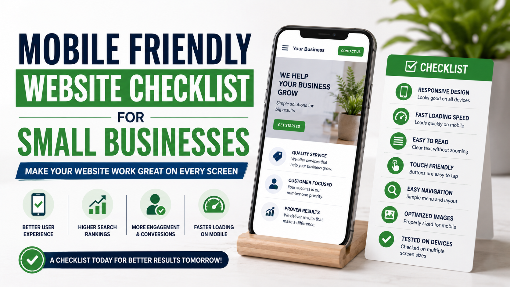
One of the easiest ways to get a false sense of confidence about a website is to review it only from a laptop.
Everything looks clean.
The navigation fits perfectly.
The hero image looks sharp.
The contact form is easy to complete.
Then you open the same website on your phone.
The headline takes up half the screen.
A popup covers the button.
The menu is difficult to tap.
The phone number is not clickable.
The contact form has tiny fields.
And a six-megabyte hero image takes forever to appear.
I have seen this happen on websites that were described as “fully responsive.”
Technically, they were.
The layout became narrower on a phone.
But being responsive and being genuinely mobile-friendly are not exactly the same thing.
A mobile-friendly website should make it easy for a customer to do whatever they came to do, whether that means calling a plumber, checking restaurant hours, requesting a landscaping quote, booking a dental appointment, viewing a contractor’s work, or finding directions to a store.
That is especially important for small businesses because many mobile visitors have strong intent.
They are not casually browsing from a desk.
They may already need the service.
Here is the checklist I would use before calling any small-business website mobile-friendly.
1. Start With a Real Phone, Not Just Desktop Preview
This is my first rule.
Do not rely entirely on the mobile preview inside:
WordPress.
Elementor.
Webflow.
Wix.
Squarespace.
Shopify.
Chrome DevTools.
Those tools are useful.
But eventually, pick up an actual phone.
Open the website.
Try to use it like a customer.
Click through:
Homepage.
Main service page.
Contact page.
Menu.
Quote form.
Gallery.
Booking system.
Phone number.
Map.
Then try another device if possible.
An iPhone and Android phone can sometimes expose different problems.
The site does not need to look identical everywhere.
It needs to remain easy to use.
2. Make Sure the Site Uses Responsive Design
For most small businesses, responsive design is the simplest approach.
Responsive design means the same core page adapts to different screen sizes instead of requiring a completely separate mobile website.
Google currently recommends responsive web design because it is generally the easiest mobile configuration to implement and maintain. Google also uses the mobile version of a site’s content for indexing and ranking through mobile-first indexing.
That means mobile should not be treated as a stripped-down afterthought.
Your important:
Content.
Headings.
Links.
Images.
Structured data.
Metadata.
Calls to action.
should remain properly accessible on mobile.
3. Check the Viewport
This is a technical detail that causes very visible problems when it is wrong.
A proper viewport configuration helps the browser understand how the page should fit the device screen.
When the viewport is missing or badly configured, you may see:
Tiny desktop-style pages.
Horizontal scrolling.
Strange zoom behavior.
Content wider than the phone.
Modern website platforms normally handle this automatically.
But custom-built or older sites can still have issues.
If users need to pinch and zoom simply to read the homepage, something is wrong.
4. Eliminate Horizontal Scrolling
Open the page and swipe sideways.
Does the entire layout move?
It should not.
Horizontal scrolling is often caused by:
Oversized images.
Fixed-width sections.
Wide tables.
Long URLs.
Sliders.
Embedded maps.
Incorrect padding.
Custom code.
Large comparison charts.
A mobile user should generally scroll up and down, not hunt for hidden content off the right side of the screen.
Check every important template, not only the homepage.
5. Make Your Headline Readable Immediately
Desktop headlines often become ridiculous on mobile.
A headline that looks elegant across one desktop line may turn into six lines on a phone.
For example:
“Professional Commercial Landscaping and Outdoor Property Maintenance Solutions”
may occupy nearly the whole first screen.
You do not necessarily need completely different copy.
But adjust:
Font size.
Line height.
Maximum width.
Spacing.
Line breaks.
The visitor should still understand the main offer quickly.
For example:
Commercial Landscaping for Dallas Properties
is easier to process than a long branding statement filling the entire screen.
6. Keep Body Text Comfortable to Read
If visitors need to zoom in to read your service description, the text is too small.
Small businesses sometimes reduce mobile fonts because they want more content visible above the fold.
That usually makes the page harder to use.
Readable text should have:
Comfortable font size.
Reasonable line height.
Enough contrast.
Short paragraphs.
Good spacing.
Google’s mobile UX guidance specifically emphasizes readable text and properly sized content rather than forcing visitors to zoom.
Remember that a phone is usually held farther from the eyes than a printed page.
Comfort beats squeezing everything into less space.
7. Break Long Paragraphs Into Smaller Sections
This matters more on mobile than desktop.
A paragraph that looks acceptable across a wide monitor can become a giant wall of text on a phone.
Keep paragraphs relatively short.
Use helpful subheadings.
Use bullets when they genuinely make information easier to scan.
For example, instead of one giant paragraph describing a landscaping package, break it into:
Lawn maintenance.
Seasonal cleanup.
Irrigation checks.
Mulching.
Shrub care.
Customers often scan before they read.
Make that easy.
8. Make Buttons Large Enough to Tap
A desktop visitor has a precise mouse pointer.
A mobile visitor has a thumb.
That difference matters.
Buttons and links should have enough space around them that someone can tap one without accidentally hitting another.
Common problem:
“Call | Email | Directions | Instagram”
all squeezed into one tiny line.
Good mobile design gives each important action breathing room.
Google has long recommended sizing and spacing touch targets appropriately for mobile interaction.
You do not need giant cartoon buttons.
Just make them comfortable.
9. Do Not Put Tap Targets Too Close Together
This happens frequently in:
Footers.
Menus.
Pagination.
Product filters.
Form options.
Social icons.
Imagine trying to tap:
“Services”
but accidentally opening:
“About.”
That creates unnecessary frustration.
Give links enough vertical and horizontal spacing.
Test with your thumb, not your mouse.
10. Make the Main CTA Obvious
A mobile visitor should not have to scroll through five screens to figure out how to contact you.
Depending on the business, your main CTA may be:
Call Now.
Request a Quote.
Book Appointment.
Get an Estimate.
Check Availability.
Schedule Consultation.
The action should appear reasonably early.
For local businesses, I often like a clear hero CTA combined with another option farther down the page.
Do not hide the conversion action inside a hamburger menu.
11. Make Phone Numbers Tap-to-Call
This is one of the simplest improvements a local service business can make.
Suppose someone searches:
“emergency plumber near me.”
They reach your site on a phone.
The phone number appears as:
(555) 123-4567
but tapping it does nothing.
Now the visitor must memorize or copy the number.
That friction is unnecessary.
Make phone numbers clickable.
This is especially important for:
Plumbers.
Electricians.
HVAC.
Roofers.
Dentists.
Clinics.
Auto repair.
Towing.
Restaurants.
Any service where calls matter.
12. Consider a Sticky Mobile CTA
A sticky CTA remains visible while someone scrolls.
For example:
Call Now
or:
Get Quote
at the bottom of the screen.
This can work extremely well for high-intent service businesses.
But use it carefully.
I have seen mobile pages with:
Cookie banner.
WhatsApp bubble.
Chat widget.
Sticky phone button.
Sticky navigation.
all fighting for screen space.
Half the page becomes controls.
One useful sticky CTA is enough.
13. Test the Mobile Navigation
Your menu should be simple.
When the visitor taps the menu icon:
Does it open immediately?
Are the items readable?
Can submenus be expanded comfortably?
Can the menu be closed?
Does it cover the entire page accidentally?
Does scrolling still work?
Common navigation problems include:
Tiny submenu arrows.
Menus opening off-screen.
Dropdowns that require hover.
Too many menu levels.
Unclear close buttons.
For a small service business, the navigation usually does not need to be complicated.
Something like:
Home
Services
Projects
About
Reviews
Contact
may be enough.
14. Do Not Depend on Hover Effects
Desktop websites often use hover interactions.
Move the mouse over a service card.
Additional text appears.
Move over an image.
A button becomes visible.
Phones do not have the same hover behavior.
If important information or navigation exists only on hover, mobile visitors may never see it.
Anything required for understanding or conversion should be accessible without hovering.
15. Test Every Contact Form on Mobile
Forms deserve special attention because they are often where leads disappear.
Complete your form on an actual phone.
Check:
Are fields tall enough?
Can you easily tap inside them?
Is the text readable?
Do dropdowns work?
Can you see error messages?
Does the keyboard cover the submit button?
Does autofill work reasonably?
Are labels clear?
If the form feels annoying to you, it will feel annoying to customers too.
16. Remove Unnecessary Form Fields
Mobile typing is slower than desktop typing.
That makes unnecessary fields even more painful.
A roofing quote form probably does not need:
Job title.
Company revenue.
Referral source.
Secondary phone.
Fax number.
Detailed project history.
Ask for what is required to start the conversation.
For example:
Name.
Phone or email.
Service needed.
Property location.
Short message.
You can collect more information later.
17. Use the Correct Keyboard for Form Fields
This is a small technical improvement that makes forms feel much better.
When someone taps:
Phone number field
the phone should ideally show a number-friendly keyboard.
When they tap:
Email field
the keyboard should make email entry convenient.
When they enter:
Website URL
the keyboard can adapt appropriately.
Using semantic input types helps mobile browsers provide better controls. Google’s mobile UX guidance specifically recommends appropriate semantic input types.
Small detail.
Better experience.
18. Keep Forms From Resetting After an Error
Imagine filling out six fields on your phone.
You press:
“Request Quote.”
Then the site says:
“Please choose a service.”
And every field becomes empty.
That is enough to make some visitors leave.
When validation fails:
Highlight the problem.
Explain it clearly.
Preserve the information already entered.
Never punish someone for one missing field.
19. Make CAPTCHA Reasonable
Spam protection is important.
But CAPTCHA can become one of the least mobile-friendly parts of a form.
If a customer needs to identify six traffic lights, three motorcycles, two buses, and a crosswalk just to request landscaping service, the system is creating friction.
Use modern spam protection where appropriate.
Options may include:
Honeypot fields.
Bot detection.
Rate limiting.
Less intrusive CAPTCHA implementations.
Test whatever you use on a phone.
20. Compress Images
Mobile connections are not always fast.
Do not force every visitor to download giant photography files.
A common problem is uploading a 5 MB image straight from the camera and displaying it at 700 pixels wide.
Resize images appropriately.
Compress them.
Use modern formats such as WebP or AVIF where supported by your platform.
A project gallery can still look excellent without each photo being several megabytes.
21. Serve the Right Image Size
Do not make a phone download an enormous desktop image when a much smaller version would look identical on that screen.
Modern responsive image techniques can let browsers select an appropriate image size.
Many CMS platforms and image CDNs handle part of this automatically.
Still, check the output.
I have seen WordPress sites generating multiple image sizes correctly while the template still forces the original full-resolution file everywhere.
Automation does not guarantee good implementation.
22. Be Careful With Full-Screen Video
A cinematic background video may look great on desktop.
On mobile it can:
Consume bandwidth.
Delay loading.
Make text hard to read.
Drain battery.
Push important content down.
Increase page weight.
Consider using:
A static mobile image.
A lightweight preview.
Short optimized video.
Or no video at all.
The mobile version does not need every desktop effect.
23. Lazy Load Below-the-Fold Media
If your page has 25 project photos, the browser does not necessarily need all of them immediately.
Lazy loading can delay below-the-fold media until it gets closer to the viewport.
That helps reduce initial page weight.
But be careful with the hero image.
If the main visible image is important to initial rendering, delaying it may actually hurt performance.
Lazy loading should be selective, not automatic thinking.
24. Check Mobile Page Speed Separately
Do not assume desktop speed tells you what mobile visitors experience.
Run important URLs through Google PageSpeed Insights.
PSI reports both mobile and desktop performance and uses a mix of real-world Chrome User Experience Report data and Lighthouse lab testing.
Test:
Homepage.
Top service page.
Paid landing page.
Contact page.
Product page if relevant.
Do not only test one URL.
Different templates may have completely different problems.
25. Pay Attention to Core Web Vitals
The current Core Web Vitals focus on:
Largest Contentful Paint (LCP) — loading.
Interaction to Next Paint (INP) — responsiveness.
Cumulative Layout Shift (CLS) — visual stability.
A mobile website that looks attractive but responds slowly or jumps around is not providing a good experience.
Use PageSpeed Insights and Search Console to identify the biggest problems.
Then focus on real bottlenecks rather than trying to achieve a perfect performance score.
26. Stop Layout Shifts
This is especially irritating on a small screen.
You are about to press:
“Request a Quote.”
Then an image loads.
The page moves.
You tap something else.
Common causes include:
Images without reserved dimensions.
Late-loading fonts.
Ads.
Cookie banners.
Embedded widgets.
Review widgets.
Dynamic content.
Give visual elements predictable space whenever possible.
A stable mobile page feels much more professional.
27. Check Popups on Mobile
Desktop popups can become monsters on phones.
A newsletter popup that occupies 40% of a monitor may cover nearly the whole screen on mobile.
Always test:
Can the user close it?
Is the close icon easy to tap?
Does it appear too early?
Does it cover the main CTA?
Does it return repeatedly?
For many local businesses, I would rather have a clean page than an aggressive popup appearing five seconds after arrival.
28. Test Cookie and Consent Banners
Privacy banners can create major usability problems.
Look for:
Buttons off-screen.
Tiny settings links.
Banner covering the sticky CTA.
No obvious way to make a selection.
Scrolling disabled accidentally.
The legal implementation matters, but so does usability.
A visitor should be able to interact with the required controls comfortably.
29. Check Chat and WhatsApp Widgets
Chat can be useful.
WhatsApp can be excellent for local businesses in markets where customers use it heavily.
But floating widgets often create mobile clutter.
Place them where they do not overlap:
Form buttons.
Cookie controls.
Navigation.
Sticky CTAs.
Important text.
If you have both a live-chat bubble and WhatsApp bubble, ask whether both are genuinely necessary.
More contact options do not automatically mean more leads.
30. Make Maps Mobile-Friendly
If you embed a map:
Does it fit the screen?
Does it load quickly?
Can visitors scroll past it without accidentally dragging the map?
Does it show the correct location?
Could a simple:
“Get Directions”
button work better?
For some businesses, linking to Google Maps is more useful than embedding a large interactive map.
Especially when performance matters.
31. Make Business Hours Easy to Find
Mobile local searches often have immediate intent.
Customers may want to know:
Are you open?
Are you available today?
Do you offer emergency service?
Your hours should not be buried inside the footer in tiny text.
Consider showing them clearly on:
Contact page.
Location page.
Header or mobile menu where relevant.
For businesses with irregular hours, keep them updated.
32. Show the Service Area Clearly
A visitor should not have to investigate whether you work in their location.
For example:
“Serving Dallas, Plano, Frisco, and surrounding areas.”
That information can appear near:
Hero section.
Contact information.
Service page.
Location section.
Mobile users looking for local services often want this answer quickly.
33. Keep Your Most Important Content on Mobile
One dangerous mistake is hiding useful content on mobile simply to make the page shorter.
Google uses mobile-first indexing, meaning it primarily uses the mobile version of page content for indexing and ranking. Google recommends keeping equivalent primary content, metadata, images, and relevant structured data available on mobile.
Do not remove:
Important service descriptions.
Internal links.
Relevant headings.
Useful FAQs.
Key project information.
simply because the page looks long.
You can organize the content better without deleting valuable information.
34. Use Accordions Sensibly
Accordions can help organize long mobile pages.
For example:
FAQs.
Technical details.
Optional service information.
But do not put every important message behind a click.
Visitors should be able to understand:
What you do.
Why it matters.
Why they should trust you.
What to do next.
without opening 12 accordions.
Use them for supporting information.
35. Keep Images and Videos Crawlable
If mobile content matters for search, Google also needs to be able to access it.
Google advises site owners not to block important mobile resources and warns against loading primary content only after user actions such as clicking or swiping when that prevents Google from accessing it normally.
This is particularly important with:
JavaScript galleries.
Lazy-loaded content.
Tabs.
Custom sliders.
Interactive page builders.
The customer and the search engine both need access to the important content.
36. Use Clear Contrast
Sunlight changes everything.
A subtle gray button may look elegant indoors on a large monitor.
Outside on a phone, it may practically disappear.
Check contrast for:
Text.
Buttons.
Links.
Form labels.
Navigation.
Error messages.
Do not make design so subtle that usability suffers.
Accessibility and conversion often improve together.
37. Do Not Put Text Inside Important Images
This is common with promotional graphics.
A business uploads a desktop banner containing:
Headline.
Offer.
Phone number.
CTA.
On mobile, the image shrinks.
Now all the text is tiny.
Whenever possible, keep important copy as real HTML text.
That makes it:
Responsive.
Readable.
Selectable.
Accessible.
Easier to update.
More useful to search engines.
Use images for imagery, not as a replacement for the entire page.
38. Make Galleries Easy to Swipe Without Becoming Confusing
For:
Contractors.
Architects.
Interior designers.
Landscapers.
Photographers.
Real project galleries are strong trust signals.
On mobile, make sure visitors can:
Swipe naturally.
Open larger images.
Close galleries easily.
Understand what each project is.
Do not create a gallery where the user becomes trapped in a full-screen slider with no obvious close button.
39. Optimize Tables for Small Screens
Pricing tables and comparison charts often break mobile layouts.
A five-column desktop table may become unreadable.
Possible solutions include:
Stacking information vertically.
Using cards.
Allowing controlled horizontal scrolling.
Reducing nonessential columns.
Creating a mobile-specific presentation.
Do not shrink everything until the text becomes microscopic.
Reformat it.
40. Check Your Booking System
Third-party booking software can be the weakest part of an otherwise good mobile site.
Test:
Calendly.
Acuity.
Square Appointments.
Clinic software.
Restaurant booking system.
Custom scheduling app.
Ask:
Does it fit the phone?
Are times easy to select?
Does it require too many steps?
Does the date picker work?
Can someone go backward?
Does the confirmation appear?
Do not stop testing at the point where the visitor leaves your own website.
The entire booking journey matters.
41. Test Ecommerce Checkout on a Phone
For ecommerce businesses, the checkout is one of the most important mobile experiences.
Actually make a test purchase.
Check:
Product selection.
Variant options.
Add to cart.
Cart editing.
Shipping.
Coupon field.
Payment.
Apple Pay or Google Pay where supported.
Order confirmation.
A beautiful mobile homepage is irrelevant if checkout is painful.
42. Offer Convenient Payment Options Where Appropriate
Typing card information on a phone can create friction.
Depending on the store and payment setup, mobile wallets and familiar payment providers can make purchasing easier.
Do not add every payment method imaginable.
Use the options your customers genuinely expect.
Also make sure payment buttons do not break the layout.
43. Avoid Interruptive Interstitials
A user lands on your service page.
Immediately:
Cookie banner.
Newsletter popup.
App install popup.
Location request.
Notification request.
Chat bubble.
That is a terrible first impression.
Ask for things when they become relevant.
Do not make the visitor clear five layers before they can read what your business does.
44. Make Search Useful on Larger Sites
A five-page plumber website probably does not need internal search.
A large ecommerce store does.
If you provide search:
Make the search icon obvious.
Use a large enough input.
Return relevant results.
Handle spelling variations reasonably.
Make filters mobile-friendly.
Do not copy desktop filter sidebars directly onto small screens.
45. Check Your Footer
Mobile footers often become huge.
They may contain:
Logo.
Description.
Eight service links.
Ten location links.
Social icons.
Newsletter.
Phone.
Email.
Hours.
Policies.
Awards.
Everything stacked for several screens.
Prioritize.
Keep useful information.
Collapse large link groups where appropriate.
Make contact details easy to use.
A footer should support navigation, not become a second website.
46. Check Accessibility Basics
Mobile-friendly and accessible design overlap heavily.
Look for:
Readable contrast.
Clear labels.
Logical heading structure.
Useful alt text.
Keyboard-accessible controls where applicable.
Visible focus states.
Buttons that work properly.
Form error messaging.
Do not treat accessibility as a plugin checkbox.
Good accessible design often makes the site easier for everyone.
47. Check Links and Buttons After Every Major Update
A mobile CTA can break without anyone noticing.
For example:
Desktop “Request Quote” works.
Mobile sticky version points to an old page.
Or:
Phone button includes the wrong number.
Or:
WhatsApp link contains an expired message template.
Test conversion actions regularly.
Especially after:
Redesigns.
Theme updates.
Plugin updates.
Page migrations.
New campaign launches.
48. Use Analytics to Compare Mobile Performance
Do not guess whether mobile visitors are struggling.
Look at your analytics.
Compare mobile and desktop where appropriate.
Look at:
Traffic.
Engagement.
Form submissions.
Calls.
Purchases.
Bookings.
Lead quality.
Suppose:
Desktop conversion rate is healthy.
Mobile traffic is huge.
Mobile conversion is dramatically weaker.
That is a reason to investigate the mobile journey.
The device itself may not be the problem, but the difference can tell you where to look.
49. Use PageSpeed Insights for Important URLs
Run several pages through PageSpeed Insights.
Google’s current PSI reports both mobile and desktop performance using Lighthouse lab diagnostics and real-world Chrome data when available.
Do not focus only on the score.
Look at the actual opportunities:
Largest image loading late.
Heavy JavaScript.
Layout shifts.
Slow server response.
Unused code.
Long main-thread tasks.
That tells you what to investigate.
50. Remember That Mobile-First Does Not Mean Mobile-Only
Desktop still matters.
Tablets still matter.
Large monitors still matter.
The goal is not:
“Make the mobile version amazing and ignore everything else.”
The goal is one strong experience that adapts appropriately.
Google recommends responsive design partly because it makes this easier to manage consistently.
Design for the customer’s situation, not one device category.
Common Mobile Website Mistakes Small Businesses Make
A few problems show up constantly.
Shrinking Desktop Instead of Redesigning for Mobile
The layout technically fits, but everything feels cramped.
Tiny Buttons
Visitors constantly tap the wrong thing.
Huge Hero Images
The page takes too long to become useful.
Non-Clickable Phone Numbers
High-intent customers face unnecessary work.
Overloaded Sticky Elements
Chat, cookies, WhatsApp, and CTAs cover the page.
Long Forms
Typing becomes exhausting.
Desktop-Only Hover Features
Important information becomes inaccessible.
Tiny Text
Visitors need to zoom.
Hidden Important Content
Mobile users get a weaker version of the site.
Poor Navigation
Customers cannot find services.
Slow Third-Party Widgets
The main business page suffers because of tools few people use.
No Real-Device Testing
Problems remain invisible until customers complain.
A Practical Mobile-Friendly Website Checklist
If I were reviewing a small-business site today, I would work through it like this:
Layout
- Does every page fit the screen?
- Is there any accidental horizontal scrolling?
- Does the responsive layout work at different widths?
Content
- Is the main offer clear immediately?
- Is text comfortable to read?
- Are paragraphs easy to scan?
- Is important desktop content also available on mobile?
Navigation
- Does the menu open and close properly?
- Are important pages easy to reach?
- Are menu items easy to tap?
Calls to Action
- Is the primary CTA visible?
- Is the phone number clickable?
- Does a sticky CTA help rather than obstruct?
Forms
- Are fields easy to tap?
- Is the form short enough?
- Are errors clear?
- Does the correct keyboard appear?
- Does submission work?
Media
- Are images compressed?
- Are appropriate image sizes served?
- Are videos optimized?
- Is below-the-fold media lazy-loaded appropriately?
Performance
- Have key URLs been checked in PageSpeed Insights?
- Are Core Web Vitals reasonable?
- Does the site respond quickly?
- Does content stay visually stable?
Local Business Details
- Are hours easy to find?
- Is the service area clear?
- Can visitors get directions?
- Are contact options obvious?
Trust
- Are reviews readable?
- Are project photos easy to view?
- Can customers see the real team or business?
- Are badges and credentials legible?
Tracking
- Are calls tracked where needed?
- Are form submissions recorded?
- Can you compare mobile lead performance with desktop?
If you can answer yes to most of those questions, you are much closer to a genuinely mobile-friendly website.
A Real Example: Local Roofing Company
Imagine someone discovers a roofer through Google while standing outside after a storm.
They open the website on their phone.
Bad Experience
A giant drone video loads.
Popup asks for email subscription.
Navigation covers the screen.
Headline says:
“Building Confidence From the Top Down.”
No phone number visible.
Customer scrolls.
More animation.
Eventually finds:
“Contact.”
The form asks for 11 fields.
That visitor may go back to Google.
Better Experience
Page opens quickly.
Headline:
Roof Repair and Replacement in Dallas
Supporting text:
“Storm damage, leaks, and full roof replacement for Dallas-area homeowners.”
Buttons:
Call Now
Request Inspection
Below:
4.9-star review rating.
Real roof projects.
Simple service explanation.
Short form.
Tap-to-call phone number.
Service area.
That is mobile-friendly design doing actual business work.
Another Example: Dental Clinic
A patient searches:
“dentist near me.”
They arrive on mobile.
What do they probably need?
Location.
Hours.
Services.
Insurance information.
Reviews.
Phone.
Appointment booking.
Make those things easy.
They probably do not need to watch a 90-second cinematic video before seeing the appointment button.
Understand the intent.
Build around it.
Another Example: Restaurant
For a restaurant, mobile priorities might be:
Menu.
Opening hours.
Directions.
Reserve table.
Call.
Order online.
Photos.
A beautifully written company history is fine.
But if the menu takes five clicks to find, the mobile experience is still weak.
The definition of “mobile-friendly” changes slightly by business type because customer intent changes.
Another Example: Landscaping Company
A landscaping visitor may want to:
View previous projects.
Check service area.
Understand available services.
Request an estimate.
The mobile page should make project photography easy to browse while keeping the CTA accessible.
Do not load 40 full-resolution project photos immediately.
Optimize the gallery.
Then let the visitor request an estimate without navigating somewhere else.
Do Not Judge Mobile Design by Appearance Alone
This is probably the most important lesson.
A mobile website can look beautiful and still perform badly.
Ask whether a visitor can actually:
Understand.
Navigate.
Read.
Tap.
Call.
Submit.
Book.
Buy.
Those actions tell you much more than whether the mobile screenshot looks good in a design presentation.
Mobile-Friendly Is Ongoing Maintenance
A website can be mobile-friendly today and frustrating six months later.
Someone installs a new chat widget.
Marketing adds another tracking script.
A new popup launches.
A page builder update changes spacing.
New images are uploaded without compression.
The booking platform changes its embed.
Performance slowly gets worse.
That is why I would review mobile periodically.
You do not need a giant technical audit every week.
Just pick up a phone occasionally and use the website.
Submit the form.
Make a test booking.
Open the menu.
Tap the phone number.
Check the important pages.
It is surprisingly effective.
The Best Mobile Website Feels Almost Invisible
A genuinely good mobile website does not make the visitor think:
“Wow, impressive responsive design.”
They simply use it.
The page loads.
The business is clear.
The text is readable.
The menu works.
The button is easy to tap.
The form takes less than a minute.
The phone number calls the business.
Nothing jumps unexpectedly.
Nothing blocks the screen.
That is the standard I would aim for.
Google’s mobile-first approach makes mobile quality important for search visibility, but I would not improve the mobile site only for Google. Google itself recommends mobile-friendly design because it creates a better experience for people, and its current guidance continues to favor responsive implementation while indexing primarily from mobile content.
For a small business, those people are potential customers.
Someone may be searching from a parking lot, sitting in a broken-down car, standing beside a leaking pipe, comparing contractors from their sofa, or trying to book an appointment between meetings.
They should not have to fight the website.
That is really what a mobile-friendly website comes down to.
Make the important information easy to see.
Make important actions easy to tap.
Make pages fast enough that visitors do not lose patience.
Make forms simple.
Test everything on a real phone.
And build the experience around what the customer actually wants to accomplish.
Do that well, and “mobile-friendly” stops being a technical checkbox.
It becomes part of how the website generates business.