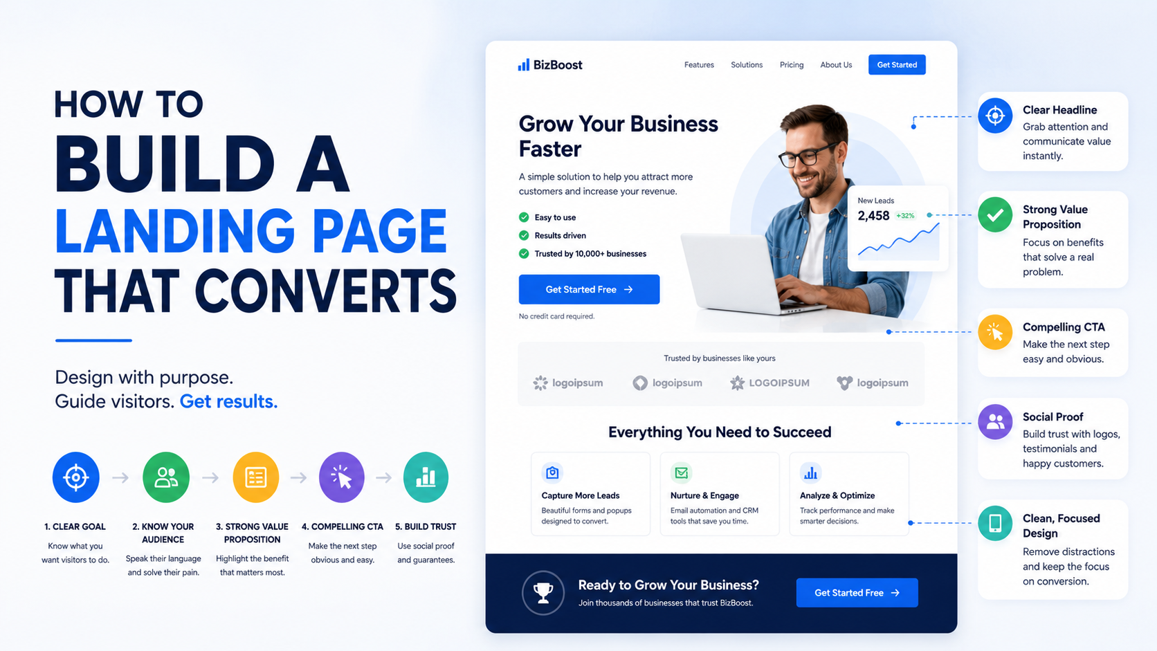
I have seen landing pages with beautiful design, sharp animations, polished illustrations, and almost no leads.
I have also seen very simple pages with plain layouts outperform them.
That was one of the first things that changed how I think about landing pages.
A landing page does not convert because it looks expensive.
It converts because the visitor understands the offer quickly, believes it is relevant, trusts the business, and knows exactly what to do next.
That sounds obvious, but it is surprisingly easy to get wrong.
Most weak landing pages are not failing because the button color is wrong.
They fail because the message is vague.
The offer is confusing.
There is no proof.
The form asks too much.
The page does not match the ad.
Or the visitor reaches the bottom and still does not understand why they should act now.
If you are building a landing page for Google Ads, Facebook Ads, LinkedIn campaigns, SEO traffic, email outreach, or a product launch, the process should start with the visitor’s problem, not the design.
Here is how I would build one from scratch.
Start With One Goal
The first thing I decide is what I want the visitor to do.
Not three things.
One.
That action might be:
Request a quote.
Book a demo.
Schedule a consultation.
Start a free trial.
Download a guide.
Call the business.
Join a waitlist.
Buy a product.
The rest of the page should support that goal.
This is where landing pages differ from normal websites.
A homepage may need to serve several audiences.
A landing page should be much more focused.
If the main goal is:
“Request a Commercial Cleaning Quote”
then I would not also push:
Newsletter signup.
Instagram follow.
Blog articles.
Careers.
Other unrelated services.
Every extra choice competes with the primary action.
Know Exactly Who the Page Is For
Trying to convert “everyone” usually produces generic copy.
Suppose you sell bookkeeping.
A broad page might say:
“Professional Bookkeeping Services for Growing Businesses.”
It is okay.
Now imagine the page is specifically for ecommerce brands.
You can say:
“Bookkeeping for Ecommerce Brands That Need Clean Monthly Numbers Without Wrestling With Shopify, Stripe, and Inventory Reports.”
Much stronger.
The second page feels like it understands the visitor.
Before writing anything, define:
Who is this person?
What problem brought them here?
What are they worried about?
What would make them hesitate?
What do they want to happen?
That information shapes the whole page.
Match the Landing Page to the Traffic Source
This is one of the biggest conversion mistakes.
An ad says one thing.
The landing page says something broader.
For example:
Ad
“Emergency AC Repair in Phoenix”
Landing Page
“Welcome to Smith Heating & Cooling”
That is weak message match.
A better headline:
“Emergency AC Repair in Phoenix With Same-Day Availability”
Now the visitor immediately knows they are in the right place.
The page should continue the conversation the ad already started.
The same applies to:
Google Ads.
Meta Ads.
LinkedIn Ads.
Email campaigns.
SEO pages.
If the traffic source is specific, the landing page should usually be specific too.
Write the Headline Before Designing the Page
I would not start with colors.
I would not start with icons.
I would not start with a template.
I would start with the headline.
Why?
Because if you cannot explain the offer clearly in one or two sentences, design will not solve the problem.
A good headline should usually tell the visitor:
What is being offered?
Who is it for?
What outcome or problem does it relate to?
For example:
“Commercial Landscaping for Property Managers Across Dallas”
Clear.
Or:
“Get More Qualified Dental Patients From Google Ads”
Also clear.
Compare those with:
“Accelerate Your Growth”
or:
“Solutions That Move You Forward.”
Those could belong to almost any company.
Clarity wins.
Use the Supporting Copy to Add Context
The subheadline should not simply repeat the headline.
Use it to explain the next important detail.
Example:
Headline
“Commercial Cleaning for Medical Offices in Houston”
Supporting Copy
“Reliable daily and weekly cleaning for clinics, dental offices, and medical facilities, with one point of contact and flexible scheduling.”
Now the visitor understands:
Who it is for.
What type of service.
What makes it convenient.
That is useful copy.
Make the Main CTA Obvious
The call to action should be easy to understand.
Examples:
“Request a Quote”
“Book a Demo”
“Get My Estimate”
“Schedule a Consultation”
“Start Free Trial”
“Call Now”
Avoid vague buttons when the action matters.
“Learn More” can work in a navigation section.
It is weaker when you actually want someone to request a service.
The visitor should know exactly what clicking the button will do.
Use One Primary CTA Throughout the Page
You can repeat the CTA several times.
In fact, I usually would.
But keep the action consistent.
For example:
Top of page:
“Request a Quote”
Middle of page:
“Request a Quote”
Bottom of page:
“Request a Quote”
That creates a clear conversion path.
What I would avoid is:
“Get Started”
then:
“Contact Us”
then:
“Book Call”
then:
“Download Brochure”
then:
“Join Newsletter.”
Now the visitor has to decide what you want from them.
Put Important Information Above the Fold
“Above the fold” simply means what the visitor sees before scrolling.
You do not need to fit the entire sales pitch there.
But I want the top section to answer:
What is this?
Is it for me?
Why should I care?
What should I do next?
A useful hero section may include:
Headline.
Short supporting paragraph.
Primary CTA.
One strong trust signal.
Relevant image or product visual.
That is enough.
Avoid Hero Sections That Are Mostly Decoration
Large videos and fancy animations can look great.
But if the visitor has to wait for the animation to finish before understanding the offer, the design is working against the page.
Ask:
Does this visual explain the product?
Does it show the result?
Does it build trust?
Does it support the offer?
If the answer is no, it may simply be decoration.
Decoration is fine.
Just do not let it compete with clarity.
Build the Page Around the Visitor’s Problem
After the hero, explain the problem in a way that feels familiar.
For example, a landing page for a lead-generation agency could say:
“Getting traffic is not the same as getting qualified leads.
If your ads are sending people to a generic homepage, your team may be paying for clicks that never become enquiries.”
That works because it describes a situation the visitor recognizes.
You do not need dramatic copy such as:
“Your business is bleeding money every second!”
That usually feels exaggerated.
Describe the real problem clearly.
Explain the Solution Simply
Once the visitor recognizes the problem, explain how your offer solves it.
Avoid turning this into a massive features list.
For example:
“We build campaign-specific landing pages around one audience, one offer, and one conversion action. Each page includes conversion tracking so you can see which campaigns actually generate leads.”
That is enough to understand the service.
Then you can go deeper.
Focus on Outcomes, Not Just Features
Features matter.
But visitors usually care about what those features help them achieve.
Feature:
CRM integration.
Outcome:
New leads go directly to the sales team instead of getting lost in an inbox.
Feature:
Call tracking.
Outcome:
You can see which ads generate actual phone enquiries.
Feature:
Mobile optimization.
Outcome:
Visitors can request a quote easily from their phone.
Feature:
Automated follow-up.
Outcome:
New leads receive an immediate response while your team is busy.
Explain features in terms of real consequences.
Use Real Proof Early
Trust is one of the biggest conversion factors for service businesses.
I like to introduce proof relatively early.
That may include:
Customer reviews.
Client logos.
Case study results.
Number of projects completed.
Certifications.
Ratings.
Relevant testimonials.
The strongest proof is specific.
Weak:
“Trusted by hundreds of businesses.”
Better:
“Used by 120+ property managers and commercial facilities teams.”
Only use numbers you can genuinely support.
Do not make up statistics just because they look good in a design.
Use Testimonials That Match the Audience
Imagine your landing page targets dentists.
Which testimonial is stronger?
“Great company. Highly recommend.”
or:
“Our dental group needed better tracking between Google Ads and booked patient calls. The new landing pages made it much easier to see which locations were actually generating enquiries.”
The second feels relevant.
Whenever possible, match proof to the audience you are targeting.
That might mean using different testimonials on different landing pages.
Case Studies Can Do a Lot of Selling
For higher-ticket offers, I like short case studies.
They do not need to be huge.
A simple structure works:
Problem
The client was paying for ads but sending traffic to a generic homepage.
Change
We created service-specific landing pages and simplified the lead form.
Outcome
The campaign generated more qualified enquiries from the same traffic source.
If you have verified numbers, use them.
For example:
“Qualified lead conversion increased from 3.1% to 6.4%.”
But only if that data is real.
Specific proof is powerful.
Fake precision is not.
Show the Process
People hesitate when they do not know what happens after they convert.
A simple process section can help.
For example:
1. Tell Us What You Need
Submit a short project form.
2. We Review the Details
Our team checks the requirements and prepares the next step.
3. We Speak
We schedule a short call if the project looks like a fit.
4. You Get a Clear Proposal
Scope, timeline, and pricing are explained before work begins.
That removes uncertainty.
Keep the Form as Short as Possible
Forms are one of the easiest places to lose conversions.
I have seen landing pages ask for:
First name.
Last name.
Phone.
Email.
Business name.
Job title.
Address.
Website.
Team size.
Budget.
Revenue.
Timeline.
Referral source.
Project details.
All before the prospect has spoken to anyone.
For most initial enquiries, that is too much.
Ask for what you actually need.
For a simple service business:
Name.
Phone or email.
Service.
Short message.
That might be enough.
But Do Not Remove Every Qualifying Field
Short forms usually reduce friction, but low-quality leads create their own problem.
If you sell $20,000 consulting engagements, adding:
“Approximate project budget”
may save everyone time.
You need balance.
A good form collects enough information to move the sales process forward without making the visitor feel like they are completing a tax return.
Multi-Step Forms Can Work Well
If you genuinely need more information, break the form into smaller steps.
For example:
Step 1
What service do you need?
Step 2
What is your approximate budget?
Step 3
When do you want to start?
Step 4
Name and contact details.
This can feel easier than showing 12 fields at once.
Tools such as Typeform, Jotform, HubSpot Forms, Gravity Forms, and various landing-page builders can handle multi-step flows depending on your platform.
Tell the Visitor What Happens After Submission
This small detail helps more than people expect.
Under the form, you could write:
“Submit your details and our team will respond within one business day.”
Or:
“After you request a demo, we’ll review your requirements and send available times.”
Now there is less uncertainty.
The visitor knows what they are agreeing to.
Make Phone Calls Easy for Local Services
For high-intent local services, the phone may be the main conversion action.
For example:
Emergency plumber.
HVAC repair.
Locksmith.
Towing.
Water damage restoration.
Put the phone number somewhere obvious.
Make it clickable on mobile.
A sticky mobile call button can work well if it does not interfere with the page.
Do not force someone with a leaking pipe to fill out seven fields.
Mobile Is Not a Smaller Desktop Page
Always test the landing page on a real phone.
This is one of the easiest ways to spot problems.
Check:
Headline length.
Button size.
Form usability.
Spacing.
Phone links.
Image size.
Sticky elements.
Navigation.
Page speed.
Popups.
Some pages look perfect in a design tool and become painful on an actual phone.
Conversion design has to survive real use.
Page Speed Matters
When you pay for traffic, slow pages are especially painful.
You already paid for the click.
If the visitor leaves while waiting for a huge video to load, the money is gone.
Use tools such as Google PageSpeed Insights to spot problems.
Common issues include:
Oversized images.
Heavy JavaScript.
Too many third-party tools.
Autoplay videos.
Poor hosting.
Large font files.
Unused scripts.
Too many tracking tags.
Do not chase a perfect score blindly.
Focus on making the page genuinely fast and stable.
Trust Matters Near the CTA
Do not put all credibility at the very bottom of the page.
Add trust near decision points.
For example:
“Request a Quote”
then directly underneath:
“Rated 4.9/5 from 180+ customer reviews.”
Or:
“Trusted by property managers across Houston.”
Or:
“Licensed and insured.”
Only use claims that are true and appropriate for the business.
The closer the visitor gets to making a decision, the more reassurance helps.
Address Objections Before They Become Sales Problems
Think about the questions prospects ask on calls.
Those questions belong on the landing page.
Common objections include:
How much does it cost?
How long does it take?
Do I need a contract?
Can you work with my existing system?
What happens if I need revisions?
Do you serve my location?
Do you offer support?
Can I cancel?
Use an FAQ section to remove uncertainty.
Good FAQs reduce the amount of basic explaining your sales team needs to do.
Do Not Hide Pricing If Pricing Is a Major Question
You do not always need exact prices.
But some guidance can improve lead quality.
For example:
“Projects start at $3,500.”
Or:
“Most installations range from $5,000 to $12,000 depending on size.”
Or:
“Plans start at $99/month.”
This helps visitors self-qualify.
You may get fewer leads.
But they may be better leads.
Add Risk Reduction Where Appropriate
People hesitate because they are worried about making the wrong choice.
You can reduce that risk with legitimate assurances.
Examples:
Free consultation.
No-obligation estimate.
Transparent pricing.
Cancel-anytime plan.
Money-back policy where genuinely offered.
Warranty.
Revision policy.
Trial period.
Do not invent guarantees.
The point is to remove real risk, not create fake urgency.
Avoid Fake Scarcity
Countdown timers are everywhere.
Sometimes they are legitimate.
For example:
Registration really closes Friday.
A webinar really starts tomorrow.
A product discount really ends tonight.
That is fine.
But a timer that resets every time the visitor refreshes the page damages trust.
Do not fake:
Limited availability.
Deadline.
Stock shortage.
Discount expiration.
Trust is worth more than a temporary conversion bump.
Use Visuals That Explain Something
A good landing page visual should support the offer.
For SaaS:
Product screenshot.
Dashboard preview.
Workflow.
For contractors:
Real project photos.
Before-and-after work.
For agencies:
Campaign dashboard.
Website examples.
Results.
For consultants:
Process diagram.
Real team.
Relevant client work.
Use stock images carefully.
A smiling person pointing at a laptop rarely explains much.
Real Photos Often Beat Generic Stock Photography
This is especially true for local and service businesses.
Show:
Real staff.
Real vehicles.
Real office.
Real projects.
Real equipment.
Real customer environments, with permission.
People want proof that there is a real company behind the landing page.
Authenticity builds confidence.
Keep Navigation Limited
A landing page should generally have fewer distractions than a homepage.
That may mean removing links such as:
Careers.
Blog.
Press.
Investor information.
Unrelated services.
But I would not blindly remove everything.
For expensive services, visitors may want to check:
About.
Case studies.
Privacy policy.
Main website.
Contact information.
The right balance depends on how much trust the purchase requires.
Repeat the Offer Naturally
Long pages need repeated reminders.
A good structure may look like:
Hero + CTA.
Problem.
Solution.
Proof + CTA.
Features or benefits.
Case study.
Process.
FAQ.
CTA.
That is enough repetition without becoming aggressive.
Add a Strong Final Section
The bottom of the page should not simply stop after the FAQ.
Give the visitor a final reason to act.
For example:
“Ready to see where your paid traffic is leaking?
Tell us what you’re currently running and we’ll review whether a dedicated landing page makes sense.”
CTA:
“Request a Review”
This gives the page a proper ending.
Track the Right Conversion
Before launching, decide what success means.
Is it:
Form submission?
Phone call?
Booked demo?
Purchase?
Free trial?
WhatsApp conversation?
Track that action.
Tools may include:
GA4.
Google Tag Manager.
Google Ads conversion tracking.
Meta Pixel.
LinkedIn Insight Tag.
CRM tracking.
Call tracking software.
The stack depends on where your traffic comes from.
Connect Leads to the CRM
Do not stop measuring at:
“Form completed.”
You need to know what happened after that.
A simple funnel might be:
Visitor.
Lead.
Qualified lead.
Meeting.
Proposal.
Customer.
Revenue.
Tools such as HubSpot, Pipedrive, Close, Zoho CRM, or Salesforce can help.
For a small business, a structured spreadsheet may still work.
The important thing is connecting marketing with sales.
Lead Quality Is More Important Than Conversion Rate Alone
Imagine two landing pages.
Page A
Conversion rate: 12%.
100 leads.
3 customers.
Page B
Conversion rate: 6%.
50 leads.
15 customers.
Page B is much more valuable.
This is why I do not chase conversion rate without looking at lead quality.
Track:
Qualified leads.
Meetings.
Sales.
Revenue.
Not just form submissions.
Heatmaps Can Help You Find Friction
Tools such as Microsoft Clarity and Hotjar can show:
Where people click.
How far they scroll.
Where they stop.
Whether they repeatedly click something that does not work.
Session recordings can also reveal frustrating behavior.
For example:
Visitors keep clicking a product image expecting it to open.
The CTA is not visible.
The form breaks on mobile.
People never reach the case study.
These observations can give you real ideas for improvement.
Use behavior tracking responsibly and respect applicable privacy requirements.
Do Not A/B Test Everything Immediately
There is a tendency to turn landing page optimization into endless testing.
Red button.
Blue button.
Round button.
Square button.
Before worrying about that, fix obvious problems.
If the headline is unclear, rewrite it.
If the form is broken, fix it.
If the mobile experience is bad, repair it.
If there is no proof, add proof.
Once the fundamentals are solid and traffic is high enough, then test meaningful differences.
What I Would Test First
If the page receives enough traffic, I would prioritize major variables.
Headline
Specific vs broad.
Offer
Free audit vs consultation.
CTA
“Book a Call” vs “Get a Quote.”
Form Length
Three fields vs six.
Proof
General testimonial vs industry-specific case study.
Hero Structure
Copy-led vs visual-led.
These tests can change how people understand the offer.
Do Not Change Ten Things at Once
If you replace:
Headline.
CTA.
Layout.
Form.
Offer.
Testimonials.
Pricing.
all at the same time, and conversions improve, you will not know why.
When practical, make controlled changes.
That turns optimization into learning rather than guessing.
Common Landing Page Mistakes
Generic Headlines
Visitors cannot tell what the offer is.
Too Many CTAs
The page has no clear goal.
Weak Message Match
The page does not reflect the ad.
Long Forms
Visitors abandon before submitting.
No Proof
The company asks for trust without earning it.
Fake Urgency
Short-term pressure damages credibility.
Slow Pages
Paid clicks disappear before the page loads.
Poor Mobile Design
Visitors struggle to act.
Too Much Text Without Structure
Good copy still needs readable formatting.
Too Little Information
High-ticket visitors cannot make a confident decision.
Stock Photography Everywhere
The business feels generic.
No Follow-Up Process
Leads arrive and nobody responds.
A Step-by-Step Landing Page Build Process
If I were starting a page from zero, I would use this order.
Step 1: Define the Audience
Who exactly is the campaign for?
Step 2: Define the Offer
What do they get?
Step 3: Define the Conversion
What action do we want?
Step 4: Understand the Traffic Source
What did the visitor see before arriving?
Step 5: Write the Headline
Make the offer obvious.
Step 6: Write the Supporting Copy
Explain who it is for and why it matters.
Step 7: Add the Primary CTA
Keep it specific.
Step 8: Build the Problem and Solution Sections
Show that you understand the situation.
Step 9: Add Proof
Testimonials, case studies, projects, reviews.
Step 10: Explain the Process
Remove uncertainty.
Step 11: Build the Form
Ask only for useful information.
Step 12: Add FAQs
Answer the objections you already hear.
Step 13: Build Mobile First-Class, Not Second-Class
Test everything on a phone.
Step 14: Improve Speed
Compress, simplify, and remove unnecessary weight.
Step 15: Set Up Tracking
Know exactly what happens after launch.
Step 16: Connect Leads to Sales
Do not let enquiries disappear into email.
Step 17: Launch and Watch Real Behavior
Use analytics and sales feedback.
Step 18: Improve the Biggest Weakness First
Do not redesign blindly.
A Simple Example
Imagine you run a commercial landscaping company.
You are advertising to property managers.
A useful landing page might look like this:
Hero
Commercial Landscaping for Multi-Property Managers in Dallas
One reliable team for scheduled maintenance, seasonal work, and property improvements across multiple locations.
Request a Property Quote
Trust
“Trusted by commercial properties across the Dallas area.”
Real logos or reviews where available.
Problem
Managing different landscaping contractors across several locations creates communication and scheduling problems.
Solution
One team.
One contact.
Consistent service standards.
Services
Maintenance.
Irrigation.
Seasonal cleanup.
Landscape improvements.
Proof
Real commercial project photos.
Property manager testimonial.
Process
Site review.
Proposal.
Schedule.
Ongoing service.
FAQ
Contract terms.
Locations.
Pricing.
Service frequency.
Final CTA
“Tell us how many properties you manage and we’ll prepare the next step.”
That is much more focused than sending paid traffic to a generic landscaping homepage.
The Best Landing Pages Feel Easy
That is the quality I notice most.
The visitor does not have to work.
They do not have to decode the headline.
They do not have to search for proof.
They do not have to wonder what the button does.
They do not have to zoom in on their phone.
They do not have to complete a 15-field form.
Everything moves logically.
Problem.
Solution.
Proof.
Action.
That is what conversion-focused design really is.
Not psychological tricks.
Not fake scarcity.
Not button-color hacks.
It is reducing unnecessary uncertainty and friction.
If your landing page is underperforming, I would not ask:
“What clever thing can we add?”
I would ask:
“What is making the visitor hesitate?”
Maybe the offer is unclear.
Maybe there is no trust.
Maybe the form is painful.
Maybe the page does not match the ad.
Maybe the visitor does not know what happens next.
Find that hesitation.
Remove it.
Then watch what happens.
A landing page that converts well is usually not the page shouting the loudest.
It is the page that makes the decision feel simplest.