I have seen websites do almost everything right and still lose leads at the last step.
The service page is clear.
The reviews are strong.
The photos look professional.
The visitor clicks “Request a Quote.”
Then the form appears.
Twelve fields.
Three dropdowns.
A budget question.
A company-size question.
A mandatory phone number.
A mandatory message.
A CAPTCHA that barely works on mobile.
At that point, the visitor has to decide whether contacting the company is worth the effort.
Sometimes they finish.
Sometimes they leave.
That is why I do not treat contact forms as a small technical detail.
For many service websites, the contact form is where interest turns into an actual lead.
If the form is frustrating, unclear, badly placed, or followed by a weak response process, all the work that brought the visitor there can be wasted.
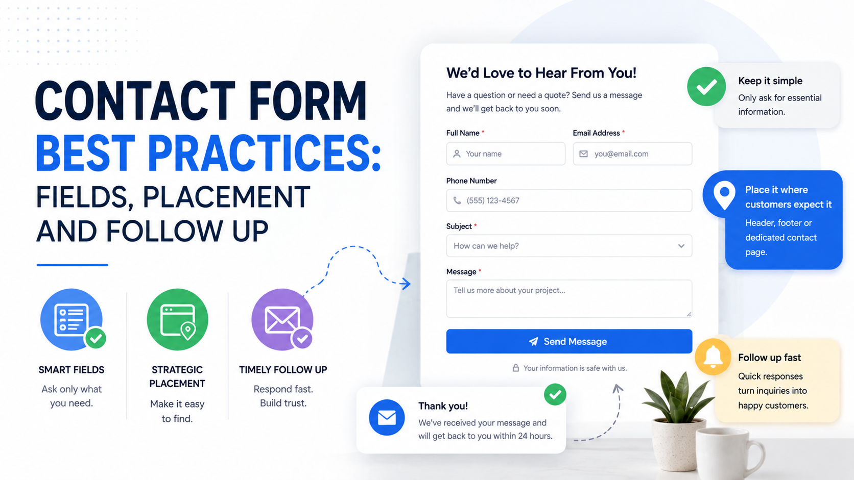
The best forms are usually simple.
They ask for the right amount of information.
They appear at the right moment.
They set expectations clearly.
And most importantly, somebody actually follows up after the person submits them.
That last part matters more than people think.
A perfect form cannot fix a sales process where leads sit unanswered for two days.
Start With the Purpose of the Form
Before deciding which fields to add, decide what the form is supposed to do.
Different forms have different jobs.
A general contact form may only need to start a conversation.
A quote request may need some project details.
A demo request may need company information.
A high-ticket consulting form may need qualification.
An emergency service form should probably be extremely short.
This is where many businesses go wrong.
They use the same form everywhere.
The homepage.
Service pages.
Contact page.
Landing pages.
Paid campaigns.
Everything points to one giant form.
That may be convenient for the business.
It is not always convenient for the visitor.
Every Extra Field Has a Cost
When I review a form, I ask a simple question about every field:
“Do we actually need this information before speaking to the person?”
If the answer is no, I consider removing it.
A typical small service business probably does not need this on the first contact:
Job title.
Company size.
Annual revenue.
Full postal address.
How they heard about you.
Preferred communication channel.
Exact budget.
Exact project deadline.
Three separate service questions.
A long project description.
That information may be useful later.
But useful later is not the same as necessary now.
The Best Form Length Depends on the Business
There is no universal ideal number of fields.
A three-field form might be perfect for a plumber.
It might be too basic for an enterprise software demo.
Think about the value and complexity of the service.
Simple Local Service
You may only need:
Name
Phone
Service needed
Short message
B2B Agency
You might ask:
Name
Work email
Company
Service needed
Short project description
High-Ticket Consulting
You might reasonably add:
Company size
Budget range
Timeline
The question is not:
“How short can we make the form?”
It is:
“What is the minimum information we need to move this lead forward properly?”
That is a better standard.
Name Fields: Keep Them Simple
Do you really need:
First Name
Middle Name
Last Name
For most lead forms, no.
A single:
“Name”
field is often enough.
If your CRM or personalization setup genuinely needs separate first and last names, separate them.
But do not split fields purely because the default template does it.
Every unnecessary interaction adds friction.
Email and Phone: Do You Need Both?
This depends on how your sales process works.
If your team primarily replies by email, email should probably be required.
If you sell an urgent local service, phone may be more important.
For example, someone requesting emergency HVAC repair probably expects a call.
A person downloading a guide may not want to give a phone number at all.
I would avoid making both mandatory unless there is a real reason.
A common setup is:
Email required.
Phone optional.
Or the reverse for call-driven local services.
Be clear about how the information will be used.
Avoid Asking for Information You Can Find Yourself
Suppose someone enters:
Company: Northstar Dental
Website: northstardental.com
Do you also need them to type:
Industry: Dental
Probably not.
If the information is easy for your team to find, do not make the visitor provide it unless it directly helps with qualification.
Good form design respects the visitor’s time.
Use Dropdowns Carefully
Dropdown fields are useful when choices are limited.
For example:
“What service do you need?”
- SEO
- Google Ads
- Web Design
- Local SEO
- Not Sure
That can help route the lead.
But dropdowns become annoying when the options are too detailed.
I have seen forms where a visitor must choose from 25 service categories.
That is unnecessary.
If someone cannot decide which option applies, they may abandon the form.
Always include something like:
“Not sure”
or:
“Other”
when appropriate.
Budget Fields Can Improve Lead Quality
Budget questions are controversial.
Some people dislike them because they may reduce submissions.
That is true.
But fewer submissions can be a good thing if the leads are better.
Suppose your minimum project is $10,000.
A form with no budget guidance may generate many leads expecting to spend $500.
Your sales team wastes time qualifying people who were never a fit.
A simple field such as:
“What budget range are you working with?”
can help.
For example:
Under $2,500
$2,500–$5,000
$5,000–$10,000
$10,000+
Not sure yet
The key is making the ranges realistic.
Do not create a budget field simply to make the form look professional.
Use it when the answer actually affects your sales process.
Timeline Questions Can Be Useful Too
The same applies to timeline.
A construction company may need to know whether the customer wants to start:
Immediately
Within 1–3 months
Within 3–6 months
Just researching
That helps prioritize leads.
A website designer may ask:
“When are you hoping to launch?”
These questions are helpful when timing matters.
If timing does not change what you do next, do not ask.
Do Not Make the Message Field Too Demanding
A large text box can feel like work.
The label matters.
Instead of:
“Please provide a detailed description of your requirements, goals, current challenges, desired outcomes, budget limitations, and expectations.”
Try:
“Tell us briefly what you need.”
Much easier.
You can learn more during the conversation.
The initial form should not feel like a proposal-writing exercise.
Use Helpful Placeholder Text
A blank message box can make people wonder what to write.
You can give a light prompt.
For example:
“Example: We need monthly landscaping for three commercial properties.”
Or:
“Tell us the service, location, and anything we should know.”
This can improve the quality of the enquiry without adding more fields.
Form Placement Matters More Than People Think
A good form in the wrong place can still underperform.
There are several places where forms usually make sense.
Placement Option 1: Dedicated Contact Page
This is the traditional approach.
The visitor clicks:
Contact
and lands on a page with:
Form.
Phone.
Email.
Address.
Business hours.
Other contact options.
This works well because people arriving there already have intent.
But I would not rely on the contact page alone.
Many visitors may be ready to enquire before they ever reach it.
Placement Option 2: Service Pages
This is one of my preferred placements for service businesses.
Someone reads a page about:
Commercial Roofing
They see:
Service details.
Projects.
Reviews.
FAQ.
Then a quote form appears near the bottom.
That makes sense.
The visitor has enough information to decide.
You can even prefill the service field:
“Commercial Roofing”
That removes another step.
Placement Option 3: Landing Pages
For paid campaigns, I usually want the form directly on the landing page or one clear click away.
Do not send paid visitors through several pages just to contact you.
If the ad says:
“Request a Free Website Audit”
the form should be easy to find.
A common structure is:
Hero CTA.
Short form near the top.
Proof.
Benefits.
Case study.
Second form or CTA near the bottom.
That works well because visitors can convert whenever they feel ready.
Placement Option 4: Homepage
A homepage can include a form near the bottom, especially for service businesses.
I usually would not place a huge form immediately at the top unless the visitor already understands the offer.
A CTA such as:
“Request a Quote”
may work better in the hero.
Then the actual form can appear later after trust has been built.
Should You Put the Form Above the Fold?
Sometimes.
It depends on how much explanation the visitor needs.
Good Candidate for Above-the-Fold Form
Emergency plumbing
Simple home-service estimate
Free quote
Basic consultation
Low-friction offer
Better Candidate for More Context First
Enterprise consulting
High-ticket construction
Complex software demo
Legal services
Custom development
Expensive B2B services
If the customer needs trust and explanation before contacting you, do not force the form too early.
Sticky Forms and Buttons Can Work
On mobile, a sticky CTA can be useful.
For example:
“Call Now”
“Get Quote”
“Book Appointment”
This keeps the conversion action available while the visitor scrolls.
Just make sure it does not cover:
Navigation.
Cookie controls.
Form fields.
Important content.
I have seen mobile sites where three sticky elements compete for the bottom of the screen.
That is not helpful.
Pop-Up Forms: Use Them Carefully
Popups can work, but they can also become annoying fast.
A popup may make sense after someone clicks:
“Request Pricing”
and the form opens in a modal.
That is intentional.
A popup appearing five seconds after page load saying:
“WAIT! GET YOUR FREE QUOTE!”
is much more intrusive.
Use popups when they support a visitor action.
Do not use them simply because a conversion tool recommends them.
Multi-Step Forms Can Reduce Visual Friction
If you need several fields, a multi-step form can make the process feel easier.
Instead of showing ten questions at once:
Step 1
What service do you need?
Step 2
What is your location?
Step 3
When would you like to start?
Step 4
What is your name and contact information?
This can make longer qualification forms feel less intimidating.
Tools such as Jotform, Typeform, HubSpot Forms, Gravity Forms, WPForms, and various landing page builders can support multi-step forms depending on your website stack.
But do not use multi-step forms just because they look modern.
A four-field form does not need four screens.
Always Test the Form on Mobile
This sounds basic.
Still worth saying.
Open the form on an actual phone.
Try to submit it.
Check:
Are fields large enough?
Does the keyboard cover the button?
Do dropdowns work?
Does autofill work?
Is the CAPTCHA usable?
Can you see error messages?
Does the page jump around?
Can you submit without zooming?
A form that works on desktop can be surprisingly frustrating on mobile.
Error Messages Need to Be Clear
Do not make visitors guess what went wrong.
Bad error:
“Submission failed.”
Better:
“Please enter a valid email address.”
Or:
“Please select a service before continuing.”
Highlight the actual field.
Preserve the information they already entered.
Nothing is more frustrating than completing a long form, making one mistake, and watching everything disappear.
Do Not Reset the Form After an Error
This deserves its own mention.
If someone enters:
Name.
Email.
Phone.
Project details.
Budget.
Timeline.
Then misses one required dropdown, do not erase all the other information.
Good form tools should preserve it.
Always test this.
It can dramatically affect completion.
CAPTCHA Should Not Become the Biggest Obstacle
Spam protection is necessary.
But aggressive CAPTCHA systems can reduce real submissions too.
If users constantly have to identify:
Traffic lights.
Crosswalks.
Motorcycles.
Buses.
just to request a quote, the experience is poor.
Consider less intrusive anti-spam tools such as:
Honeypot fields.
Modern bot detection.
Server-side filtering.
Rate limiting.
Appropriate CAPTCHA implementations.
Balance security with usability.
Spam Protection Still Matters
The other extreme is having no protection.
Then the business inbox fills with:
Fake SEO offers.
Cryptocurrency spam.
Bot submissions.
Random links.
Now real leads become harder to notice.
Spam protection is part of lead management, not just technical maintenance.
Monitor the quality after implementation to make sure genuine visitors are not being blocked.
Your Submit Button Should Be Specific
“Submit” is functional.
It is not very helpful.
Better options:
“Request My Quote”
“Book My Consultation”
“Send My Enquiry”
“Get Project Estimate”
“Request a Demo”
“Check Availability”
The button reinforces what happens next.
That reduces uncertainty.
Add Reassurance Near the Button
People hesitate right before submitting.
A short reassurance line can help.
Examples:
“No obligation.”
“We’ll respond within one business day.”
“Your details stay private.”
“No spam. Just the information you requested.”
Only make promises you can actually keep.
If you say:
“Replies within 30 minutes”
and your team responds two days later, that trust disappears immediately.
Show Privacy Information Clearly
If you collect personal information, explain what you do with it.
You do not need a legal essay directly under the form.
A simple line may say:
“By submitting, you agree to our Privacy Policy.”
Depending on your location, marketing use, tracking setup, and applicable laws, you may need additional consent mechanisms or disclosures.
Do not automatically add people to marketing newsletters simply because they asked for a roofing estimate.
A service enquiry and marketing subscription are not necessarily the same thing.
Do Not Pre-Check Marketing Consent Boxes
If you ask visitors to opt into promotional email, make the choice clear.
Avoid hidden or misleading consent.
The contact form should primarily help the person complete the action they came for.
Good privacy practices also make the business look more trustworthy.
The Thank-You Message Is Part of the Form
Many businesses spend hours designing the form and five seconds on what comes next.
After someone submits, they see:
“Success.”
That is a missed opportunity.
A better message:
“Thanks — we received your request. Our team will review the details and contact you within one business day.”
Now the visitor knows the form actually worked.
Use a Dedicated Thank-You Page When It Helps
A thank-you page can do more than confirm the submission.
It can include:
Next steps.
Expected response time.
Booking link.
Case study.
Preparation checklist.
Contact details.
FAQs.
For example:
“Thanks for requesting a consultation.
Step 1: We review your information.
Step 2: You’ll receive an email within one business day.
Step 3: If the project looks like a fit, we’ll schedule a short call.”
That reduces uncertainty.
Track Form Submissions Properly
If form submissions are important, track them.
Depending on your setup, that may involve:
GA4.
Google Tag Manager.
Google Ads conversion tracking.
Meta Pixel.
LinkedIn Insight Tag.
CRM integration.
Do not count button clicks as form submissions unless the submission actually succeeded.
I have seen reporting setups where:
Click “Submit”
equals:
Lead.
Even when the form throws an error.
That creates bad data.
Track the success event.
Send Leads Somewhere Reliable
Where does the form go?
This question sounds obvious until you find out the form sends everything to:
info@company.com
and nobody checks it regularly.
A better process might be:
Form submitted.
Lead enters CRM.
Sales person receives email notification.
Sales team receives Slack alert.
Lead owner is assigned.
Follow-up task is created.
Depending on the business, tools such as HubSpot, Pipedrive, Zoho CRM, Salesforce, Close, Zapier, or Make can help automate parts of this process.
The exact stack is not the important part.
Ownership is.
Someone must know:
“This lead is mine.”
Test the Notification Emails
This is one of the simplest things businesses forget.
Submit the form yourself.
Did the business receive it?
Did the visitor receive confirmation?
Did the lead go to the CRM?
Did the phone number format correctly?
Did the service choice appear?
Did spam filtering catch it?
Test forms after:
Website updates.
Plugin updates.
Theme changes.
Hosting migrations.
CRM changes.
Forms can break quietly.
Speed of Follow-Up Matters
Imagine a homeowner requests quotes from four contractors.
Contractor A replies quickly.
Contractor B replies later that afternoon.
Contractor C replies tomorrow.
Contractor D replies three days later.
Who has the best chance of starting the conversation?
Usually one of the faster responders.
The exact ideal response time depends on the service, but the general rule is simple:
Do not let high-intent leads sit.
For urgent services, speed matters even more.
Automatic Replies Are Useful, but They Are Not Follow-Up
An automatic email saying:
“Thanks, we received your request.”
is helpful.
It confirms the form worked.
It is not a sales response.
The lead still needs a real person to follow up.
Do not allow automation to create the illusion that the lead has been handled.
Write Confirmation Emails Like a Human
Bad:
“Dear User,
Your submission has been successfully received by our system.”
Better:
“Hi Sarah,
Thanks for getting in touch. We received your request for commercial landscaping in Dallas.
Someone from our team will review the details and reply within one business day.
Best,
Alex”
Simple.
Clear.
Human.
Give the Lead a Useful Next Step
Depending on the business, your confirmation message could include:
Calendar link.
Phone number.
Project checklist.
Document request.
FAQ.
For example:
“If you have photos of the area, reply to this email and send them over. That will help us review the project before we speak.”
Now the follow-up process is already moving forward.
Do Not Send a Huge Sales Sequence Immediately
Someone who requests a quote does not necessarily want to receive 12 promotional emails.
Treat enquiry follow-up differently from cold marketing.
The first priority is the service they asked about.
Reply to that.
Then, if appropriate and compliant, you can introduce additional marketing later.
Relevance matters.
Use Lead Routing for Different Services
Suppose a company offers:
Roofing.
Siding.
Windows.
Gutters.
The service selected in the form can determine who receives the lead.
For example:
Roofing → Roofing sales team.
Windows → Window specialist.
Commercial → Commercial division.
This reduces internal delays.
Even a small company can use simple routing rules.
Track Lead Source Too
A good form should help you understand where the lead came from without forcing the visitor to answer:
“How did you hear about us?”
every time.
Use tracking when possible.
For example:
UTM parameters.
Hidden form fields.
Referral data.
Ad campaign IDs.
Landing-page URLs.
Then your CRM may show:
Source: Google Ads
Campaign: Commercial Roofing
Landing Page: Dallas Roof Repair
That is far more reliable than expecting every prospect to remember which ad they clicked.
Keep a Manual “How Did You Hear About Us?” Question Only When Useful
Sometimes asking directly still helps.
People may say:
Friend referral.
Google.
Instagram.
Existing customer.
Event.
The problem is making it mandatory on every simple contact form.
If the information is valuable, consider making it optional.
Lead Quality Should Influence Form Design
Suppose your form generates:
100 leads per month.
Your sales team complains that 80 are irrelevant.
The automatic response is often:
“We need more leads.”
Probably not.
You may need better qualification.
Add one or two fields that filter poor-fit enquiries.
For example:
Property type.
Company size.
Minimum budget.
Location.
Service needed.
This may reduce submissions while increasing useful leads.
That is often a win.
Measure More Than Form Conversion Rate
Imagine:
Form A converts 10% of visitors.
Form B converts 6%.
Form A looks better.
But then:
Form A generates mostly poor-fit enquiries.
Form B generates serious buyers.
Which form is better?
Measure:
Form submissions.
Qualified leads.
Meetings.
Quotes.
Sales.
Revenue.
The best form is not necessarily the one generating the most submissions.
It is the one supporting the best business outcome.
Common Contact Form Mistakes
Too Many Required Fields
Visitors abandon.
Asking for Information Too Early
Qualification becomes interrogation.
Poor Mobile Design
The form is frustrating to use.
Generic “Submit” Buttons
Visitors are less clear about the next step.
No Confirmation
People do not know whether the form worked.
No Response-Time Expectation
The lead is unsure what happens next.
Broken Notifications
Leads disappear unnoticed.
No CRM Integration
Follow-up becomes inconsistent.
Treating Auto-Replies as Real Follow-Up
Nobody actually talks to the prospect.
No Spam Protection
Real leads get buried.
Too Much Spam Protection
Real visitors get blocked.
No Tracking
Marketing cannot see what produces leads.
A Practical Contact Form Setup for a Local Service Business
Suppose I am building a form for a landscaping company.
I might use:
Name
Phone
Service Needed
- Landscape Maintenance
- Installation
- Drainage
- Grading
- Other
Property Type
- Residential
- Commercial
Message
“Tell us briefly what you need.”
Button:
Request My Estimate
Below:
“We’ll review your request and respond within one business day.”
That is enough to start.
A Practical Form for a B2B Agency
I might use:
Name
Work Email
Company
Website
Service Needed
- SEO
- Paid Ads
- Web Design
- Not Sure
Approximate Monthly Marketing Budget
- Under $2,500
- $2,500–$5,000
- $5,000–$10,000
- $10,000+
- Not Sure
What are you trying to improve?
Button:
Request a Consultation
This collects more information because the sales process needs more context.
A Practical Form for an Emergency Service
Keep it very short.
Name
Phone
Service Needed
Button:
Request Immediate Help
And show the phone number prominently.
If someone has water pouring through their ceiling, do not ask for company size and project budget.
Match the form to the situation.
A Simple Form Audit You Can Run Today
Open your website and check:
What is the goal of this form?
Which fields are truly necessary?
Which fields can be removed?
Does the form work on mobile?
Are error messages clear?
Does spam protection create friction?
Is the CTA specific?
Does the visitor know what happens next?
Does the form actually send?
Who receives the lead?
How fast do they respond?
Is the source tracked?
Does the lead enter the CRM?
Is there a confirmation email?
Can you connect the lead to a sale later?
Those questions will usually uncover more useful improvements than changing the form color.
The Form Is Only Half the Conversion
This is the part I think businesses underestimate most.
You can optimize the form perfectly.
Reduce it from eight fields to four.
Move it to a better position.
Improve the CTA.
Add trust.
Increase submissions.
Great.
But if the lead then waits 48 hours for someone to respond, the funnel is still weak.
A contact form is not the finish line.
It is a handoff.
The visitor has raised their hand and said:
“I might be interested.”
Your job is to make that handoff smooth.
The form should make it easy to ask for help.
The confirmation should make it clear what happens next.
The CRM should make sure the lead reaches the right person.
And the follow-up should happen while the enquiry is still relevant.
That is what good contact-form optimization really looks like.
Not just fewer fields.
Not just a nicer button.
A complete process from visitor interest to real conversation.
If I were improving a contact form today, I would start with three questions:
Are we asking for too much?
Is the form easy to find and complete?
What happens immediately after someone submits it?
Get those three things right, and the form becomes much more than a box on the website.
It becomes a reliable part of the sales process.