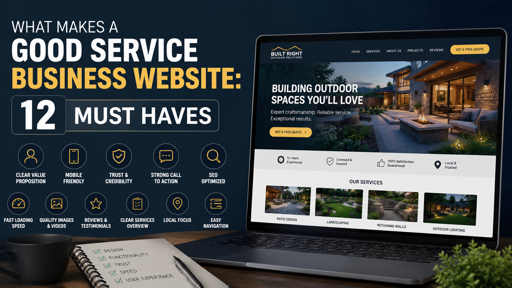
I have looked at plenty of service business websites that were technically “good” but still did a poor job of generating business.
The design was clean.
The logo looked professional.
The animations were smooth.
The pages loaded.
Nothing was obviously broken.
But after a few minutes on the site, I still had basic questions.
What exactly does this company do?
Who do they work with?
Which locations do they serve?
Why should I trust them?
How do I get a quote?
That is the problem with judging a service website mainly by how it looks.
A website for a roofer, accountant, landscaping company, law firm, consultant, plumber, agency, cleaning company, or contractor is not just a branding exercise.
It has a job.
It needs to help the right visitor move from:
“I found this company”
to:
“This looks relevant”
to:
“I trust them”
to:
“I’m going to contact them.”
If the website cannot support that journey, a beautiful design will not rescue it.
Over time, I have found that the strongest service websites tend to get the same fundamentals right.
Here are the 12 things I would want on almost any service business website before worrying about advanced animations, fancy effects, or another redesign.
1. A Homepage That Explains the Business Immediately
This sounds obvious.
It is also one of the most common problems I see.
A visitor lands on the homepage and sees:
“Creating Better Possibilities.”
Or:
“Solutions Designed Around You.”
Or:
“Transforming the Future Together.”
These phrases sound polished.
They also explain almost nothing.
A service website should quickly answer three questions:
What do you do?
Who do you do it for?
Where do you provide it, if location matters?
For example:
“Commercial Landscaping for Offices and Retail Properties in Dallas”
is much stronger than:
“Outdoor Spaces That Inspire.”
The first version gives me context immediately.
I know the service.
I know the customer type.
I know the market.
You can still make the website look premium.
Just do not sacrifice clarity for cleverness.
A Simple Homepage Formula
A useful hero section might contain:
Headline: What you do.
Supporting text: Who it is for and the main outcome.
Primary CTA: What the visitor should do next.
Example:
Commercial Cleaning for Offices Across Houston
Reliable scheduled cleaning for offices, clinics, and commercial facilities without long-term confusion around staffing or supplies.
Request a Quote
Simple.
Clear.
That is usually more effective than trying to sound like a global technology brand when you clean offices.
2. A Clear Call to Action
A surprising number of websites make visitors work too hard to become leads.
The visitor is interested.
They scroll through the service page.
They like the projects.
They read the reviews.
Then they cannot figure out what to do next.
Your main call to action should be obvious.
Examples include:
Request a Quote
Book a Consultation
Schedule an Inspection
Get an Estimate
Call Now
Check Availability
Talk to Our Team
The right wording depends on the service.
A roofing company may use:
“Get a Free Roof Inspection”
while a consulting firm might use:
“Book an Intro Call.”
The important part is that the visitor understands what happens after clicking.
Avoid Vague Buttons
Buttons such as:
“Explore”
“Discover”
“Learn More”
“Get Started”
can work in the right place, but they are often too vague for high-intent pages.
If someone is ready to hire a plumber, “Request Service” is more useful than “Start Your Journey.”
3. Dedicated Pages for Important Services
One of the first things I look for on a service business website is whether each major service has its own useful page.
Imagine a contractor offers:
Kitchen Remodeling
Bathroom Remodeling
Basement Finishing
Home Additions
But all four are described in six sentences on one “Services” page.
That creates several problems.
Customers cannot learn much about each service.
The company has fewer opportunities to rank for specific searches.
Paid ads have no focused landing destination.
Internal linking becomes weaker.
Each important service deserves enough space to answer questions properly.
A Good Service Page Should Explain
What the service is.
Who it is for.
What problems it solves.
What the process looks like.
What is included.
Relevant examples.
Common questions.
Why customers choose you.
How to get started.
You do not need to write 4,000 words simply for SEO.
Write enough to help someone make a decision.
4. Real Proof That You Can Do the Work
This is one of the most important sections on any service website.
A visitor does not just want to know what you claim you can do.
They want evidence.
That proof may include:
Before-and-after photos.
Portfolio projects.
Case studies.
Customer reviews.
Testimonials.
Certifications.
Licenses.
Awards.
Client logos.
Relevant statistics.
The strongest proof depends on the business.
A landscaping company should probably show completed landscapes.
A marketing agency should show real results.
A web designer should show websites.
A consultant might use case studies.
A commercial cleaning company may use client reviews and recognizable facilities served.
Real Proof Beats Generic Claims
Compare:
“We deliver exceptional quality.”
with:
“We completed landscaping and irrigation work across 14 commercial properties for this client.”
The second statement gives me something concrete.
If you have measurable results, use them accurately.
Do not invent statistics because you think every website needs huge numbers.
A modest real result is more useful than an impressive fake one.
5. Testimonials That Actually Say Something
Testimonials are powerful when they sound like customers.
They are weak when they sound like marketing copy.
Bad example:
“Excellent company! Highly recommended!”
It is positive, but it gives the visitor almost no information.
Better example:
“We hired them to maintain three commercial properties. Communication has been consistent, scheduling is reliable, and we no longer need to chase different contractors for seasonal work.”
That testimonial answers real concerns.
The Best Testimonials Often Mention
What problem existed.
Why the customer chose the company.
What the experience was like.
What changed afterward.
Where possible, include the customer’s:
Name.
Company.
Role.
Photo or logo, with permission.
People trust specific details.
6. A Fast, Simple Contact Process
This is where a lot of otherwise good websites lose leads.
The visitor clicks:
“Request a Quote”
and gets a form asking for:
First name.
Last name.
Company.
Position.
Phone.
Email.
Street address.
City.
State.
ZIP code.
Budget.
Timeline.
Number of employees.
Referral source.
Project description.
That is a lot of work for someone who just wanted to ask a question.
Ask only for the information you genuinely need at the first stage.
For many service companies, that might be:
Name.
Phone or email.
Service needed.
Short message.
You can qualify the person later.
When Longer Forms Make Sense
There are exceptions.
A high-ticket construction or consulting company may need one or two qualifying questions such as:
Project budget.
Property size.
Number of locations.
Project timeline.
That can reduce poor-fit inquiries.
The goal is not always the shortest possible form.
The goal is the least amount of friction needed to get useful information.
7. Strong Mobile Usability
I have seen websites that look excellent on a large monitor and become frustrating the moment I open them on a phone.
That matters because service business customers often search while mobile.
Someone may be sitting in their car searching for:
“Emergency plumber near me.”
Or standing inside a damaged property looking for:
“Roof repair company.”
They are not opening your website on a 27-inch monitor.
Test the website on a real phone.
Do not only drag the browser window narrower on your computer.
Try to:
Read the headline.
Open the navigation.
Tap the phone number.
Submit the form.
View the portfolio.
Click the CTA.
Read the testimonials.
Common Mobile Problems
Buttons too small.
Text too close together.
Huge hero images.
Popups covering content.
Contact forms that are painful to complete.
Sticky elements blocking buttons.
Phone numbers that are not clickable.
Slow pages.
The site does not need to be visually identical across desktop and mobile.
It needs to be usable.
8. Fast Page Speed
Speed is not exciting.
It is still important.
A service business can spend money on:
SEO.
Google Ads.
Social advertising.
Content.
Then waste part of that traffic because the website takes too long to become usable.
You can check performance with tools such as Google PageSpeed Insights.
Common problems include:
Huge uncompressed photos.
Background video.
Too many scripts.
Poor hosting.
Heavy page builders.
Unused plugins.
Excessive tracking tools.
Third-party widgets.
Do Not Chase a Perfect Score Blindly
I would not destroy a useful website just to get a performance tool from 92 to 100.
The real question is:
Does the site feel fast?
Does important content appear quickly?
Can visitors interact without waiting?
Prioritize actual experience over vanity scores.
9. Trust Information That Makes the Business Feel Real
When people hire a service company, they are often taking a risk.
They may be inviting someone into their home.
Paying a large deposit.
Giving access to company systems.
Sharing financial information.
Committing to a long contract.
Trust matters.
A website should help the visitor answer:
Who is behind this company?
How long has it existed?
Where is it based?
Can I contact a real person?
Does it have experience?
Are there real customers?
Useful Trust Elements
Real team photos.
Physical location, where relevant.
Phone number.
Professional email.
Google reviews.
Licenses.
Insurance information where appropriate.
Industry certifications.
Association memberships.
Company history.
Real project photos.
Do not fill the page with meaningless badges.
Show the things that actually matter in your industry.
10. Local Information for Businesses That Serve Specific Areas
If your company serves a particular geographic market, make that obvious.
I regularly see service websites where the location is surprisingly difficult to find.
The visitor is left wondering:
Do they even work in my city?
A local business website should clearly communicate:
Primary location.
Service area.
Nearby cities.
Contact details.
Business hours where relevant.
For example:
“Serving El Paso, Horizon City, Socorro, and surrounding areas.”
That is useful for both customers and local search visibility.
Location Pages Can Help When They Are Genuine
If you operate across several important areas, dedicated location pages may make sense.
But avoid creating 200 nearly identical pages where only the city name changes.
A useful location page should contain real information.
Examples:
Services available there.
Relevant projects.
Local customer reviews.
Specific service area.
Local contact information.
Unique business details.
Create pages for customers, not search engines.
11. FAQs That Remove Sales Objections
A good FAQ section is not filler.
It can remove hesitation before the visitor contacts you.
Use questions customers genuinely ask.
For example:
How much does the service cost?
How long will it take?
Do you provide free estimates?
Which areas do you serve?
Do I need to be home during the work?
Are you insured?
What happens after I request a quote?
Do you offer financing?
Can you work with our existing system?
What is included?
You already hear these questions in:
Phone calls.
Emails.
Sales meetings.
Contact forms.
Customer support.
Use those conversations to build the FAQ.
FAQs Help Sales Too
If prospects repeatedly ask:
“How quickly can you start?”
put the answer on the website.
If people are worried about contracts:
Explain the contract.
If they want to understand the process:
Show the process.
The more uncertainty the website removes, the easier the eventual sales conversation becomes.
12. Proper Tracking and Lead Management
This is the least visible “must have,” but it may be one of the most important.
A website should not simply generate form submissions.
You need to know what happens afterward.
At minimum, track important actions such as:
Contact form submissions.
Phone calls.
Quote requests.
Booked meetings.
WhatsApp clicks.
Demo requests.
Purchases where relevant.
Depending on your setup, you may use:
GA4.
Google Tag Manager.
Google Search Console.
Google Ads conversion tracking.
Meta Pixel.
Call tracking software.
CRM tracking.
Connect Leads to Sales
This is where the real value appears.
Suppose Google Ads generated:
40 leads.
SEO generated:
Social media generated:
At first glance, Google Ads looks strongest.
Then you check actual sales.
Google Ads:
40 leads → 2 customers.
SEO:
15 leads → 7 customers.
Social:
25 leads → 1 customer.
Now the picture is completely different.
Lead quantity is not enough.
You need to understand quality.
A CRM such as HubSpot, Pipedrive, Close, Zoho CRM, or Salesforce can help track the journey from:
Visitor
to:
Lead
to:
Opportunity
to:
Customer.
For smaller businesses, a well-maintained spreadsheet may be enough initially.
The important part is having a process.
Bonus: The Website Needs a Clear Value Proposition
I know this article is called “12 Must Haves,” but this one connects all of them.
Why should someone choose you?
Not why are you “the best.”
Why are you relevant?
A value proposition might be:
“Same-day HVAC repairs across Phoenix with upfront pricing.”
Or:
“Bookkeeping for agencies that have outgrown DIY accounting.”
Or:
“Commercial landscaping for multi-property managers who want one reliable maintenance partner.”
Those statements give the customer something specific.
Compare that with:
“Quality. Integrity. Excellence.”
Those values sound positive.
Every competitor can say the same thing.
Specific positioning makes a website easier to remember.
Bonus: Show Your Process
People are often nervous because they do not understand what happens after contacting a company.
A simple process can reduce that uncertainty.
For example:
1. Request a Quote
Tell us what you need.
2. Site Visit
We inspect the property and confirm the scope.
3. Proposal
You receive clear pricing and timing.
4. Work Begins
Our team completes the agreed project.
5. Final Review
We inspect everything with you before completion.
Simple process sections work especially well for complicated or high-value services.
The Biggest Service Website Mistakes I See
Once you understand the must-haves, the common mistakes become easier to spot.
Designing for Awards Instead of Customers
Fancy interactions are useless if customers cannot find the contact button.
Hiding What the Company Does
Clarity should come before clever copy.
Using Only Stock Photos
Real work creates more trust.
Publishing One Generic Services Page
Important services deserve real explanations.
Asking for Too Much Information
Forms should not feel like loan applications.
Forgetting Mobile
Mobile usability is not optional.
Having No Proof
Claims need evidence.
Sending Every Visitor to the Homepage
Paid campaigns often need focused landing pages.
Ignoring Page Speed
Heavy design can become expensive friction.
Hiding Pricing Context
You do not necessarily need exact prices, but some guidance can improve lead quality.
Tracking Traffic Without Tracking Leads
Visitors are not the business goal.
Generating Leads Without Following Up
A website cannot close a lead sitting unread in an inbox.
What I Would Put on a New Service Business Website
If I were building a website for a new service company with a limited budget, I would not start with 30 pages.
I would build the essentials first.
Homepage
Clear offer.
Main CTA.
Services.
Trust.
Projects.
Reviews.
Process.
FAQ.
Final CTA.
Individual Service Pages
One for each major service.
About Page
Real company story and credibility.
Projects or Case Studies
Show actual work.
Contact Page
Simple ways to reach the team.
Location Information
Where the business operates.
That is enough to create a strong foundation.
Then expand based on:
SEO opportunities.
Customer questions.
New services.
Locations.
Campaign needs.
Review the Site Like a Customer
This is one of the easiest audits you can run.
Forget that it is your website for ten minutes.
Imagine you found the company through Google.
Ask:
Can I understand the business in five seconds?
Can I see where they operate?
Can I find the service I need?
Can I see proof?
Can I tell whether this company is legitimate?
Can I contact them easily?
Does the website work on my phone?
Do I know what happens after I submit the form?
If several answers are no, start there.
Do not immediately change the colors or typography.
Fix the business questions first.
A Good Website Does Not Need to Feel Complicated
Some of the highest-performing service websites are surprisingly straightforward.
Clear headline.
Relevant photos.
Simple services.
Real reviews.
Easy contact options.
Fast pages.
There is no rule saying a professional website needs three-dimensional graphics, complicated transitions, or a cinematic homepage.
Those things can be useful when the brand calls for them.
But they are optional.
Clarity is not optional.
Trust is not optional.
Usability is not optional.
The Website Should Make Hiring You Feel Easier
That is really what all 12 must-haves are trying to accomplish.
A potential customer already has enough uncertainty.
They are wondering:
Is this company good?
Are they expensive?
Do they work in my area?
Will they actually respond?
Have they done this before?
Can I trust them?
How long will it take?
What should I do next?
A good service business website answers those questions before the visitor has to ask.
It does not try to impress people into becoming leads.
It removes reasons not to become one.
That is the difference between a website that merely looks professional and one that actually supports the business.
If your site already has traffic but inquiries are weak, I would not immediately redesign everything.
Start with the fundamentals.
Clarify the offer.
Improve the CTA.
Strengthen service pages.
Add proof.
Simplify the form.
Test mobile.
Improve speed.
Answer common questions.
Track what converts.
Then improve based on actual customer behavior.
That approach may sound less exciting than launching a completely new website every two years.
But it is much more useful.
A service business does not need a website people admire for thirty seconds.
It needs a website that helps the right customer confidently say:
“Yes, this looks like the company I should contact.”